
Security News
The Hidden Blast Radius of the Axios Compromise
The Axios compromise shows how time-dependent dependency resolution makes exposure harder to detect and contain.
By Ahmad Nassri - Apr 01, 2026
react-native-infobox
Advanced tools
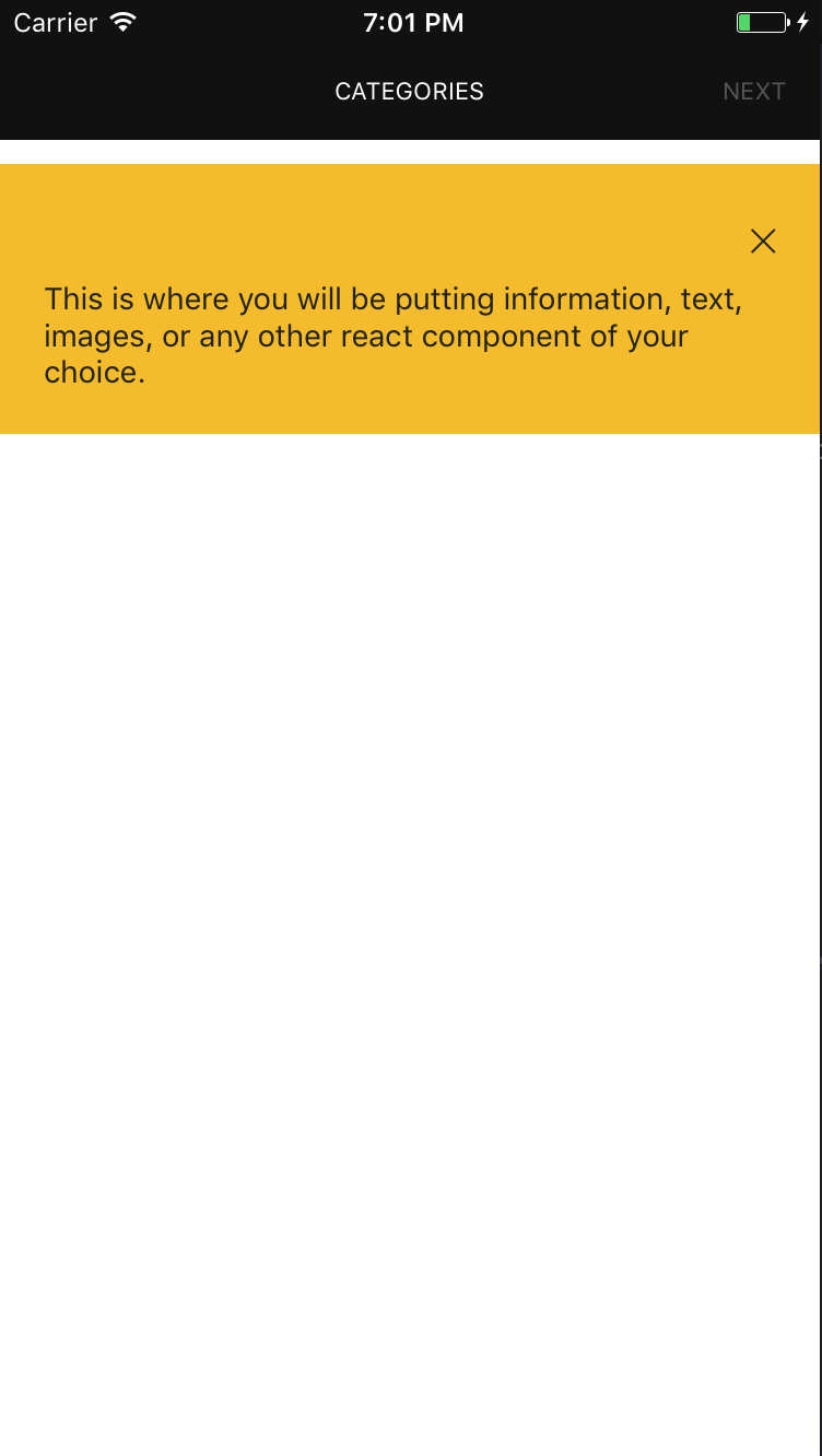
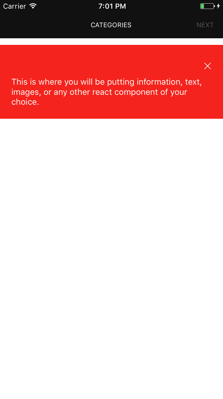
An information box component for react-native. This is still very much a work in progress and only handles the simplest of cases, ideas and contributions are very welcome.

npm install react-native-infobox --saveThis project uses [React Native Vector Icons] (https://github.com/oblador/react-native-vector-icons) which uses Ionic fonts. Please follow the proper instructions from their project to use it in iOS or Android.
'use strict';

import React, {Component} from 'react'
import InfoBox from 'react-native-infobox'

class App extends Component {
	...

	render() {
		return (
			<InfoBox
				hidden={false}
				onClose={() => {}}
				timeout={5}>
				<Text style={{color: 'white'}}>Hello this is a help box.</Text>
			</InfoBox>
		)
	}
}
'use strict';

import React, {Component} from 'react'
import InfoBox from 'react-native-infobox'

class App extends Component {
	...

	render() {
		return (
			<InfoBox>
				<Text style={{color: 'white'}}>Hello this is a help box.</Text>
			</InfoBox>
		)
	}
}
Component accepts several self-descriptive properties:
hidden (Bool) - if true, the info box will be hidden by default.onClose (Function)timeout (Number) - set timeout in seconds to define when the infobox closes automatically.children (React Component)containerStyle (Object) - applies style to the infobox container.iconName (String) - Ionicon icon name for the close icon, See ionicon font cheatsheet.iconColor (String) - Close icon color.iconSize (Number) - Close icon size.MIT Licensed
FAQs
An information box for react native
We found that react-native-infobox demonstrated a not healthy version release cadence and project activity because the last version was released a year ago. It has 1 open source maintainer collaborating on the project.
Did you know?

Socket for GitHub automatically highlights issues in each pull request and monitors the health of all your open source dependencies. Discover the contents of your packages and block harmful activity before you install or update your dependencies.
Security News
The Axios compromise shows how time-dependent dependency resolution makes exposure harder to detect and contain.

Research
A supply chain attack on Axios introduced a malicious dependency, plain-crypto-js@4.2.1, published minutes earlier and absent from the project’s GitHub releases.

Research
Malicious versions of the Telnyx Python SDK on PyPI delivered credential-stealing malware via a multi-stage supply chain attack.