react-native-layout
Semantic JSX layout components for react-native
This project contains react-native
layout components which brings more semantic to your JSX code.
It contains a "little bit more complex" BorderLayout,
as well as really simple layout modules like
Center, Fill,
Header, Footer,
and it also renames a view group as LinearLayout.
API, documentation and unit tests are WIP. Ideas, discussions and contributions
are welcome:
Open an issue
If your brave install the alpha version (0.0.x):
npm install react-native-layout --save
You can expect a beta version (0.1.0) soon.
Why?
Developing apps with react-native
is great. But sometimes the JSX markup loses its simplicity with a growing
number of components and view elements.
Especially when you extracts and imports the
stylesheets
from an external file.
Examples
An example project is coming soon. Currently please checkout the examples
folder and the following inline codes.
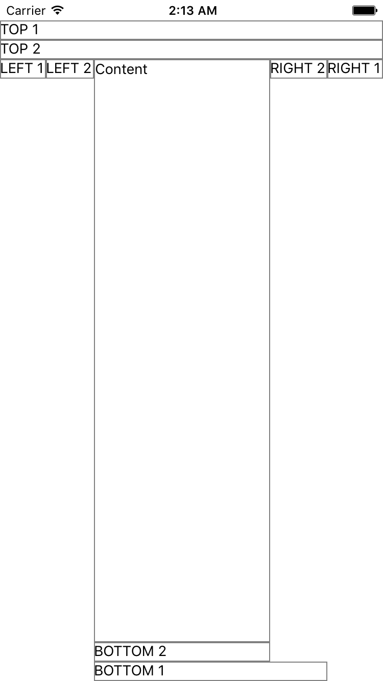
BorderLayoutExample1.js
BorderLayoutExample2.js
BorderLayoutExample3.js
Center Content
Instead of:
<View style={{ flex: 1, alignItems: 'center', justifyContent: 'center' }}>
    <Text>Center Content</Text>
</View>
Write:
<Center>
    <Text>Center Content</Text>
</Center>
BorderLayout
Instead of:
<View style={{ flex: 1 }}>
    <View><Text>Header</Text></View>
    <View style={{ flex: 1 }}><Text>Content</Text></View>
    <View><Text>Footer</Text></View>
</View>
You could write:
<Fill>
    <Top><Text>Header</Text></Top>
    <Bottom><TextFooter</Text></Bottom>
    <View><Text>Content</Text></View>
</Fill>


