react-native-lq-toast
A lightweight and customizable toast notification library for React Native. It supports animations, different toast variants, and allows users to pass a custom component for the toast design.
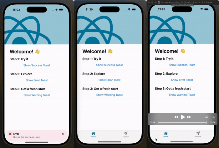
🎥 Demo
Here’s how the toast appears from the top and bottom:
📦 Installation
npm install react-native-lq-toast
or using Yarn:
yarn add react-native-lq-toast
🚀 Usage
1⃣ Wrap Your App with ToastProvider
To use the toast system, wrap your app with the ToastProvider.
import React from "react";
import { ToastProvider } from "react-native-lq-toast";
import HomeScreen from "./HomeScreen";

const App = () => {
    return (
        <ToastProvider position="top" animationType="slide">
            <HomeScreen />
        </ToastProvider>
    );
};

export default App;
2⃣ Use useToast() Hook to Show Toasts
Inside any component, you can use the useToast hook to show or hide toasts.
import React from "react";
import { View, Button } from "react-native";
import { useToast } from "react-native-lq-toast";

const HomeScreen = () => {
    const { showToast } = useToast();

    return (
        <View>
            <Button
                title="Show Success Toast"
                onPress={() =>
                    showToast({
                        title: "Success",
                        description: "Your action was successful!",
                        variant: "success",
                    })
                }
            />

            <Button
                title="Show Error Toast"
                onPress={() =>
                    showToast({
                        title: "Error",
                        description: "Something went wrong.",
                        variant: "error",
                    })
                }
            />
        </View>
    );
};

export default HomeScreen;
3⃣ Customize Toast Position and Animation
By default, the toast appears at the top of the screen with a slide animation, but you can customize both:
<ToastProvider position="bottom" animationType="fade">
    <HomeScreen />
</ToastProvider>
4⃣ Passing a Custom Toast Component
You can pass a custom component for the toast UI while still using the built-in animation:
const CustomToast = ({ title, description, onDismiss }) => {
    return (
        <View
            style={{ backgroundColor: "black", padding: 10, borderRadius: 5 }}
        >
            <Text style={{ color: "white", fontWeight: "bold" }}>{title}</Text>
            <Text style={{ color: "white" }}>{description}</Text>
            <Button title="Close" onPress={onDismiss} />
        </View>
    );
};

<ToastProvider
    position="top"
    animationType="slide"
    customComponent={() => (
        <CustomToast
            title="Custom Title"
            description="Custom Description"
            onDismiss={() => console.log("closed")}
        />
    )}
>
    <HomeScreen />
</ToastProvider>;
5⃣ Setting Toast Duration and Offsets
You can control how long the toast remains visible using the duration prop in both ToastProvider and showToast.
Additionally, you can adjust the toast's position using offsetTop and offsetBottom.
<ToastProvider
    position="top"
    animationType="fade"
    duration={4000}
    offsetTop={60}
    offsetBottom={100}
>
    <HomeScreen />
</ToastProvider>
showToast({
    title: "Info",
    description: "This message will disappear in 5 seconds.",
    variant: "warning",
    duration: 4000,
});
What’s Improved?
✅ Toast moves above the keyboard when position="bottom"
✅ Uses Keyboard.addListener() to track the keyboard height dynamically
✅ Keeps original offsetTop and offsetBottom behavior intact
✅ Supports animationType prop: "slide" and "fade"
🎨 Toast Variants
| success | ✅ | #EFFAF6 |
| error | ❌ | #FDEDF0 |
| warning | ⚠️ | #FFF4E5 |
🛠 API Reference
ToastProvider Props
position | 'top' | 'center' | 'bottom' | 'top' | Position of the toast. |
animationType | 'slide' | 'fade' | 'slide' | Animation type for toast appearance. |
customToastComponent | ReactNode | null | Custom toast component. |
duration | number | 4000ms | Duration before toast disappears (ms). |
offsetTop | number | 60 | Offset from the top when position is "top". |
offsetBottom | number | 100 | Offset from the bottom when position is "bottom". |
useToast() Methods
showToast | { title: string, description?: string, variant?: 'success' | 'error' | 'warning', animationType?: 'slide' | 'fade', duration?: number, offsetTop?: number, offsetBottom?: number } | Displays a toast. |
hideToast | () | Hides the current toast. |
This makes sure the toast never overlaps the keyboard when appearing at the bottom! 🚀
📝 License
This project is licensed under the MIT License.
Now you're all set to use react-native-lq-toast in your project! 🚀🔥


