
Product
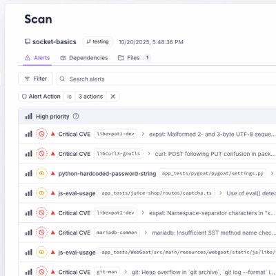
Introducing Webhook Events for Pull Request Scans
Add real-time Socket webhook events to your workflows to automatically receive pull request scan results and security alerts in real time.
By Jeppe Hasseriis - Oct 22, 2025
react-native-modalview
Advanced tools
An advanced and composable Modal component for react-native
onOpen, onOpened, onClose, onClosedcoming soon
This library is available on npm, install it with: npm install --save react-native-modalview or yarn add react-native-modalview.
Use all of the features or toggle features on and off via props;
import React, { Component } from 'react'
import { Text, TouchableOpacity, View } from 'react-native'
import Modal from 'react-native-modalview'

export default class ModalDemo extends Component {
  state = {
    showModal: false
  }

  _showModal = () => this.setState({ showModal: true })

  _hideModal = () => this.setState({ showModal: false })

  render () {
    const { showModal } = this.state;
    return (
      <View style={{ flex: 1 }}>
        <TouchableOpacity onPress={this._showModal}>
          <Text>Show Modal</Text>
        </TouchableOpacity>
        <Modal
          open={showModal}
          backdrop={true}
          swipeToDismiss={true}
          onClosed={this._hideModal}
        >
          <View style={{ backgroundColor: '#fff' }}>
            <Text>Hello!</Text>
          </View>
        </Modal>
      </View>
    )
  }

}
If you don't need all the functionality like backdrop or swipeToDismiss you can also
import the base components and compose the Modal without this functionality or extend it with
your own.
import { ModalBase, withBackdrop} from 'react-native-modalview'
import { compose } from 'ramda';

const Modal = compose(
  withBackdrop,
)(ModalBase);
ModalBase
| Name | Type | Default | Description |
|---|---|---|---|
| open | bool | false | open/close the modal |
| disabled | bool | false | disable open/closing of the modal |
| children | node | REQUIRED | The modal content |
| style | any | null | Style applied to the modal |
| positionVertical | string | 'center' | vertical position of the modal. possible values: 'start', 'center', 'end' |
| positionHorizontal | string | 'center' | horizontal position of the modal. possible values: 'start', 'center', 'end' |
| animation | string | 'slideBottom' | convenience prop to set the animation type for open/close. |
| animationDuration | number | 300 | convenience prop to set the animation duration for open/close/backdrop |
| animationEasing | string | 'easeOut' | convenience prop to set the animation easing for open/close/backdrop |
| animationIn | string | animation | animation type for opening the modal |
| animationInDuration | string | animationDuration | animation duration for opening the modal |
| animationInEasing | string, func | animationEasing | animation easing for opening the modal |
| animationOut | string | animation | animation type for closing the modal |
| animationOutDuration | string | animationDuration | animation duration for closing the modal |
| animationOutEasing | string, func | animationEasing | animation easing for closing the modal |
| animationUseNativeDriver | bool | false | use useNativeDriver for animations |
| overlay | bool | false | wrap view in react-native Modal to present content above everything else |
| testID | string | null | Used to locate this view in end-to-end tests. |
withBackdrop
| Name | Type | Default | Description |
|---|---|---|---|
| backdrop | bool | false | show/hide backdrop |
| backdropClickToClose | bool | false | close modal by clicking on backdrop |
| backdropColor | string | #00000099 | change backdrop color |
| backdropAnimationDuration | string | animationDuration | animation duration for opening and closing the backdrop |
| backdropAnimationEasing | string, func | animationEasing | animation easing for opening and closing the backdrop |
withSwipeToDismiss
| Name | Type | Default | Description |
|---|---|---|---|
| swipeToDismiss | bool | false | enable/disable swipe-to-dismiss functionality |
| swipeThreshold | number | 50 | threshold to reach in pixels to close the modal |
| swipeArea | number | null | width/height in pixels of the swipeable area. By default the whole modal is swipeable. |
| Name | Type | Default | Description |
|---|---|---|---|
| onLayout | func | null | invoked on mount and layout changes |
| onContentLayout | func | null | invoked when content layout changes |
| onClose | func | null | invoked when the modal starts closing |
| onClosed | func | null | invoked when the modal is closed completely |
| onOpen | func | null | invoked when the modal starts opening |
| onOpened | func | null | invoked when the modal is opened completely |
fadeslideBottomslideTopslideRightslideLeftscaleBackgroundscaleForegroundfunclineareaseIneaseOuteaseInOuteaseInQuadeaseOutQuadeaseInOutQuadeaseInCubiceaseOutCubiceaseInOutCubiceaseInSineeaseOutSineeaseInOutSineeaseInCirceaseOutCirceaseInOutCirceaseInExpoeaseOutExpoeaseInOutExpoeaseInBounceeaseOutBounceeaseInOutBounceeaseInQuarteaseOutQuarteaseInOutQuarteaseInQuinteaseOutQuinteaseInOutQuinteaseInElasticeaseOutElasticeaseInOutElasticeaseInBackeaseOutBackeaseInOutBackfuncFAQs
An advanced and composable Modal component for react-native
The npm package react-native-modalview receives a total of 1 weekly downloads. As such, react-native-modalview popularity was classified as not popular.
We found that react-native-modalview demonstrated a not healthy version release cadence and project activity because the last version was released a year ago. It has 1 open source maintainer collaborating on the project.
Did you know?

Socket for GitHub automatically highlights issues in each pull request and monitors the health of all your open source dependencies. Discover the contents of your packages and block harmful activity before you install or update your dependencies.
Product
Add real-time Socket webhook events to your workflows to automatically receive pull request scan results and security alerts in real time.

Research
The Socket Threat Research Team uncovered malicious NuGet packages typosquatting the popular Nethereum project to steal wallet keys.
Product
A single platform for static analysis, secrets detection, container scanning, and CVE checks—built on trusted open source tools, ready to run out of the box.