
Security News
New CVE Forecasting Tool Predicts 47,000 Disclosures in 2025
CVEForecast.org uses machine learning to project a record-breaking surge in vulnerability disclosures in 2025.
By Sarah Gooding - Jul 07, 2025
react-native-multiple-select-list
Advanced tools
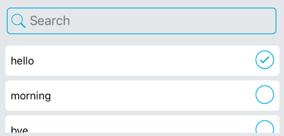
Multiple select list with search bar
npm install --save react-native-multiple-select-list
import CustomMultiPicker from "react-native-multiple-select-list";

const userList = {
  "123":"Tom",
  "124":"Michael",
  "125":"Christin"
}

<CustomMultiPicker
  options={userList}
  search={true} // should show search bar?
  multiple={true} //
  placeholder={"Search"}
  placeholderTextColor={'#757575'}
  returnValue={"label"} // label or value
  callback={(res)=>{ console.log(res) }} // callback, array of selected items
  rowBackgroundColor={"#eee"}
  rowHeight={40}
  rowRadius={5}
  iconColor={"#00a2dd"}
  iconSize={30}
  selectedIconName={"ios-checkmark-circle-outline"}
  unselectedIconName={"ios-radio-button-off-outline"}
  scrollViewHeight={130}
  selected={[1,2]} // list of options which are selected by default
/>
| Prop | Type | Description |
|---|---|---|
| options | Object | list of options/items |
| search | Boolean | if the search bar should be shown or not |
| multiple | Boolean | if user can select multiple options or not. if you select an item which is already selected, it will be unselected. if multiple is disabled, it will work like radio buttons. |
| placeholder | String | placeholder text for search bar |
| placeholderTextColor | String | placeholder text color for search bar |
| returnValue | String | should it return keys of selected options or values? |
| callback | Function | whenever user selects or changes selections it will be called. |
| rowBackgroundColor | String | background color for each row in list |
| rowHeight | Integer | row height |
| rowRadius | Integer | row border radius |
| iconColor | String | icon color for checked/unchecked icons and search icon also border color of search bar |
| iconSize | Integer | icon size for checked/unchecked icons |
| selectedIconName | String | selected/checked icon name (react-native-vector-icons/Ionicon) |
| unselectedIconName | String | unselected/unchecked icon name (react-native-vector-icons/Ionicon) |
| scrollViewHeight | Integer | scrollview height (list of items) |
| selected | Object | list of options which are selected by default |
Ata S.Mohammadi. ataomega@gmail.com
FAQs
react-native-multiple-select-list
The npm package react-native-multiple-select-list receives a total of 40 weekly downloads. As such, react-native-multiple-select-list popularity was classified as not popular.
We found that react-native-multiple-select-list demonstrated a not healthy version release cadence and project activity because the last version was released a year ago. It has 1 open source maintainer collaborating on the project.
Did you know?

Socket for GitHub automatically highlights issues in each pull request and monitors the health of all your open source dependencies. Discover the contents of your packages and block harmful activity before you install or update your dependencies.
Security News
CVEForecast.org uses machine learning to project a record-breaking surge in vulnerability disclosures in 2025.

Security News
Browserslist-rs now uses static data to reduce binary size by over 1MB, improving memory use and performance for Rust-based frontend tools.

Research
Security News
Eight new malicious Firefox extensions impersonate games, steal OAuth tokens, hijack sessions, and exploit browser permissions to spy on users.