
Security News
CVE Volume Surges Past 48,000 in 2025 as WordPress Plugin Ecosystem Drives Growth
CVE disclosures hit a record 48,185 in 2025, driven largely by vulnerabilities in third-party WordPress plugins.
By Sarah Gooding - Jan 09, 2026
react-native-neomorph-shadows-fixes
Advanced tools
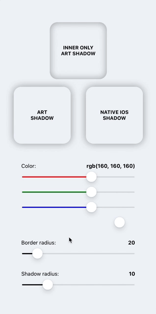
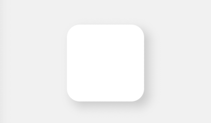
Shadows and neumorphism/neomorphism UI for iOS & Android (like iOS).


Original project is dead, so we have this.
Shadows and neumorphism/neomorphism for iOS & Android (like iOS).
IMPORTANT:
this library, starting from v1.0.0, no longer supports expo because React Native Art library was recently deprecated from expo.
Run the command below to install the plugin.
npm i react-native-neomorph-shadows
You need to install React Native Art in your project.
npm install @react-native-community/art --save
With autolinking (react-native 0.60+)
cd ios && pod install && cd ..
Pre 0.60
react-native link @react-native-community/art
Great! Let's start to use it.
There are three components: Shadow, Neomorph & NeomorphBlur. Prop style supports most of the view/layout styles.
IMPORTANT: Components dont't support Flex.
If you want flex and auto sizing of Shadow or Neomorph components, use ShadowFlex/NeomorphFlex experimental components, but be careful, these components reduce performance by double rerender. If you know exactly what size(width, height props) it should be, use Shadow/Neomorph components.
import { Shadow } from 'react-native-neomorph-shadows';

...

<Shadow
  inner // <- enable inner shadow
  useArt // <- set this prop to use non-native shadow on ios
  style={{
    shadowOffset: {width: 10, height: 10},
    shadowOpacity: 1,
    shadowColor: "grey",
    shadowRadius: 10,
    borderRadius: 20,
    backgroundColor: 'white',
    width: 100,
    height: 100,
    // ...include most of View/Layout styles
  }}
>
  ...
</Shadow>
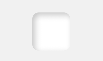
Opacity of two shadows automaticly changing and depends of backgroundColor brightness.
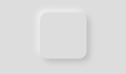
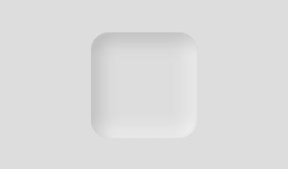
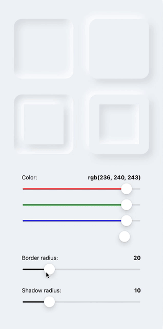
import { Neomorph } from 'react-native-neomorph-shadows';

...

<Neomorph
  inner // <- enable shadow inside of neomorph
  swapShadows // <- change zIndex of each shadow color
  style={{
    shadowRadius: 10,
    borderRadius: 25,
    backgroundColor: '#DDDDDD',
    width: 150,
    height: 150,
  }}
>
  ...
</Neomorph>
<Neomorph
style={{
shadowRadius: 3,
borderRadius: 100,
backgroundColor: '#DDDDDD',
width: 200,
height: 200,
justifyContent: 'center',
alignItems: 'center',
}}
>
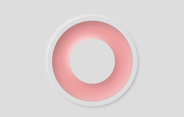
<Neomorph
inner
style={{
shadowRadius: 7,
borderRadius: 90,
backgroundColor: '#F19F9F',
width: 180,
height: 180,
justifyContent: 'center',
alignItems: 'center',
}}
>
<Neomorph
style={{
shadowRadius: 7,
borderRadius: 50,
backgroundColor: '#DDDDDD',
width: 100,
height: 100,
}}
/>
</Neomorph>
</Neomorph>
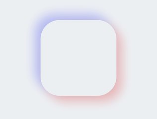
<Neomorph
  darkShadowColor="#FF3333" // <- set this
  lightShadowColor="#3344FF" // <- this
  style={{
    shadowOpacity: 0.3, // <- and this or yours opacity
    shadowRadius: 15,
    borderRadius: 50,
    backgroundColor: '#ECF0F3',
    width: 200,
    height: 200,
  }}
/>

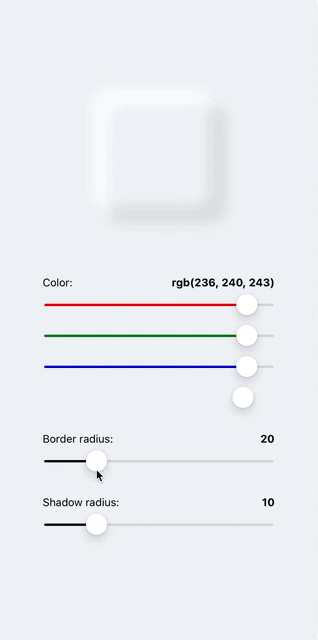
import { NeomorphBlur } from 'react-native-neomorph-shadows';

<NeomorphBlur
  style={{
    shadowRadius: 12,
    borderRadius: 70,
    backgroundColor: '#ECF0F3',
    width: 140,
    height: 140,
  }}
/>;
import { Animated } from 'react-native';
import { Shadow, Neomorph, NeomorphBlur } from 'react-native-neomorph-shadows';

const AnimatedShadow = Animated.createAnimatedComponent(Shadow);
const AnimatedNeomorph = Animated.createAnimatedComponent(Neomorph);
const AnimatedNeomorphBlur = Animated.createAnimatedComponent(NeomorphBlur);

...

<AnimatedShadow />
<AnimatedNeomorph />
<AnimatedNeomorphBlur />
| Prop | Type | Default | Description |
|---|---|---|---|
| style | object | undefined | Like View/Layout style prop with a few difference. Flex not available. width & height is required. (None of this is about the ShadowFlex) |
| useArt | bool | false | If true, the component will use drawable shadow on both platform (iOS, Android) |
| inner | bool | false | If true, a shadow will be inside of component |
| children | node | undefined |
| Prop | Type | Default | Description |
|---|---|---|---|
| style | object | undefined | Like View/Layout style prop with a few difference. Flex not available. width & height is required. (None of this is about the NeomorphFlex) |
| swapShadows | bool | false | If true, the value of zIndex property both shadows will swap |
| inner | bool | false | If true, shadows will be inside of component |
| darkShadowColor | string | 'black' | Dark shadow color |
| lightShadowColor | string | 'white' | Light shadow color |
| children | node | undefined |
FAQs
Shadows and neumorphism/neomorphism UI for iOS & Android (like iOS).
We found that react-native-neomorph-shadows-fixes demonstrated a not healthy version release cadence and project activity because the last version was released a year ago. It has 1 open source maintainer collaborating on the project.
Did you know?

Socket for GitHub automatically highlights issues in each pull request and monitors the health of all your open source dependencies. Discover the contents of your packages and block harmful activity before you install or update your dependencies.
Security News
CVE disclosures hit a record 48,185 in 2025, driven largely by vulnerabilities in third-party WordPress plugins.

Security News
Socket CEO Feross Aboukhadijeh joins Insecure Agents to discuss CVE remediation and why supply chain attacks require a different security approach.

Security News
Tailwind Labs laid off 75% of its engineering team after revenue dropped 80%, as LLMs redirect traffic away from documentation where developers discover paid products.