


Installation
$ npm i react-native-parallax-header --save
Demo
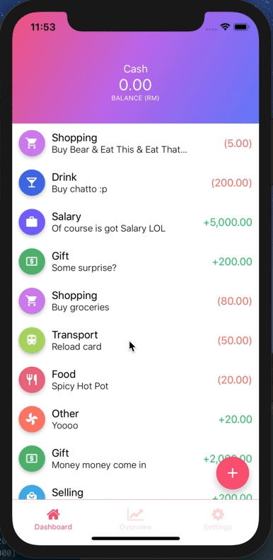
iPhone X or XS (Using alwaysShowTitle={false} & alwaysShowNavBar={false})
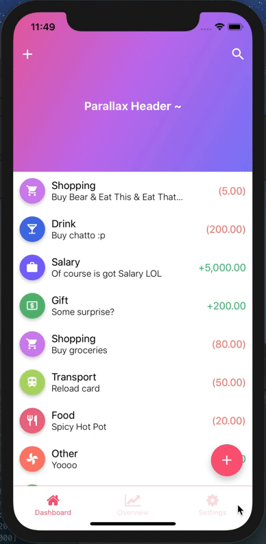
iPhone X or XS
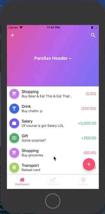
iPhone 8
Example
Refer to TestParallax for working example
import React from 'react';
import {
  StyleSheet,
  View,
  Text,
  StatusBar,
  Dimensions,
  TouchableOpacity,
} from 'react-native';
import ReactNativeParallaxHeader from 'react-native-parallax-header';

const {height: SCREEN_HEIGHT} = Dimensions.get('window');

const IS_IPHONE_X = SCREEN_HEIGHT === 812 || SCREEN_HEIGHT === 896;
const STATUS_BAR_HEIGHT = Platform.OS === 'ios' ? (IS_IPHONE_X ? 44 : 20) : 0;
const HEADER_HEIGHT = Platform.OS === 'ios' ? (IS_IPHONE_X ? 88 : 64) : 64;
const NAV_BAR_HEIGHT = HEADER_HEIGHT - STATUS_BAR_HEIGHT;

const renderNavBar = () => (
  <View style={styles.navContainer}>
    <View style={styles.statusBar} />
    <View style={styles.navBar}>
      <TouchableOpacity style={styles.iconLeft} onPress={() => {}}>
        <Text style={{color: 'white'}}>About</Text>
      </TouchableOpacity>
      <TouchableOpacity style={styles.iconRight} onPress={() => {}}>
        <Text style={{color: 'white'}}>Me</Text>
      </TouchableOpacity>
    </View>
  </View>
);

const renderContent = () => {
  return (
    <View style={styles.body}>
      {Array.from(Array(30).keys()).map((i) => (
        <View
          key={i}
          style={{padding: 15, alignItems: 'center', justifyContent: 'center'}}>
          <Text>Item {i + 1}</Text>
        </View>
      ))}
    </View>
  );
};

const title = () => {
  return (
    <View style={styles.body}>
      <Text style={{color: 'white', fontSize: 25}}>Parallax Header</Text>
    </View>
  );
};

const App = () => {
  return (
    <>
      <StatusBar barStyle="dark-content" />
      <ReactNativeParallaxHeader
        headerMinHeight={HEADER_HEIGHT}
        headerMaxHeight={250}
        extraScrollHeight={20}
        navbarColor="#3498db"
        titleStyle={styles.titleStyle}
        title={title()}
        backgroundImage={require('./bg.png')}
        backgroundImageScale={1.2}
        renderNavBar={renderNavBar}
        renderContent={renderContent}
        containerStyle={styles.container}
        contentContainerStyle={styles.contentContainer}
        innerContainerStyle={styles.container}
        scrollViewProps={{
          onScrollBeginDrag: () => console.log('onScrollBeginDrag'),
          onScrollEndDrag: () => console.log('onScrollEndDrag'),
        }}
      />
    </>
  );
};

const styles = StyleSheet.create({
  container: {
    flex: 1,
  },
  contentContainer: {
    flexGrow: 1,
  },
  navContainer: {
    height: HEADER_HEIGHT,
    marginHorizontal: 10,
  },
  statusBar: {
    height: STATUS_BAR_HEIGHT,
    backgroundColor: 'transparent',
  },
  navBar: {
    height: NAV_BAR_HEIGHT,
    justifyContent: 'space-between',
    alignItems: 'center',
    flexDirection: 'row',
    backgroundColor: 'transparent',
  },
  titleStyle: {
    color: 'white',
    fontWeight: 'bold',
    fontSize: 18,
  },
});

export default App;
API Usage
renderNavBar | func | No | This renders the nav bar component | Empty <View /> |
renderContent | func | YES | This renders the scroll view content | - |
headerMaxHeight | number | No | This is the header maximum height | Default to 170 |
headerMinHeight | number | No | This is the header minimum height | Default to common ios & android navbar height (have support for iPhone X too :p) |
backgroundImage | image source | No | This renders the background image of the header (if specified, background color will not take effect) | Default to null |
backgroundImageScale | number | No | This is the image scale - either enlarge or shrink (after scrolling to bottom & exceed the headerMaxHeight) | Default is 1.5 |
backgroundColor | string | No | This is the color of the parallax background (before scrolling up), will not be used if backgroundImage is specified | Default color is #303F9F |
extraScrollHeight | number | No | This is the extra scroll height (after scrolling to bottom & exceed the headerMaxHeight) | Default is 30 |
navbarColor | string | No | This is the background color of the navbar (after scroll up) | Default color is #3498db |
statusBarColor | string | No | This is the status bar color (for android) navBarColor will be used if no statusBarColor is passed in | Default to null |
title | any | No | This is the title to be display in the header, can be string or component | Default to null |
titleStyle | style | No | This is the title style to override default font size/color | Default to color: ‘white’ text and fontSize: 16 |
headerTitleStyle | style | No | This is the header title animated view style to override default <Animated.View> style | Default to null |
scrollEventThrottle | number | No | This is the scroll event throttle | Default is 16 |
contentContainerStyle | style | No | This is the contentContainerStyle style to override default <ScrollView> contentContainerStyle style | Default to null |
containerStyle | style | No | This is the style to override default outermost <View> style | Default to null |
scrollViewStyle | style | No | This is the scrollview style to override default <ScrollView> style | Default to null |
innerContainerStyle | style | No | This is the inner content style to override default <View> style inside <ScrollView> component | Default to null |
alwaysShowTitle | bool | No | This is to determine whether show or hide the title after scroll | Default to true |
alwaysShowNavBar | bool | No | This is to determine whether show or hide the navBar before scroll | Default to true |
scrollViewProps | object | No | This is to override default scroll view properties | Default to {} |


