Currently works only with iOS and Android.
This component is modified from another project react-native-tooltip-menu
How to install
npm install react-native-popover-tooltip --save
To use the component, import the component as shown below
import PopoverTooltip from 'react-native-popover-tooltip';
Example
class App extends React.Component {
constructor(props) {
super(props);
this.state = {
order: 1
};
}
render() {
return (
<View style={{flex:1, alignSelf:'stretch', alignItems:'center', justifyContent:'flex-start', backgroundColor:'#fff'}}>
<View style={{height: 40}} />
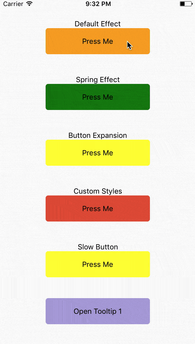
<Text>Default Effect</Text>
<PopoverTooltip
ref='tooltip1'
buttonComponent={
<View style={{width:200, height:50, backgroundColor: 'orange', justifyContent: 'center', alignItems: 'center', borderRadius: 5}}>
<Text>
Press Me
</Text>
</View>
}
items={[
{
label: 'Item 1',
onPress: () => {}
},
{
label: 'Item 2',
onPress: () => {}
}
]}
// animationType='timing'
// using the default timing animation
/>
<View style={{height:40}}/>
<Text>Spring Effect</Text>
<PopoverTooltip
ref='tooltip2'
buttonComponent={
<View style={{width:200, height:50, backgroundColor: 'green', justifyContent: 'center', alignItems: 'center', borderRadius: 5}}>
<Text>
Press Me
</Text>
</View>
}
items={[
{
label: 'Item 1',
onPress: () => {}
},
{
label: 'Item 2',
onPress: () => {}
}
]}
animationType='spring' // spring-damper animation
springConfig={{tension: 100, friction: 3}} // tension controls the potential of the spring effect,
// friction controls the damper effect
/>
<View style={{height: 40}}/>
<Text>Button Expansion</Text>
<PopoverTooltip
ref='tooltip3'
buttonComponent={
<View style={{width:200, height:50, backgroundColor: 'yellow', justifyContent: 'center', alignItems: 'center', borderRadius: 5}}>
<Text>
Press Me
</Text>
</View>
}
items={[
{
label: 'Item 1',
onPress: () => {}
},
{
label: 'Item 2',
onPress: () => {}
}
]}
animationType='spring'
buttonComponentExpandRatio={1.2} // ratio of button component expansion after tooltip poped up
/>
<View style={{height: 40}}/>
<Text>Custom Styles</Text>
<PopoverTooltip
ref='tooltip4'
buttonComponent={
<View style={{width:200, height:50, backgroundColor: '#ED5736', justifyContent: 'center', alignItems: 'center', borderRadius: 5}}>
<Text>
Press Me
</Text>
</View>
}
items={[
{
label: 'Item 1',
onPress: () => {}
},
{
label: 'Item 2',
onPress: () => {}
}
]}
animationType='spring'
overlayStyle={{backgroundColor: 'transparent'}} // set the overlay invisible
tooltipContainerStyle={{borderRadius:0}}
labelContainerStyle={{backgroundColor: '#ED5736', width: 120, alignItems: 'center'}}
labelSeparatorColor='#1BD1A5' />
<View style={{height: 40}}/>
<Text>Slow Button</Text>
<PopoverTooltip
ref='tooltip5'
buttonComponent={
<View style={{width:200, height:50, backgroundColor: 'yellow', justifyContent: 'center', alignItems: 'center', borderRadius: 5}}>
<Text>
Press Me
</Text>
</View>
}
items={[
{
label: 'Item 1',
onPress: () => {}
},
{
label: 'Item 2',
onPress: () => {}
}
]}
// animationType='timing'
// using the default timing animation
timingConfig={{duration: 1000}}
opacityChangeDuration={1000} />
<View style={{height: 40}}/>
<TouchableOpacity
style={{width:200, height:50, backgroundColor: '#B0A4E3', justifyContent: 'center', alignItems: 'center', borderRadius: 5}}
onPress={() => {
this.refs['tooltip'+this.state.order].toggle(); // open popover tooltips one by one
this.setState({order: (this.state.order)%5+1 });
}}>
<Text>
Open Tooltip {this.state.order}
</Text>
</TouchableOpacity>
</View>
);
}
}
Configuration
Props:
| buttonComponent | node | | |
| items | Array | | Items to be rendered in menu. Each of item requires label as string or function if you want to render your own component and onClick as function to be called when you click item. |
| componentWrapperStyle | Object | Optional | Style Object if you want to overwrite wrapper for your buttonComponent |
| componentContainerStyle | Object | Optional | Style Object if you want to overwrite container that is between wrapper and your buttonComponent |
| overlayStyle | Object | Optional | Style Object if you want to overwrite overlay style's. |
| onRequestClose | function | Optional, default () => {} | Modal onRequestClose required function on Android |
| labelContainerStyle | Object | Optional | Style Object if you want to change default TooltipMenuItem View's style. |
| tooltipContainerStyle | Object | Optional | Style of the container of the entire tooltip menu. |
| labelStyle | Object | Optional | Style Object if you want to change default TooltipMenuItem Text's style. |
| labelSeparatorColor | String | Color of the separator between two tooltip menu items. | |
| animationType | String | timing | Tooptip popping animation. timing = popup within a specific duration, spring = popup with a spring bumper model. |
| timingConfig | Object | {duration: 200} | Configuration of timing animation. Attribute duration is the duration of the animation. |
| springConfig | Object | {tension: 100, friction: 7} | Configuration of spring animation. Attributes tension and friction control the behavior of the spring bumper effect. |
| opacityChangeDuration | number | 200 | Duration of opacity change of the overlay, during both appearance and dispearance. |
| buttonComponentExpandRatio | number | 1.0 | Ratio of button component expansion after tooltip poped up. |
| setBelow | Boolean | false | Sets the default position of the tooltip to appear below the intended target. |
| triangleOffset | Number | 0 | Number of pixels to offset triangle from center. Positive numbers will push right. Negative Numbers will push left. |
Methods:
| toggle | Open or hide popover tooltip |