
Research
Security News
The Growing Risk of Malicious Browser Extensions
Socket researchers uncover how browser extensions in trusted stores are used to hijack sessions, redirect traffic, and manipulate user behavior.
By Kush Pandya - Jun 13, 2025
react-native-progress-bar-animated
Advanced tools
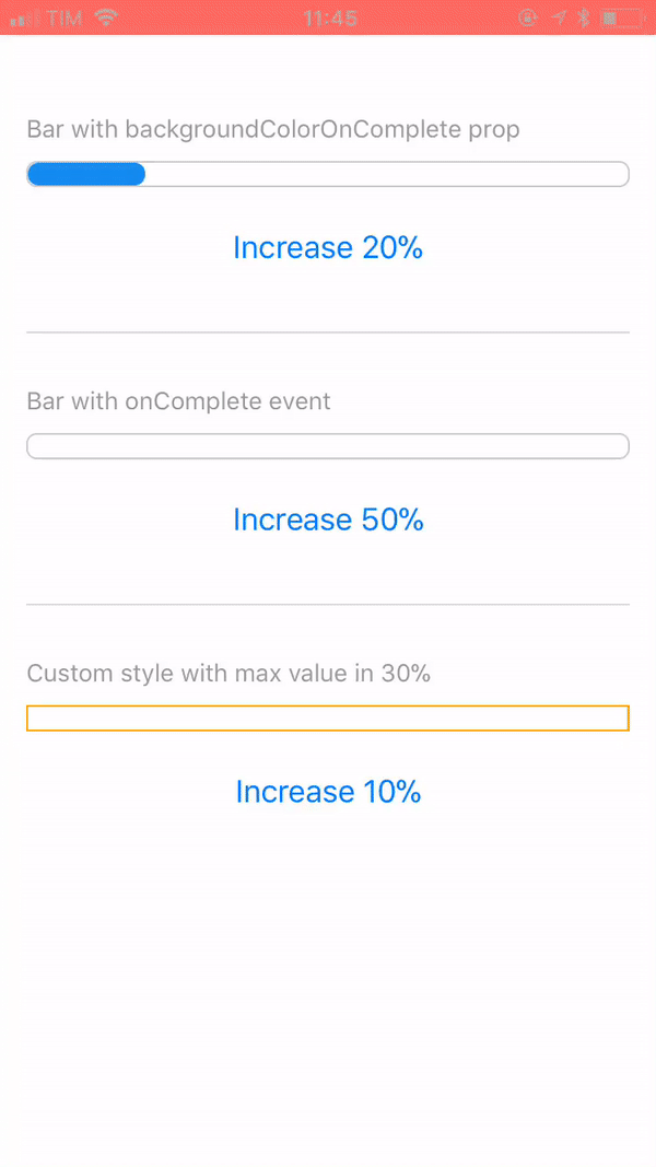
Simple, customizable and animated progress bar for React Native
📊 Simple, customizable and animated progress bar for React Native
You can try on expo: https://expo.io/@rafaelmotta021/react-native-progress-bar-animated-demo
yarn add react-native-progress-bar-animated
or
npm install --save react-native-progress-bar-animated
import React from 'react';
import {
  View,
  StyleSheet,
  Dimensions,
  Button,
  Alert,
  Text,
} from 'react-native';

import ProgressBarAnimated from 'react-native-progress-bar-animated';

export default class App extends React.Component {

  state = {
    progress: 20,
    progressWithOnComplete: 0,
    progressCustomized: 0,
  }

  increase = (key, value) => {
    this.setState({
      [key]: this.state[key] + value,
    });
  }

  render() {
    const barWidth = Dimensions.get('screen').width - 30;
    const progressCustomStyles = {
      backgroundColor: 'red',
      borderRadius: 0,
      borderColor: 'orange',
    };

    return (
      <View style={styles.container}>
        <View>
          <Text style={styles.label}>Bar with backgroundColorOnComplete prop</Text>
          <ProgressBarAnimated
            width={barWidth}
            value={this.state.progress}
            backgroundColorOnComplete="#6CC644"
          />
          <View style={styles.buttonContainer}>
            <View style={styles.buttonInner}>
              <Button
                title="Increase 20%"
                onPress={this.increase.bind(this, 'progress', 20)}
              />
            </View>
          </View>
        </View>
        <View style={styles.separator} />
        <View>
          <Text style={styles.label}>Bar with onComplete event</Text>
          <ProgressBarAnimated
            width={barWidth}
            value={this.state.progressWithOnComplete}
            onComplete={() => {
              Alert.alert('Hey!', 'onComplete event fired!');
            }}
          />
          <View style={styles.buttonContainer}>
            <View style={styles.buttonInner}>
              <Button
                title="Increase 50%"
                onPress={this.increase.bind(this, 'progressWithOnComplete', 50)}
              />
            </View>
          </View>
        </View>
        <View style={styles.separator} />
        <View>
          <Text style={styles.label}>Custom style with max value in 30%</Text>
          <ProgressBarAnimated
            {...progressCustomStyles}
            width={barWidth}
            maxValue={30}
            value={this.state.progressCustomized}
          />
          <View style={styles.buttonContainer}>
            <View style={styles.buttonInner}>
              <Button
                title="Increase 10%"
                onPress={this.increase.bind(this, 'progressCustomized', 10)}
              />
            </View>
          </View>
        </View>
      </View>
    );
  }
}

const styles = StyleSheet.create({
  container: {
    flex: 1,
    backgroundColor: '#FFF',
    marginTop: 50,
    padding: 15,
  },
  buttonContainer: {
    marginTop: 15,
  },
  separator: {
    marginVertical: 30,
    borderWidth: 0.5,
    borderColor: '#DCDCDC',
  },
  label: {
    color: '#999',
    fontSize: 14,
    fontWeight: '500',
    marginBottom: 10,
  },
});
| Name | Type | Default | Description |
|---|---|---|---|
| value | number | 0 | Progress value |
| maxValue | number | 500 | Max percentage bar can have |
| barEasing | string | 'linear' | Easing animation type(bounce, cubic, ease, sin, linear, quad) |
| barAnimationDuration | number | [] | Duration in ms of bar width animation |
| backgroundAnimationDuration | number | null | Duration in ms of bar background color change |
| width | number | REQUIRED | Width of bar |
| height | number | 15 | Height of bar |
| backgroundColor | string | '#148cF0' | Color that will complete the bar |
| backgroundColorOnComplete | string | null | Optional color that will overwrite background color when reach the max value prop |
| borderWidth | number | 1 | Style prop |
| borderColor | string | '#148cF0' | Style prop |
| borderRadius | number | 6 | Style prop |
| onComplete | function | null | Callback after bar reach the max value prop |
FAQs
Simple, customizable and animated progress bar for React Native
The npm package react-native-progress-bar-animated receives a total of 1,030 weekly downloads. As such, react-native-progress-bar-animated popularity was classified as popular.
We found that react-native-progress-bar-animated demonstrated a not healthy version release cadence and project activity because the last version was released a year ago. It has 1 open source maintainer collaborating on the project.
Did you know?

Socket for GitHub automatically highlights issues in each pull request and monitors the health of all your open source dependencies. Discover the contents of your packages and block harmful activity before you install or update your dependencies.
Research
Security News
Socket researchers uncover how browser extensions in trusted stores are used to hijack sessions, redirect traffic, and manipulate user behavior.

Research
Security News
An in-depth analysis of credential stealers, crypto drainers, cryptojackers, and clipboard hijackers abusing open source package registries to compromise Web3 development environments.

Security News
pnpm 10.12.1 introduces a global virtual store for faster installs and new options for managing dependencies with version catalogs.