react-native-resimple-modal
A simple JavaScript modal component for React Native. Works on iOS, Android and Windows.
All credits goes to maxjvh. If you're interested, hit him up on: max.huttunen@gmail.com
This is just a simple modification for the original package to elimenate some warnings especially for Windows platform.
Installation
npm install react-native-resimple-modal --save
Or
yarn add react-native-resimple-modal
Usage
See example. Make sure to put the <Modal> at the end of the render function so that it renders above the content!
Properties and their default values
import Modal from "react-native-resimple-modal";

<Modal
  useNativeDriver={true}
  animationDuration={200}
  animationTension={40}
  closeOnTouchOutside={true}
  containerProps={undefined}
  containerStyle={{
    justifyContent: "center",
  }}
  disableOnBackPress={false}
  modalDidClose={() => undefined}
  modalDidOpen={() => undefined}
  modalProps={undefined}
  modalStyle={{
    borderRadius: 2,
    margin: 20,
    padding: 10,
    backgroundColor: "#F5F5F5",
  }}
  offset={0}
  open={false}
  overlayStyle={{
    backgroundColor: "rgba(0, 0, 0, 0.75)",
    flex: 1,
  }}
/>;
Example
import React from "react";
import { Text, TouchableOpacity, View } from "react-native";
import Modal from "react-native-resimple-modal";
export default class App extends React.Component {
state = { open: false };
modalDidOpen = () => console.log("Modal did open.");
modalDidClose = () => {
this.setState({ open: false });
console.log("Modal did close.");
};
moveUp = () => this.setState({ offset: -100 });
resetPosition = () => this.setState({ offset: 0 });
openModal = () => this.setState({ open: true });
closeModal = () => this.setState({ open: false });
render() {
return (
<View style={{ flex: 1, justifyContent: "center", alignItems: "center" }}>
<TouchableOpacity onPress={this.openModal}>
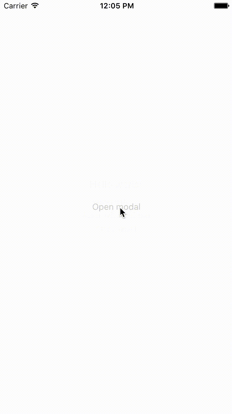
<Text>Open modal</Text>
</TouchableOpacity>
<Modal
offset={this.state.offset}
open={this.state.open}
modalDidOpen={this.modalDidOpen}
modalDidClose={this.modalDidClose}
style={{ alignItems: "center" }}
>
<View style={{ alignItems: "center" }}>
<Text style={{ fontSize: 20, marginBottom: 10 }}>Hello world!</Text>
<TouchableOpacity style={{ margin: 5 }} onPress={this.moveUp}>
<Text>Move modal up</Text>
</TouchableOpacity>
<TouchableOpacity
style={{ margin: 5 }}
onPress={this.resetPosition}
>
<Text>Reset modal position</Text>
</TouchableOpacity>
<TouchableOpacity style={{ margin: 5 }} onPress={this.closeModal}>
<Text>Close modal</Text>
</TouchableOpacity>
</View>
</Modal>
</View>
);
}
}


