React Native Reponsive UI


Building responsive UIs in React Native.
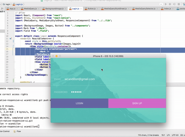
An example is available via expo here.
What about existing packages?
-
react-native-responsive: This library provides interesting APIs but it doesn't listen to changes in the app window.
This is problematic when changing the orientation of the device or when splitting screens.
-
react-native-responsive-styles: This is a great library but it contains a native depency which prevents you to use it with expo for instance.
Installation
npm install react-native-responsive-ui --save
Usage
The MediaQuery component renders its children only if the query evaluates to true (see list of properties below).
This component listens to changes in the window dimensions.
In the example below, we render the Logo component if the window's height has a minimum size of 450dp and if the device orientation is in portrait mode (height is larger than width).
Media Queries
import React, {Component} from "react";
import {View} from "react-native";
import {MediaQuery} from "react-native-responsive-ui";
export default class Login extends Component {
render(): React$Element<*> {
return <View>
<MediaQuery minHeight={450} orientation="portrait">
<Logo />
</MediaQuery>
</View>;
}
}
Properties
| minHeight | dp | Minimum height of the window. |
| maxHeight | dp | Maximum height of the window. |
| minWidth | dp | Minimum width of the window. |
| maxWidth | dp | Maximum width of the window. |
| minAspectRatio | number | Minimum aspect ration of the window (ratio of horizontal pixels to vertical pixels). |
| maxAspectRatio | number | Maximum aspect ration of the window (ratio of horizontal pixels to vertical pixels). |
| minPixelRatio | number | Minimum device pixel density. See PixelRatio. |
| maxPixelRatio | number | Maximum device pixel density. See PixelRatio. |
| orientation | portrait or landspace | Indicates whether the viewport is in landscape (the display is wider than it is tall) or portrait (the display is square or taller than it is wide) mode. |
| platform | string | Platform of the device. See Platform. |
| condition | boolean | Abritrary boolean value that must be true for the media query to pass. |
Responsive Annotation
You can use es7 annotation in order to listen for dimension changes in a React component.
import React from "react";
import {responsive} from "react-native-responsive-ui";

@responsive
export default class Debug extends React.Component {
    render() {
        const {width, height} = this.props.window;
        console.log(`New window dimensions: ${width}x${height}`);
        return null;
    }
}
Or without the decorator syntax:
import React from "react";
import {responsive} from "react-native-responsive-ui";

class Debug extends React.Component {
    render() {
        const {width, height} = this.state.window;
        console.log(`New window dimensions: ${width}x${height}`);
        return null;
    }
}

export default responsive(Debug);
ResponsiveStyleSheet
ResponsiveStyleSheet returns a stylesheet given multiple media queries.
Unlike Stylesheet from React Native, you need to invoke this method from the render() method since it will be invoked for each dimension change.
In order to re-render the component for each dimension change, you need to extends ResponsiveComponent.
See example below.
import React from "react";
import {ResponsiveComponent, ResponsiveStyleSheet} from "react-native-responsive-ui";

export default class Buttons extends ResponsiveComponent {
    render() {
        const {style} = this;
        return <View style={style.btns}>
            <Button label="Login" primary style={style.btn} />
            <Button label="Sign Up" style={style.btn} />
        </View>;
    }

    get style() {
        return ResponsiveStyleSheet.select([
        {
            query: { orientation: "landscape" },
            style: {
                btns: {
                    flexDirection: "row"
                },
                btn: {
                    flex: 1
                }
            }
        },
        {
            query: { orientation: "portrait" },
            style: {
                btns: {
                    alignSelf: "stretch"
                },
                btn: {
                    flex: 0
                }
            }
        }
        ]);
    }
}
MediaQuerySelector
MediaQuerySelector evaluates a media query and return true or false.
See example below.
import {Device, MediaQuerySelector} from "react-native-responsive-ui";

const {width, height} = Device.dimensions.window;
MediaQuerySelector.query({ orientation: "portrait", minHeight: 450 }, width, height)
ResponsiveComponent
ResponsiveComponents extends React.Component and add the window dimensions to the state of the component.
import React from "react";
import {ResponsiveComponent} from "react-native-responsive-ui";

export default class Debug extends ResponsiveComponent {
    render() {
        const {width, height} = this.state.window;
        console.log(`New window dimensions: ${width}x${height}`);
        return null;
    }
}


