Security News
Meet Socket at Black Hat and DEF CON 2025 in Las Vegas
Meet Socket at Black Hat & DEF CON 2025 for 1:1s, insider security talks at Allegiant Stadium, and a private dinner with top minds in software supply chain security.
react-native-scrollable-tabstring
Advanced tools
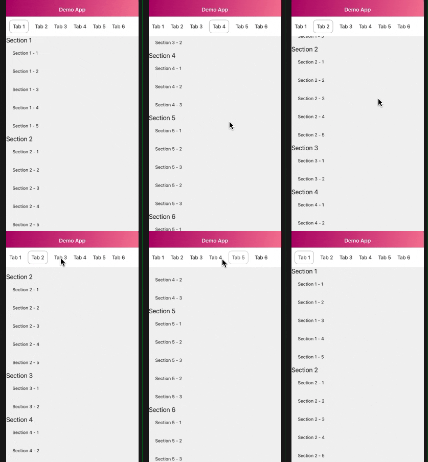
a scrollable list with animated horizontal tab when scrolling

A ScrollView-like component with animated horizontal tab when scrolling
Install the dependency.
$ npm install react-native-scrollable-tabstring
$ yarn add react-native-scrollable-tabstring
Start using the components or try it on Snack here.
import ScrollableTabString from 'react-native-scrollable-tabstring';
//Standard scrollable tab
<ScrollableTabString
    onPressTab={() => yourCustomOnPressIfNeeded}
    dataTabs={yourTabNamesList}
    dataSections={yourDataSectionList}
    renderSection={(item) => yourCustomSectionItemRender}
    renderTabName={(item) => yourCustomSectionTabName}
    selectedTabStyle={{
        ...your custom styles when a Tab is scrolled to or tapped
    }}
    unselectedTabStyle={{
        ...your custom styles when a Tab is normal
    }}
/>
This component currently support tab list for horizontal side and vertical section list. Both of which are Flatlist
| Property | Type | Required | Default | Description |
|---|---|---|---|---|
| dataTabs | Array | Yes | [] | A tab list to represent |
| dataSections | Array | Yes | [] | A Section list to represent |
| isParent | Boolean | No | false | Switch to true if you want to support more sections following by a parent tab, see detail here |
| headerTransitionWhenScroll | Boolean | No | true | Animation at tab header when section scrolling |
| tabPosition | String | No | top | Tab list position arrangement, top and bottom |
| renderSectionItem | Func | Yes | Function to render Section Item | |
| renderTabNameItem | Func | Yes | Function to render Tab Item, equal to renderItem in Flatlist | |
| customTabNamesProps | Object | No | Flatlist Props, avoid props like renderItem, data, ref, onScroll as may result some issues | |
| customSectionProps | Object | No | ScrollView Props | |
| onPressTab | Func | No | Custom function when pressing on a tab | |
| onScrollSection | Func | No | Custom function when section scrolling | |
| selectedTabStyle | Object | No | { borderBottomColor: 'black', borderBottomWidth: 1, } | Custom style when a tab is selected |
| unselectedTabStyle | Object | No | { backgroundColor: 'white', alignItems: 'center', justifyContent: 'center', } | Custom style when a tab is unselected |
Display a basic scrollable tab
Note: Length of `dataTabs` and `dataSections` must equal, otherwise may result in incorrect scrolling order

   const tabNames = [{
    title: 'Tab 1',
},
...................
{
    title: 'Tab 6',
}];

const dataSections = [
    {
        name: 'Section 1',
        data: [..........]
    },
    ...............
    {
        name: 'Section 6',
        data: [..........]

    },
];

render () {
    return (
        <ScrollableTabString
            dataTabs={tabNames}
            dataSections={dataSections}
            renderSection={(item) => (
                <View>
                    <Text>{item.name}</Text>
                    {
                        item.data.map((i) => (
                            <Text key={i.id} style={{ padding: 20 }}>{i.name}</Text>
                        ))
                    }
                </View>
            )}
            renderTabName={(item) => (
                <TouchableOpacity>
                    <Text style={{ padding: 10 }}>
                        {item.title}
                    </Text>
                </TouchableOpacity>
            )}
            selectedTabStyle={{
                borderColor: Colors.brown_grey,
                borderRadius: 10,
                borderWidth: 1,
                margin: 10
            }}
            unselectedTabStyle={{
                backgroundColor: Colors.white,
                alignItems: 'center',
                justifyContent: 'center',
            }}
        />
    )
};
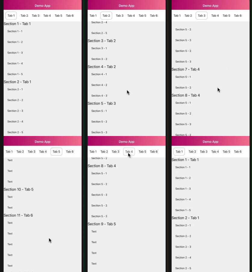
Scrollable tab with parent tab and children section follow
Use this if you want to support more sections following on a tab.
Add index key to parent tab and sections (start from 0). For example Tab 1 has 2 children section follow. They are Section 1 and Section 2 -> index of Tab 1, Section 1 and 2 are 0
Note: Index of both parent and children section must equivalent and those sections must be adjacent.

const tabNames = [{
    title: 'Tab 1',
    index: 0
}
.....
, {
    title: 'Tab 6',
    index: 5
}];

const dataSections = [
    {
        name: 'Section 1',
        index: 0,
        data: [..........]
    },
    {
        name: 'Section 2',
        index: 0,
        data: [..........]
    },
    {
        name: 'Section 3',
        index: 1,
        data: [..........]
    },
    {
        name: 'Section 4',
        index: 1,
        data: [..........]
    },
    {
        name: 'Section 5',
        index: 2,
        data: [..........]
    },
    {
        name: 'Section 6',
        index: 2,
        data: [..........]
    },
    {
        name: 'Section 7',
        index: 3,
        data: [..........]
    },
    {
        name: 'Section 8',
        index: 4,
        data: [..........]
    },
];

const ScrollableTabStringDemo = () => (
    <ScrollableTabString
        isParent //remember to add this
        dataTabs={tabNames}
        dataSections={dataSections}
        renderSection={(item) => (
            <View>
                <Text>{item.name}</Text>
                {
                    item.data.map((i) => (
                        <Text key={i.id} style={{ padding: 20 }}>{i.name}</Text>
                    ))
                }
            </View>
        )}
        renderTabName={(item) => (
            <TouchableOpacity>
                <Text style={{ padding: 10 }}>
                    {item.title}
                </Text>
            </TouchableOpacity>
        )}
        selectedTabStyle={{
            borderColor: Colors.brown_grey,
            borderRadius: 10,
            borderWidth: 1,
            margin: 10
        }}
        unselectedTabStyle={{
            backgroundColor: Colors.white,
            alignItems: 'center',
            justifyContent: 'center',
        }}
    />
);
This component allows you to customize some Flatlist props on Tab Name and ScrollView props as well. However, you should avoid some of properties like onScroll, renderItem, CellRendererComponent, horizontal as may result some issues.
Furthermore, this component doesn't support on load more yet due to heavily calculated, still working on this :p
All contributions are welcome! Please open an issue if you get stuck and bugs, or a PR if you have any feature idea, improvements and bug fixing. I'm very appreciate !
MIT
FAQs
a scrollable list with animated horizontal tab when scrolling
We found that react-native-scrollable-tabstring demonstrated a not healthy version release cadence and project activity because the last version was released a year ago. It has 1 open source maintainer collaborating on the project.
Did you know?

Socket for GitHub automatically highlights issues in each pull request and monitors the health of all your open source dependencies. Discover the contents of your packages and block harmful activity before you install or update your dependencies.

Security News
Meet Socket at Black Hat & DEF CON 2025 for 1:1s, insider security talks at Allegiant Stadium, and a private dinner with top minds in software supply chain security.

Security News
CAI is a new open source AI framework that automates penetration testing tasks like scanning and exploitation up to 3,600× faster than humans.

Security News
Deno 2.4 brings back bundling, improves dependency updates and telemetry, and makes the runtime more practical for real-world JavaScript projects.