Product
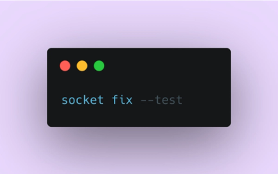
Introducing Socket Fix for Safe, Automated Dependency Upgrades
Automatically fix and test dependency updates with socket fix—a new CLI tool that turns CVE alerts into safe, automated upgrades.
react-native-sectionlist-contacts
Advanced tools
Address Book library for React Native
install the npm package:
npm install react-native-sectionlist-contacts --save
or
yarn add react-native-sectionlist-contacts
import React from 'react';
import {
  SafeAreaView,
  StyleSheet,
  View,
} from 'react-native';

import SectionListModule from 'react-native-sectionlist-contacts'

function App(): JSX.Element {

  //name is required and other params such as id is optional
  const nameData=[
    {name:'阿玛尼',id:'amani',params: ''},
    {name:'OK',id:'ok',params: '123'},
    {name:'天津饭'},
    {name:'%……&'},
    {name:'周星驰'},
    {name:'习大表哥'},
    {name:'不要这样'},
    {name:'V字仇杀队'},
    {name:'拼车'},
    {name:'他妈跌'},
    {name:'淫僧'},
    {name:'钱学森'},
    {name:'宁采臣'},
    {name:'史泰龙'},
    {name:'恐龙'},
    {name:'任达华'},
    {name:'妈咪宝贝'},
    {name:'ing'},
    {name:'康麦隆'},
    {name:'刘德华'},
    {name:'精忠报国'},
    {name:'黄药师'},
    {name:'大叔皮'},
    {name:'布达拉宫'},
    {name:'方世玉'},
    {name:'ET外星人'},
    {name:'程咬金'},
    {name:'**&&&&'},
  ]

  return (
    <SafeAreaView style={styles.container}>
      <View style={styles.container}>
        <SectionListModule
            sectionListData={nameData}
            sectionHeight={50}
            initialNumToRender={nameData.length}
            showsVerticalScrollIndicator={false}
            highlightAlphabetColor={'blue'}
            showHighlightAlphabetColor={true}
            SectionListClickCallback={(item,index,section) => {
              console.log('---SectionListClickCallback--:',item,index)
            }}
            otherAlphabet="#"
        />
      </View>
    </SafeAreaView>
  );
}

const styles = StyleSheet.create({
  container: {
    flex: 1,
  },
});
If you want to custom header,you can do like this:
render(){
     <SectionListContacts
        ...
        renderHeader={this._renderHeader}
    />
}

_renderHeader=(params)=>{
    console.log('---custom-renderHeader--',params)
    return <View><Text>{params.key}</Text></View>
}
If you want to custom section item,you can do like this:
render(){
     <SectionListContacts
        ...
       renderItem={this._renderItem}
    />
}

renderItem=(item,index,section)=>{
    console.log('---custom-renderItem--',item,index,section)
    return <View><Text>{item.name}</Text></View>
}
Issues and contributions are very welcome: bug fixes, features, documentation.
FAQs
address book for react native
The npm package react-native-sectionlist-contacts receives a total of 36 weekly downloads. As such, react-native-sectionlist-contacts popularity was classified as not popular.
We found that react-native-sectionlist-contacts demonstrated a not healthy version release cadence and project activity because the last version was released a year ago. It has 1 open source maintainer collaborating on the project.
Did you know?

Socket for GitHub automatically highlights issues in each pull request and monitors the health of all your open source dependencies. Discover the contents of your packages and block harmful activity before you install or update your dependencies.

Product
Automatically fix and test dependency updates with socket fix—a new CLI tool that turns CVE alerts into safe, automated upgrades.

Security News
CISA denies CVE funding issues amid backlash over a new CVE foundation formed by board members, raising concerns about transparency and program governance.

Product
We’re excited to announce a powerful new capability in Socket: historical data and enhanced analytics.