React Native Segmented Picker


A cross platform implementation of UIPickerView for creating dynamic, multi-dimensional picklists.
- Supports multiple columns and sizes.
- Displays any text-based content, not just dates and times.
- Works with apps built for Expo.
- Optional native extension available for iOS.
Installation
$ yarn add react-native-segmented-picker
You may also setup the Native iOS Extension at this time, but this is not mandatory.
Usage
import React, { Component } from 'react';
import SegmentedPicker from 'react-native-segmented-picker';
class Example extends Component {
constructor(props) {
super(props);
this.segmentedPicker = React.createRef();
}
componentDidMount() {
this.segmentedPicker.current.show();
}
onConfirm = (selections) => {
console.info(selections);
}
render() {
return (
<SegmentedPicker
ref={this.segmentedPicker}
onConfirm={this.onConfirm}
options={[
{
key: 'col_1',
items: [
{ label: 'Option 1', value: 'option_1' },
{ label: 'Option 2', value: 'option_2' },
],
},
{
key: 'col_2',
items: [
{ label: 'Option 3', value: 'option_3' },
],
},
]}
/>
);
}
}
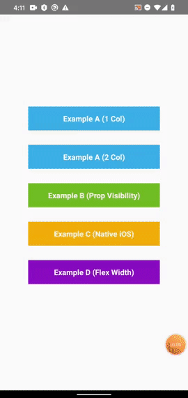
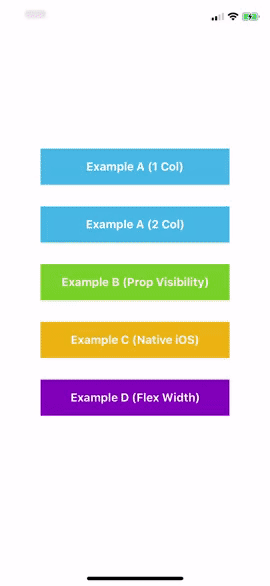
Further examples can be found in ./examples/src.
Props, Events & Methods Reference
Props
visible | Not used by default. Set to true or false to manually handle visibility. | |
options | An array of columns: [{ key: '', flex?: 1, testID?: '', items: [{ label: '', value: '', key?: '', testID?: '' }] }] | [] |
defaultSelections | Eg: {column: 'value', ...} | {} |
native | Use the native UIPickerView component on iOS. Requires additional setup. | false |
nativeTestID | Accessibility identifier of the native component for E2E testing. | '' |
size | Floating point between 0 and 1 representing the percentage of screen to take up. | 0.45 |
confirmText | Text displayed in the top right hand corner. | 'Done' |
confirmTextColor | Color of the confirmText button. | '#0A84FF' |
toolbarBackgroundColor | Background color of the top container where the confirmText is displayed. | '#FAFAF8' |
toolbarBorderColor | Bottom border color of the toolbarContainer. | '#E7E7E7' |
pickerItemTextColor | Color of the text for each item in the picklist. | '#282828' |
selectionBackgroundColor | Background color of the box which shows selected items. | '#F8F8F8' |
selectionBorderColor | Border color (top and bottom) of the selection mask. | '#DCDCDC' |
backgroundColor | Background color of the inner SegmentedPicker container. | '#FFFFFF' |
Event Props
onValueChange={({ column, value }) => ...} | Emitted each time a picklist value is modified by a user. |
onCancel={(selections) => ...} | Emitted when a user touches out of the modal, or presses the hardware back button on Android. |
onConfirm={(selections) => ...} | Emitted when a user presses the confirm text button. |
Methods
Remember that you will need to set a ref for the <SegmentedPicker /> component in order to use the methods outlined below.
ref.show();
Display the Segmented Picker modal over all other content on the screen. This is the preferred method of showing a <SegmentedPicker /> so that you don't have to manually hide the component after listening to the onCancel and onConfirm events.
Note that this method will have no effect if the visible prop is set.
ref.hide();
Hide the Segmented Picker modal from the screen. Generally should not be required, as this method is automatically called by this library after events where visibility should be toggled off.
ref.selectLabel(label, columnId, animated=true, emitEvent=true, zeroFallback=false);
Programmatically select a picker item by it's label while the component is displaying.
{string} label: Eg 'Option 1'{string} columnId: Eg 'column1'{boolean=true} animated: Scroll or snap to the item?{boolean=true} emitEvent: Specify whether to emit the onValueChange event.{boolean=false} zeroFallback Select the first list item if not found.
ref.selectValue(value, columnId, animated=true, emitEvent=true, zeroFallback=false);
Same as above, except it filters using the value of a picker item instead of label.
ref.selectIndex(index, columnId, animated=true, emitEvent=true);
Programmatically select an array index from a list column while the component is displaying. This method will give you better performance than the above methods if you already know the index of the item that you want to select.
{number} index: Eg 0{string} columnId: Eg 'column1'{boolean=true} animated: Scroll or snap to the item?{boolean=true} emitEvent: Specify whether to emit the onValueChange event.
ref.getCurrentSelections();
Returns the current selected items as they appear in the UI. This is the same method that's used internally when the onCancel and onConfirm events are fired.
Recipes
This section contains some code examples of common requirements and frequently asked questions.
1. Dynamically Changing Columns
A common use case is to have one of your columns change it's list options based off the selection in another column. In other words, implementing Column B as a function of Column A. The below example shows one possible way to achieve this using the onValueChange() event.
import React, { Component } from 'react';
import SegmentedPicker from 'react-native-segmented-picker';

const options = {
  categories: [{ label: 'Fruits', value: 'fruits' }, { label: 'Vegetables', value: 'vegetables' }],
  foods: {
    fruits: [{ label: 'Apples', value: 'apples' }, { label: 'Oranges', value: 'oranges' }],
    vegetables: [{ label: 'Carrots', value: 'carrots', }, { label: 'Potatoes', value: 'potatoes' }],
  },
};

class Demo extends Component {
  constructor(props) {
    super(props);
    this.state = {
      selections: {
        category: options.categories[0].value,
        food: undefined,
      },
    };
  }

  onValueChange = ({ column, value }) => {
    this.setState((prevState) => ({
      selections: {
        ...prevState.selections,
        [column]: value,
      },
    }));
  };

  generateOptions = () => {
    const { categories, foods } = options;
    const { selections } = this.state;
    return [
      {
        key: 'category',
        items: categories,
      },
      {
        key: 'food',
        items: foods[selections.category],
      },
    ];
  };

  render() {
    return (
      <SegmentedPicker
        options={this.generateOptions()}
        onValueChange={this.onValueChange}
        defaultSelections={this.state.selections}
      />
    );
  }
}
2. Specifying Column Widths
You can customise the relative width of picker segments by using flex notation in your column data. This integer acts as a ratio - the larger the number, the bigger it grows.
{}
<SegmentedPicker
options={[
{ key: 'col_1', flex: 1, items: [] },
{ key: 'col_2', flex: 1, items: [] },
{ key: 'col_3', flex: 1, items: [] },
]}
/>
{}
<SegmentedPicker
options={[
{ key: 'col_1', flex: 3, items: [] },
{ key: 'col_2', flex: 1, items: [] },
{ key: 'col_3', flex: 3, items: [] },
]}
/>
3. End-To-End (E2E) Testing
This library fully supports E2E testing (using tools such as Detox).
<SegmentedPicker
  options=[
    {
      key: 'col_1',
      testID: 'col_1',
      items: [
        { label: 'Option 1', value: 'option_1', testID: 'col_1_option_1' },
      ],
    },
  ]
/>
await expect(element(by.id('col_1'))).toBeVisible();
await element(by.id('col_1_option_1')).tap();
You can see full examples in our own testing suite here. Keep in mind there are also a small number of testID attributes which are automatically set on fixed elements for your convenience.
import { TEST_IDS } from 'react-native-segmented-picker';
TEST_IDS.PICKER: The entire segmented picker container (useful to check if visible).TEST_IDS.CONFIRM_BUTTON: "Done" confirmation button in the top right hand corner.TEST_IDS.CLOSE_AREA: Darkened area outside of the picker which hides the component when tapped.
Contributions
This is an open source project. Bug fixes, improvements and the addition of useful new features to this package are greatly appreciated.
- Fork and clone the repository from GitHub.
- Setup:
yarn install.
- Checkout a new branch, eg:
feature/my-thing or bugfix/terrible-thing.
- After making any changes, make sure that
yarn test still passes.
- Are there new unit test(s) that you could write to capture your changes?
- Submit a pull request to
master outlining what your change is and how you tested it.
Made with love in Melbourne by Adam McArthur.


