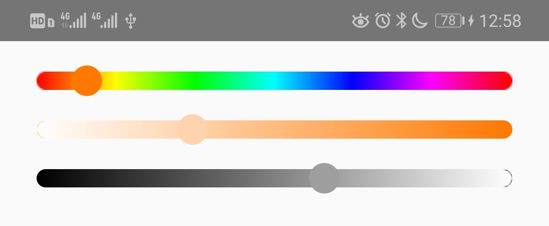
react-native-slider-color-picker


A color picker on 3 gradient image HSV palette slider.
Install
For RN >= 0.60
npm i --save react-native-slider-color-picker react-native-gesture-handler
For RN < 0.60
npm i --save react-native-slider-color-picker@2.1.x react-native-gesture-handler@1.2.2
And be aware of https://github.com/software-mansion/react-native-gesture-handler/issues/1164 if you use react-native-web and want to slide on web.
Usage
import React from 'react';
import {
SliderHuePicker,
SliderSaturationPicker,
SliderValuePicker,
} from 'react-native-slider-color-picker';
import {
AppRegistry,
Dimensions,
StyleSheet,
Text,
View,
} from 'react-native';
import {GestureHandlerRootView} from 'react-native-gesture-handler';
import tinycolor from 'tinycolor2';
const {
width,
} = Dimensions.get('window');
export default class SliderColorPickerExample extends React.Component {
constructor(props) {
super(props);
this.state = {
oldColor: "#FF7700",
};
}
changeColor = (colorHsvOrRgb, resType) => {
if (resType === 'end') {
this.setState({
oldColor: tinycolor(colorHsvOrRgb).toHexString(),
});
}
}
render() {
const {
oldColor,
} = this.state;
return (
<GestureHandlerRootView style={styles.container}>
<View style={{marginHorizontal: 24, marginTop: 20, height: 12, width: width - 48}}>
<SliderHuePicker
ref={view => {this.sliderHuePicker = view;}}
oldColor={oldColor}
trackStyle={[{height: 12, width: width - 48}]}
thumbStyle={styles.thumb}
useNativeDriver={true}
onColorChange={this.changeColor}
/>
</View>
<View style={{marginHorizontal: 24, marginTop: 20, height: 12, width: width - 48}}>
<SliderSaturationPicker
ref={view => {this.sliderSaturationPicker = view;}}
oldColor={oldColor}
trackStyle={[{height: 12, width: width - 48}]}
thumbStyle={styles.thumb}
useNativeDriver={true}
onColorChange={this.changeColor}
style={{height: 12, borderRadius: 6, backgroundColor: tinycolor({h: tinycolor(oldColor).toHsv().h, s: 1, v: 1}).toHexString()}}
/>
</View>
<View style={{marginHorizontal: 24, marginTop: 20, height: 12, width: width - 48}}>
<SliderValuePicker
ref={view => {this.sliderValuePicker = view;}}
oldColor={oldColor}
minimumValue={0.02}
step={0.05}
trackStyle={[{height: 12, width: width - 48}]}
trackImage={require('react-native-slider-color-picker/brightness_mask.png')}
thumbStyle={styles.thumb}
onColorChange={this.changeColor}
style={{height: 12, borderRadius: 6, backgroundColor: 'black'}}
/>
</View>
</GestureHandlerRootView>
);
}
}
const styles = StyleSheet.create({
container: {
flex: 1,
alignItems: "center",
},
thumb: {
width: 20,
height: 20,
borderColor: 'white',
borderWidth: 1,
borderRadius: 10,
shadowColor: 'black',
shadowOffset: {
width: 0,
height: 2
},
shadowRadius: 2,
shadowOpacity: 0.35,
},
});
<SliderValuePicker/> won't use trackImage by default, you can ref to trackImage={require('react-native-slider-color-picker/brightness_mask.png')} described above.
Props
| oldColor | Color string | Yes | undefined | Initial value of the slider |
| minimumValue | number | Yes | 0(h) or 0.01(s, v) | Initial minimum value of the slider |
| maximumValue | number | Yes | 359(h) or 1(s, v) | Initial maximum value of the slider |
| step | number | Yes | 1(h) or 0.01(s, v) | Step value of the slider. The value should be between 0 and maximumValue - minimumValue) |
| minimumTrackTintColor | string | Yes | '#3f3f3f' | The color used for the v track to the left of the button |
| maximumTrackTintColor | string | Yes | '#b3b3b3' | The color used for the v track to the right of the button |
| moveVelocityThreshold | number | Yes | 2000 | Prevent onColorChange if the dragging movement speed is over the moveVelocityThreshold |
| onColorChange | function | Yes | | Callback continuously called while the user is dragging the slider and the dragging movement speed is below the moveVelocityThreshold. The 1st argument is color in HSV representation (see below). There is 2nd string argument 'end' when the slider is released |
| style | style | Yes | | The style applied to the slider container |
| trackStyle | style | Yes | | The style applied to the track |
| trackImage | source | Yes | rainbow_slider.png(h) or saturation_mask.png(s) | Sets an image for the track. |
| thumbStyle | style | Yes | | The style applied to the thumb |
| useNativeDriver | bool | Yes | false | The useNativeDriver parameter in Animated used by react-native-gesture-handler when the user change the value. Default value is false, because some Android phone PanGestureHandler causes Animated Value to jump when using native driver |
HSV color representation is an object literal with properties:
{
h: number,
s: number,
v: number,
}
Donate
To support my work, please consider donate.


