Product
Introducing Socket Scanning for OpenVSX Extensions
Socket now scans OpenVSX extensions, giving teams early detection of risky behaviors, hidden capabilities, and supply chain threats in developer tools.
react-native-svg-animated-linear-gradient
Advanced tools
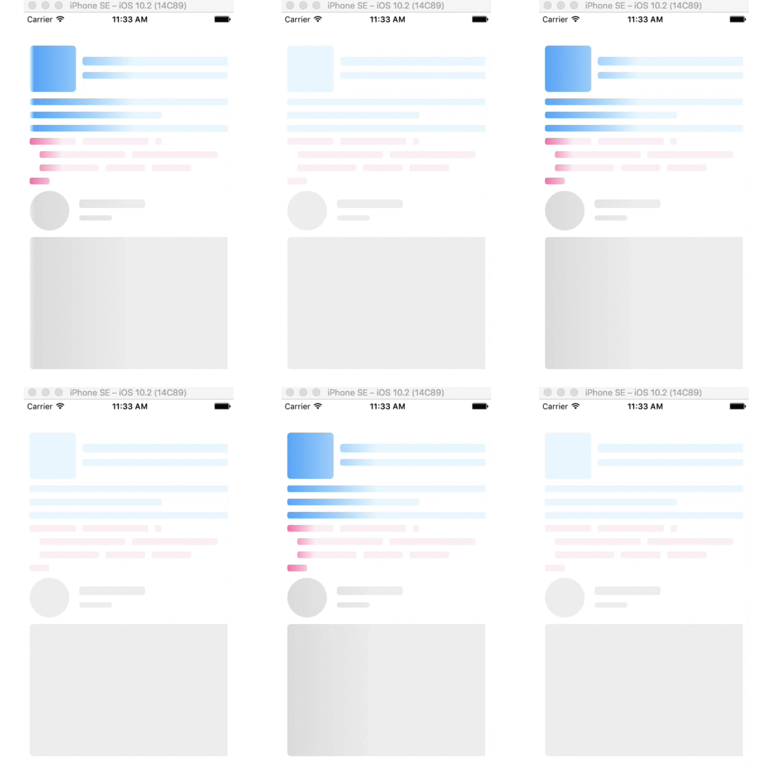
Animated linear gradient for React Native Svg
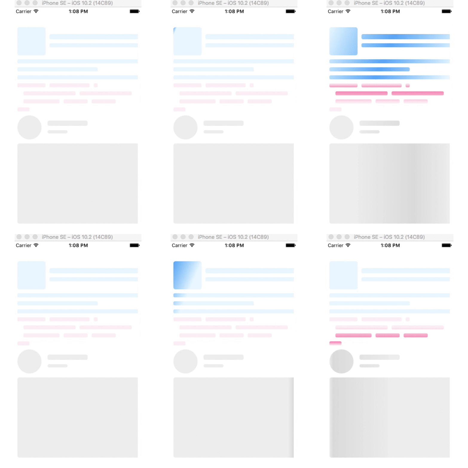
This component make Animated Linear Gradient for all SVG components as child props. You can use this component as loading component like Facebook or Instagram, used for any group of svg.
This component is using expo, if you don't want to use expo, feel free to fork this repo and remove expo, and use react-native-svg instead, or use the forked repo react-native-content-loader
 |

|
npm i react-native-svg-animated-linear-gradient --save
npm i react-native-svg
react-native link react-native-svg
Inside your component:
import SvgAnimatedLinearGradient from 'react-native-svg-animated-linear-gradient'
import Svg, {Circle, Rect, .... } from 'react-native-svg'
<SvgAnimatedLinearGradient height={300}>
    <Circle cx="30" cy="30" r="30"/>
    <Rect x="75" y="13" rx="4" ry="4" width="100" height="13"/>
    <Rect x="75" y="37" rx="4" ry="4" width="50" height="8"/>
    <Rect x="0" y="70" rx="5" ry="5" width="400" height="200"/>
</SvgAnimatedLinearGradient>
<SvgAnimatedLinearGradient
            primaryColor="#e8f7ff"
            secondaryColor="#4dadf7"
    height={140}>
    <Rect x="0" y="0" rx="5" ry="5" width="70" height="70"/>
    <Rect x="80" y="17" rx="4" ry="4" width="300" height="13"/>
    <Rect x="80" y="40" rx="3" ry="3" width="250" height="10"/>
    <Rect x="0" y="80" rx="3" ry="3" width="350" height="10"/>
    <Rect x="0" y="100" rx="3" ry="3" width="200" height="10"/>
    <Rect x="0" y="120" rx="3" ry="3" width="360" height="10"/>

</SvgAnimatedLinearGradient>
<SvgAnimatedLinearGradient
            primaryColor="#fff0f6"
            secondaryColor="#f783ac"
            height={80}>
    <Rect x="0" y="0" rx="3" ry="3" width="70" height="10"/>
    <Rect x="80" y="0" rx="3" ry="3" width="100" height="10"/>
    <Rect x="190" y="0" rx="3" ry="3" width="10" height="10"/>
    <Rect x="15" y="20" rx="3" ry="3" width="130" height="10"/>
    <Rect x="155" y="20" rx="3" ry="3" width="130" height="10"/>
    <Rect x="15" y="40" rx="3" ry="3" width="90" height="10"/>
    <Rect x="115" y="40" rx="3" ry="3" width="60" height="10"/>
    <Rect x="185" y="40" rx="3" ry="3" width="60" height="10"/>
    <Svg.Rect x="0" y="60" rx="3" ry="3" width="30" height="10"/>
</SvgAnimatedLinearGradient>
| Prop | Type | Default | Description |
|---|---|---|---|
| primaryColor | String | '#eeeeee' | Primary color, also background color |
| secondaryColor | String | '#dddddd' | Secondary color |
| duration | Number | 2000 | Animation duration in milliseconds |
| width | Number | 300 | Width of SVG |
| height | Number | 200 | Height of SVG |
| x1 | String | '0' | x of point star gradient, accept Number or Percentage |
| y1 | String | '0' | y of point star gradient, accept Number or Percentage |
| x2 | String | '100%' | x of point end gradient, accept Number or Percentage |
| y2 | String | '0' | y of point end gradient, accept Number or Percentage |
| offset | Number | 1 | Gradient offset value of animation |
MIT
FAQs
Animated linear gradient for React Native Svg
The npm package react-native-svg-animated-linear-gradient receives a total of 2,172 weekly downloads. As such, react-native-svg-animated-linear-gradient popularity was classified as popular.
We found that react-native-svg-animated-linear-gradient demonstrated a not healthy version release cadence and project activity because the last version was released a year ago. It has 1 open source maintainer collaborating on the project.
Did you know?

Socket for GitHub automatically highlights issues in each pull request and monitors the health of all your open source dependencies. Discover the contents of your packages and block harmful activity before you install or update your dependencies.

Product
Socket now scans OpenVSX extensions, giving teams early detection of risky behaviors, hidden capabilities, and supply chain threats in developer tools.

Product
Bringing supply chain security to the next generation of JavaScript package managers

Product
A safer, faster way to eliminate vulnerabilities without updating dependencies