Research
Malicious npm Packages Impersonate Flashbots SDKs, Targeting Ethereum Wallet Credentials
Four npm packages disguised as cryptographic tools steal developer credentials and send them to attacker-controlled Telegram infrastructure.
react-native-swipe-modal-up-down
Advanced tools
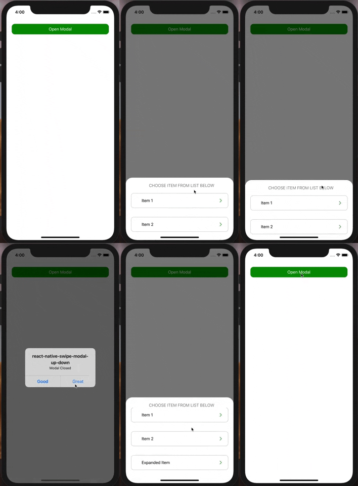
react native swipe up down it's animation modal to swipe down or up as Facebook comments, profile picture animation. it support flat-list and scroll view inside it without conflict with animation down and scrolling down
react native swipe up down it's animation modal to swipe down or up as Facebook comments, profile picture animation. it support flat-list and scroll view inside it without conflict with animation down and scrolling down
[ ]
]
$ npm install react-native-swipe-modal-up-down
import SwipeUpDownModal from 'react-native-swipe-modal-up-down';
  let [ShowComment, setShowModelComment] = useState(false);
  let [animateModal, setanimateModal] = useState(false);

<SwipeUpDownModal
  modalVisible={ShowComment}
  PressToanimate={animateModal}
  //if you don't pass HeaderContent you should pass marginTop in view of ContentModel to Make modal swipeable
  ContentModal={
    <View style={styles.containerContent}>
      <FlatList
        data={data}
        renderItem={({item, index}) => (
          <item key={index} Data={item} />
        )}
        keyExtractor={item => item.id}
      />
    </View>
  }
  HeaderStyle={styles.headerContent}
  ContentModalStyle={styles.Modal}
  HeaderContent={
    <View style={styles.containerHeader}>
          <Button
              Title={"Press Me"}
              onPress={() => {
                setanimateModal(true);
              }}
           />
    </View>
  }
  onClose={() => {
      setModelComment(false);
      setanimateModal(false);
  }}
/>

const styles = StyleSheet.create({
  containerContent: {flex: 1, marginTop: 40},
  containerHeader: {
    flex: 1,
    alignContent: 'center',
    alignItems: 'center',
    justifyContent: 'center',
    height: 40,
    backgroundColor: '#F1F1F1',
  },
  headerContent:{
    marginTop: 0,
  },
  Modal: {
    backgroundColor: '#005252',
    marginTop: 0,
  }
});
| Props | Type | default | Note |
|---|---|---|---|
| modalVisible | Boolean | false | Set visiablity of Modal |
| ContentModal | React Element | null | for example: <View><Button text="Hello Mina" align="center" onPress={() => {}}/></View> |
| ContentModalStyle | any | opacity, flex: 1, marginTop: 55 | you shouldn't pass opacity or transform |
| HeaderContent | React Element | null | for example: <View style={{flex: 1, alignContent: 'center', alignItems: 'center', justifyContent: 'center', height: 40}}><Text> Header Content </Text></View> |
| HeaderStyle | any | opacity, width: 700, marginTop: 50, position: 'absolute' | you shouldn't pass opacity or transform |
| onClose | func | () => null | Called when Modal closed |
| ImageBackgroundModal | image | null | you can set imagebackground of modal instead of backgroundColor |
| ImageBackgroundModalStyle | any | null | for example : borderTopLeftRadius: 25, borderTopRightRadius: 25 |
| duration | milliseconds | 450 | Length of animation |
| DisableHandAnimation | Boolean | false | Disable Hand animate |
| PressToanimate | Boolean | null | close modal showing animation by set value equal true |
| PressToanimateDirection | String | 'down' | Direction of animating Modal while closing, accepted value('up','down'). |
| OpenModalDirection | String | 'down' | Direction of animating Modal while Opening, accepted value('up','down'). |
| fade | Boolean | true | fading animation while opening/closing |
| MainContainerModal | style | backgroundColor: 'rgba(0, 0, 0, 0.5)',flex:1 | Main Container of modal |
FAQs
react native swipe up down it's animation modal to swipe down or up as Facebook comments, profile picture animation. it support flat-list and scroll view inside it without conflict with animation down and scrolling down
We found that react-native-swipe-modal-up-down demonstrated a not healthy version release cadence and project activity because the last version was released a year ago. It has 1 open source maintainer collaborating on the project.
Did you know?

Socket for GitHub automatically highlights issues in each pull request and monitors the health of all your open source dependencies. Discover the contents of your packages and block harmful activity before you install or update your dependencies.

Research
Four npm packages disguised as cryptographic tools steal developer credentials and send them to attacker-controlled Telegram infrastructure.

Security News
Ruby maintainers from Bundler and rbenv teams are building rv to bring Python uv's speed and unified tooling approach to Ruby development.

Security News
Following last week’s supply chain attack, Nx published findings on the GitHub Actions exploit and moved npm publishing to Trusted Publishers.