react-native-underline-tabbar


Custom Tabbar for https://github.com/skv-headless/react-native-scrollable-tab-view.
It consists of some features e.g. scrollable content in tabs. Animations are build on matrix transformations and fully compatible with Animated library.
In a new version there was significant improvement of tabbar behaviour.
Contribution
Issues are welcome. Please add a screenshot of bug and code snippet. Quickest way to solve issue is to reproduce it on one of the examples.
Pull requests are welcome. If you want to change API or making something big better to create issue and discuss it first. Before submiting PR please run eslint . Also all eslint fixes are welcome.
Please attach video or gif to PR's and issues it is super helpful.
Instalation
npm install react-native-underline-tabbar --save
Or using Yarn
yarn add react-native-underline-tabbar
Showcase
Documentation
tabs | { label: string, badge:string, badgeColor?: string, [string]: any}[] | required | You don't have to pass this prop directly to tabbar. Istead, it's automatically passed from ScrollableTabView from tabLabel of your page. In defaultTabbar it is used only to pass a label, but we use it to pass there information about badges. Example tabLabel={{label: "Page #4", badge: 8, badgeColor: 'violet'}}. Also you can pass any data you need as it's used as Map |
underlineColor | string | "navy" | Set a color for underline. You can use also transparent to hide underline |
underlineHeight | number | 2 | Set a height for underline |
underlineBottomPosition | number | 0 | Set a bottom for underline |
tabBarStyle | Object | {} | Set styles to TabBar container |
activeTabTextStyle | Object | {} | Set styles to text in tabs while tab is active |
tabBarTextStyle | Object | {} | Set styles to text in tabs |
tabBadgeColor | string | {} | Set a common color for all badges. To set badgeColor individually use badgeColor in tab property |
tabMargin | number | 20 | Set space between tabs |
tabStyles | { tab?: Object, badgeBubble?: Object, badgeText?: Object } | { tab: {}, badgeBubble: {}, badgeText: {} } | Set styles for every tab and bubble |
Simple Usage
import React, { Component } from 'react';
import {
  AppRegistry,
  StyleSheet,
  Text,
  View
} from 'react-native';
import ScrollableTabView from 'react-native-scrollable-tab-view';
import TabBar from "react-native-underline-tabbar";

const Page = ({label}) => (
    <View style={styles.container}>
      <Text style={styles.welcome}>
        {label}
      </Text>
      <Text style={styles.instructions}>
        To get started, edit index.ios.js
      </Text>
      <Text style={styles.instructions}>
        Press Cmd+R to reload,{'\n'}
        Cmd+D or shake for dev menu
      </Text>
    </View>
);

class example extends Component {
  render() {
    return (
        <View style={[styles.container, {paddingTop: 20}]}>
          <ScrollableTabView
              tabBarActiveTextColor="#53ac49"
              renderTabBar={() => <TabBar underlineColor="#53ac49" />}>
            <Page tabLabel={{label: "Page #1"}} label="Page #1"/>
            <Page tabLabel={{label: "Page #2 aka Long!", badge: 3}} label="Page #2 aka Long!"/>
            <Page tabLabel={{label: "Page #3"}} label="Page #3"/>
            <Page tabLabel={{label: "Page #4 aka Page"}} label="Page #4 aka Page"/>
            <Page tabLabel={{label: "Page #5"}} label="Page #5"/>
          </ScrollableTabView>

        </View>
    );
  }
}
Advanced usage
import React, { Component } from 'react';
import { StyleSheet, Text, View, TouchableOpacity, Animated } from 'react-native';
import ScrollableTabView from 'react-native-scrollable-tab-view';
import TabBar from 'react-native-underline-tabbar';
const styles = StyleSheet.create({
container: {
flex: 1,
justifyContent: 'center',
alignItems: 'center',
backgroundColor: '#F5FCFF',
},
welcome: {
fontSize: 20,
textAlign: 'center',
margin: 10,
},
instructions: {
textAlign: 'center',
color: '#333333',
marginBottom: 5,
fontSize: 28,
},
});
const Page = ({label, text = ''}) => (
<View style={styles.container}>
<Text style={styles.welcome}>
{label}
</Text>
<Text style={styles.instructions}>
{text}
</Text>
</View>
);
const iconsSet = {
hot: require('./images/ic_whatshot.png'),
trending: require('./images/ic_trending_up.png'),
fresh: require('./images/ic_fiber_new.png'),
funny: require('./images/ic_tag_faces.png'),
movieAndTv: require('./images/ic_live_tv.png'),
sport: require('./images/ic_rowing.png'),
};
const Tab = ({ tab, page, isTabActive, onPressHandler, onTabLayout, styles }) => {
const { label, icon } = tab;
const style = {
marginHorizontal: 20,
paddingVertical: 10,
};
const containerStyle = {
paddingHorizontal: 20,
paddingVertical: 5,
borderRadius: 25,
flexDirection: 'row',
alignItems: 'center',
backgroundColor: styles.backgroundColor,
opacity: styles.opacity,
transform: [{ scale: styles.opacity }],
};
const textStyle = {
color: styles.textColor,
fontWeight: '600',
};
const iconStyle = {
tintColor: styles.textColor,
resizeMode: 'contain',
width: 22,
height: 22,
marginLeft: 10,
};
return (
<TouchableOpacity style={style} onPress={onPressHandler} onLayout={onTabLayout} key={page}>
<Animated.View style={containerStyle}>
<Animated.Text style={textStyle}>{label}</Animated.Text>
<Animated.Image style={iconStyle} source={icon} />
</Animated.View>
</TouchableOpacity>
);
};
class UnderlineTabBarExample extends Component {
_scrollX = new Animated.Value(0);
interpolators = Array.from({ length: 6 }, (_, i) => i).map(idx => ({
scale: this._scrollX.interpolate({
inputRange: [idx - 1, idx, idx + 1],
outputRange: [1, 1.2, 1],
extrapolate: 'clamp',
}),
opacity: this._scrollX.interpolate({
inputRange: [idx - 1, idx, idx + 1],
outputRange: [0.9, 1, 0.9],
extrapolate: 'clamp',
}),
textColor: this._scrollX.interpolate({
inputRange: [idx - 1, idx, idx + 1],
outputRange: ['#000', '#fff', '#000'],
}),
backgroundColor: this._scrollX.interpolate({
inputRange: [idx - 1, idx, idx + 1],
outputRange: ['rgba(0,0,0,0.1)', '#000', 'rgba(0,0,0,0.1)'],
extrapolate: 'clamp',
}),
}));
render() {
return (
<View style={[styles.container, { paddingTop: 20 }]}>
<ScrollableTabView
renderTabBar={() => (
<TabBar
underlineColor="#000"
tabBarStyle={{ backgroundColor: "#fff", borderTopColor: '#d2d2d2', borderTopWidth: 1 }}
renderTab={(tab, page, isTabActive, onPressHandler, onTabLayout) => (
<Tab
key={page}
tab={tab}
page={page}
isTabActive={isTabActive}
onPressHandler={onPressHandler}
onTabLayout={onTabLayout}
styles={this.interpolators[page]}
/>
)}
/>
)}
onScroll={(x) => this._scrollX.setValue(x)}
>
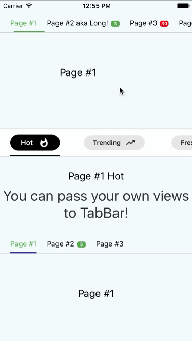
<Page tabLabel={{label: "Hot", icon: iconsSet.hot}} label="Page #1 Hot" text="You can pass your own views to TabBar!"/>
<Page tabLabel={{label: "Trending", icon: iconsSet.trending}} label="Page #2 Trending" text="Yehoo!!!"/>
<Page tabLabel={{label: "Fresh", icon: iconsSet.fresh}} label="Page #3 Fresh" text="Hooray!"/>
<Page tabLabel={{label: "Funny", icon: iconsSet.funny}} label="Page #4 Funny"/>
<Page tabLabel={{label: "Movie & TV", icon: iconsSet.movieAndTv}} label="Page #5 Movie & TV"/>
<Page tabLabel={{label: "Sport", icon: iconsSet.sport}} label="Page #6 Sport"/>
</ScrollableTabView>
</View>
);
}
}
Notice! In case of using this tabbar we must pass object into tabLabel property. It is necessary to set labels and badges.
Example
Example is here
Changelog
- [1.3.6]
- Improve recalculation of scroll values
- [1.3.5]
- Improve underline rerender on tab layout updates
- Minor code improvments
- [1.3.4]
- Improve and update
Advanced usage example
- [1.3.3]
- Improve initial setup with
initialPage property
- Remove
shouldScroll parameter due to its non-ideal work
- [1.3.2]
- [1.3.1]
- Describe tabStyles with flow
- Add tab customization in documentation
- Update Readme
- [1.3.0]
- Fix an error related to types export
- [1.2.8]
- [1.2.7]
- Types are available for importing
- [1.2.6]
- Improve offset calculations for tabs which are located in the end of TabBar
- Now you can pass more than 10 tabs to component
- [1.2.5]
- Fix bug when
activeTabTextStyle had lower priority than just textStyle
- Add customization for underline
- [1.2.4]
- [1.2.3]
- Fixed bug when user provide less than two tabs.
- [1.2.2]
- [1.2.1]
- Now it's possible to pass your own
renderTab function (hooray!). It opens many opportunities for customization
- Type of
Tab has been changed. Now it's a map where you can pass any data you need to use in your custom Tab view
- Example has been added
- [1.2.0]
- Initial setup now depends on
initialPage prop.
- Calculating of interpolations now doesn't apply transformations to underline. It prevents flickering when tab has styles which resize it
- Better manual scrolling performance of TabBar
- [1.1.7]
- Possibly unnecessary transformations to underline have been removed. It improves behaviour on Android
- [1.1.6]
- Change hardcoded marginValue on value from props to calculate scroll positions properly
- [1.1.5]
- Prevent crashing on android devices
- [1.1.4]
- Interpolation values are calculated only when all mandatory views are measured. It prevents incorrect behaviour of tabs scrolling and underline.
- Now you can set default colour for badges using
tabBadgeColor prop
- Now you can set margins between tabs using
tabMargin prop


