Security News
Meet Socket at Black Hat and DEF CON 2025 in Las Vegas
Meet Socket at Black Hat & DEF CON 2025 for 1:1s, insider security talks at Allegiant Stadium, and a private dinner with top minds in software supply chain security.
react-nested-dropdown
Advanced tools
A simple and customizable nested dropdown component for React.


# using npm
npm install react-nested-dropdown
# using pnpm
pnpm install react-nested-dropdown
# using yarn
yarn add react-nested-dropdown
import React from 'react';

import { Dropdown } from 'react-nested-dropdown';
import 'react-nested-dropdown/dist/styles.css';

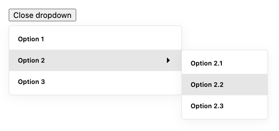
const items = [
  {
    label: 'Option 1',
    onSelect: () => console.log('Option 1 selected'),
  },
  {
    label: 'Option 2',
    items: [
      {
        label: 'Option 2.1',
        onSelect: () => console.log('Option 2.1 selected'),
      },
      {
        label: 'Option 2.2',
        onSelect: () => console.log('Option 2.2 selected'),
      },
    ],
  },
];

export const App = () => {
  return (
    <Dropdown items={items} containerWidth="300px">
      {({ isOpen, onClick }) => (
        <button type="button" onClick={onClick}>
          {isOpen ? 'Close dropdown' : 'Open dropdown'}
        </button>
      )}
    </Dropdown>
  );
};
Dropdown props| Prop | Type | Default | Description |
|---|---|---|---|
items | DropdownItem[] | [] | An array of dropdown items to render in the menu. |
containerWidth | number or string | 300 | The width of the dropdown menu container. Can be a number for pixels or a string for any valid CSS width value. |
onSelect | (value: any, option: DropdownItem) => void | null | A callback function that is called when an option is selected. It is passed the value of the selected option and the option object itself. |
children | (params: { onClick: () => void, isOpen: boolean }) => React.ReactElement | null | A function that returns a React element to be used as the trigger for the dropdown menu. The function is passed an object with an onClick function to open and close the dropdown, and an isOpen boolean to indicate the current open state of the dropdown. |
className | string | null | A custom class name to be applied to the root element of the component. |
renderOption | (option: DropdownItem) => React.ReactElement | null | A function that returns a React element for rendering each option in the dropdown menu. It is passed the option object for the current item. |
closeOnScroll | boolean | true | If set to true, the dropdown menu will close when the page is scrolled. |
DropdownItem interface| Prop | Type | Default | Description |
|---|---|---|---|
label | string | '' | The label to display for the item. |
iconBefore | React.ReactNode | null | An optional icon to display before the label. |
iconAfter | React.ReactNode | null | An optional icon to display after the label. |
items | DropdownItem[] | null | An optional array of nested items to create a submenu. |
itemsContainerWidth | number or string | 150 | The width of the sub items menu container. Can be a number for pixels or a string for any valid CSS width value. |
value | any | undefined | An optional value for the item. This value will be in Dropdown's callback onSelect as first argument. |
onSelect | () => void | null | An optional callback function to be called when the item is selected. |
disabled | boolean | false | Whether the item should be disabled and unable to be selected. |
className | string | null | An optional class name to be applied to the item element. |
FAQs
Dropdown with submenu for React
The npm package react-nested-dropdown receives a total of 411 weekly downloads. As such, react-nested-dropdown popularity was classified as not popular.
We found that react-nested-dropdown demonstrated a not healthy version release cadence and project activity because the last version was released a year ago. It has 1 open source maintainer collaborating on the project.
Did you know?

Socket for GitHub automatically highlights issues in each pull request and monitors the health of all your open source dependencies. Discover the contents of your packages and block harmful activity before you install or update your dependencies.

Security News
Meet Socket at Black Hat & DEF CON 2025 for 1:1s, insider security talks at Allegiant Stadium, and a private dinner with top minds in software supply chain security.

Security News
CAI is a new open source AI framework that automates penetration testing tasks like scanning and exploitation up to 3,600× faster than humans.

Security News
Deno 2.4 brings back bundling, improves dependency updates and telemetry, and makes the runtime more practical for real-world JavaScript projects.