react-particle-effect-button (demo)
Bursting particle effect buttons for React.


This library is a React port of an awesome Codrops Article by Luis Manuel (original source).
Install
npm install --save react-particle-effect-button
Usage
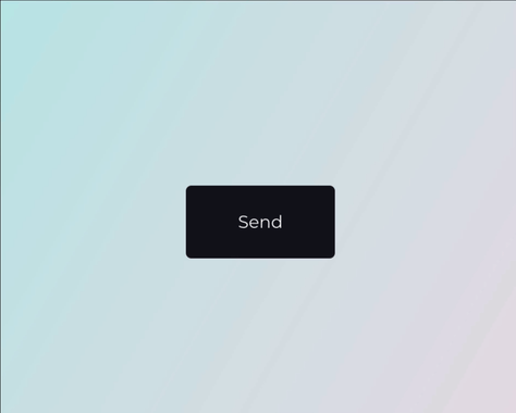
Check out the Demo to see it in action.
import React, { Component } from 'react'

import ParticleEffectButton from 'react-particle-effect-button'

class App extends Component {
  state = {
    hidden: false
  }

  render () {
    return (
      <ParticleEffectButton
        color='#121019'
        hidden={this.state.hidden}
      >
        BUTTON CONTENT GOES HERE
      </ParticleEffectButton>
    )
  }
}
Note that children can be anything from a simple <button> to a complex React subtree. The children should represent the button's contents.
You change the hidden boolean prop to kick-off an animation, typically as a result of a click on the button's contents. If hidden changes to true, the button will perform a disintegrating animation. If hidden changes to false, it will reverse and reintegrate the original content.
Props
hidden | boolean | false | Whether button should be hidden or visible. Changing this prop starts an animation. |
color | string | '#000' | Particle color. Should match the button content's background color |
children | React Node | undefined | The contents of the button. |
duration | number | 1000 | Animation duration in milliseconds. |
easing | string | 'easeInOutCubic' | Animation easing. |
type | string | circle | 'circle' or 'rectangle' or 'triangle' |
style | string | fill | 'fill' or 'stroke' |
direction | string | 'left' | 'left' or 'right' or 'top' or 'bottom' |
canvasPadding | number | 150 | Amount of extra padding to add to the canvas since the animation will overflow the content's bounds |
size | number | func | random(4) |
speed | number | func | random(4) |
particlesAmountCoefficient | number | 3 | Increases or decreases the relative number of particles |
oscillationCoefficient | number | 20 | Increases or decreases the relative curvature of particles |
onBegin | func | noop | Callback to be notified once an animation starts. |
onComplete | func | noop | Callback to be notified once an animation completes. |
I tried to keep the properties exactly the same as in the original codrops version.
Related
This module was bootstrapped with create-react-library.
License
MIT © Travis Fischer


