Research
/Security News
Contagious Interview Campaign Escalates With 67 Malicious npm Packages and New Malware Loader
North Korean threat actors deploy 67 malicious npm packages using the newly discovered XORIndex malware loader.
react-picker
Advanced tools
Picker Component with a popup options list similiar to the picker in iOS
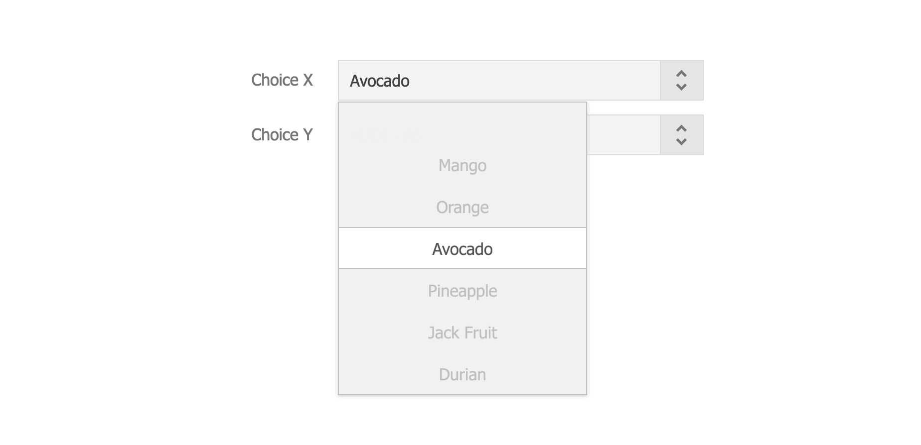
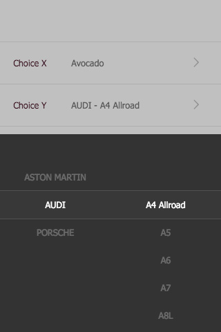
Picker Component offers a popup options list with responsive layouts.
yarn add react-picker
or
npm install react-picker --save


Demo file in repository: ./examples/demo.html
./examples/demo.jsx
import Picker from 'react-picker'
<ul>
	<li>
		<label>Choice X</label>
		<div className="edit">
			<Picker
				ref="fruitSelection"
				value={fruit}
				options={['Mango', 'Orange', 'Avocado', 'Pineapple', 'Jack Fruit', 'Durian', 'Apricot', 'Carambola', 'Dateplum Persimmon', 'Megranate']}
				onChange={this._handleFruitChange}
				>
				<OptionBox value={fruit} onClick={this._handleClickFruit} />
			</Picker>
		</div>
	</li>
	<li>
		<label>Choice Y</label>
		<div className="edit">
			<Picker
				ref="carSelection"
				value={[brand, serial]}
				options={[this.state.brands, this.state.series]}
				onChange={this._handleCarChange}
				width="600px"
				>
				<OptionBox value={this.getCarText(brand, serial)} onClick={this._handleClickCar} />
			</Picker>
		</div>
	</li>
</ul>
OptionBox is a customized component defined for the demo.
CSS: import css/picker.css
SCSS: 1) import bourbon library (http://bourbon.io/), 2) import scss/picker.scss
@value: Default selected option value
@options: Options of the picker
@onChange: callback on changing selected option
@onShow: callback on calling show method
@onDismiss: callback on calling dismiss method
@onClickAway: callback on clicking area outside the picker panel
@width: width of the picker panel
@theme: theme setting of month-picker; 2 options (light/dark); default theme is light
FAQs
Picker Component with a popup options list similiar to the picker in iOS
The npm package react-picker receives a total of 70 weekly downloads. As such, react-picker popularity was classified as not popular.
We found that react-picker demonstrated a not healthy version release cadence and project activity because the last version was released a year ago. It has 1 open source maintainer collaborating on the project.
Did you know?

Socket for GitHub automatically highlights issues in each pull request and monitors the health of all your open source dependencies. Discover the contents of your packages and block harmful activity before you install or update your dependencies.

Research
/Security News
North Korean threat actors deploy 67 malicious npm packages using the newly discovered XORIndex malware loader.

Security News
Meet Socket at Black Hat & DEF CON 2025 for 1:1s, insider security talks at Allegiant Stadium, and a private dinner with top minds in software supply chain security.

Security News
CAI is a new open source AI framework that automates penetration testing tasks like scanning and exploitation up to 3,600× faster than humans.