Security News
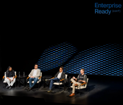
How Enterprise Security Is Adapting to AI-Accelerated Threats
Socket CTO Ahmad Nassri discusses why supply chain attacks now target developer machines and what AI means for the future of enterprise security.
react-progressive-blur
Advanced tools
A lightweight React component that creates smooth, progressive blur effects with customizable intensity and positioning. Perfect for creating modern UI overlays, video controls, and aesthetic blur gradients.
A lightweight React component that creates smooth, progressive blur effects with customizable intensity and positioning. Perfect for creating modern UI overlays, video controls, and aesthetic blur gradients.


backdrop-filter and -webkit-backdrop-filternpm install react-progressive-blur
import React from "react";
import BlurEffect from "react-progressive-blur";

export default function MyComponent() {
  return (
    <div className="relative">
      {/* Your content */}
      <img src="/your-image.jpg" alt="Background" />

      {/* Add blur effect */}
      <BlurEffect position="top" intensity={50} />
    </div>
  );
}
"use client";
import React from "react";
import BlurEffect from "react-progressive-blur";

export default function VideoPage() {
  return (
    <div className="flex flex-col items-center justify-center min-h-screen bg-black">
      <div className="max-w-[80rem] mx-auto my-8">
        <div className="relative rounded-[4rem] overflow-hidden">
          {/* Video with border radius */}
          <video
            src="/demo.webm"
            className="w-full rounded-xl"
            controls
            autoPlay
            muted
            loop
          />

          {/* Top blur overlay */}
          <BlurEffect
            className="h-32 bg-gradient-to-b from-black/20 to-transparent"
            intensity={100}
            position="top"
          />

          {/* Bottom blur overlay */}
          <BlurEffect
            className="h-72 bg-gradient-to-t from-black/20 to-transparent"
            intensity={200}
            position="bottom"
          />
        </div>
      </div>
    </div>
  );
}
| Prop | Type | Default | Description |
|---|---|---|---|
className | string | '' | Additional CSS classes to apply to the blur container |
intensity | number | 50 | Blur intensity (higher values = more blur) |
position | 'top' | 'bottom' | 'left' | 'right' | 'top' | Edge where the blur effect should be applied |
The component creates three progressive blur layers with increasing intensity:
Each layer uses CSS mask-image with linear gradients to create smooth transitions between blur levels.
<BlurEffect
  className="bg-gradient-to-b from-black/30 to-transparent"
  position="top"
  intensity={75}
/>
{/* For horizontal positions (top/bottom) */}
<BlurEffect
  className="h-40"
  position="top"
  intensity={100}
/>

{/* For vertical positions (left/right) */}
<BlurEffect
  className="w-32"
  position="left"
  intensity={100}
/>
<div className="relative">
  <img src="/background.jpg" alt="Background" />

  {/* Top blur */}
  <BlurEffect position="top" intensity={80} className="h-24" />

  {/* Bottom blur */}
  <BlurEffect position="bottom" intensity={120} className="h-32" />

  {/* Left side blur */}
  <BlurEffect position="left" intensity={60} className="w-16" />
</div>
This component uses modern CSS features:
backdrop-filter (with -webkit-backdrop-filter fallback)mask-image (with -webkit-mask-image fallback)Supported in all modern browsers. For older browser compatibility, consider adding appropriate polyfills.
MIT © Rakibur Rahaman
Contributions are welcome! Please feel free to submit a Pull Request.
FAQs
A lightweight React component that creates smooth, progressive blur effects with customizable intensity and positioning. Perfect for creating modern UI overlays, video controls, and aesthetic blur gradients.
The npm package react-progressive-blur receives a total of 650 weekly downloads. As such, react-progressive-blur popularity was classified as not popular.
We found that react-progressive-blur demonstrated a healthy version release cadence and project activity because the last version was released less than a year ago. It has 1 open source maintainer collaborating on the project.
Did you know?

Socket for GitHub automatically highlights issues in each pull request and monitors the health of all your open source dependencies. Discover the contents of your packages and block harmful activity before you install or update your dependencies.

Security News
Socket CTO Ahmad Nassri discusses why supply chain attacks now target developer machines and what AI means for the future of enterprise security.

Security News
Learn the essential steps every developer should take to stay secure on npm and reduce exposure to supply chain attacks.

Security News
Experts push back on new claims about AI-driven ransomware, warning that hype and sponsored research are distorting how the threat is understood.