

Security News
The Hidden Blast Radius of the Axios Compromise
The Axios compromise shows how time-dependent dependency resolution makes exposure harder to detect and contain.
By Ahmad Nassri - Apr 01, 2026
react-range-month-picker
Advanced tools
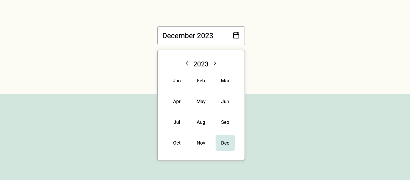
Simple, modern and customizable month picker component for ReactJS.


Simple, modern and customizable month picker component for ReactJS.
😀 Simple and easy to use.
🌶 Tiny: Minzipped size less than 1kB.
🧁 Highly customizable: Easily make it fit to your designs.
📅 Accessible: Fully accessible with keyboard navigation. Developed according the WCAG 2.1 accesibility guidelines.
🇫🇮 41 languages supported.
🚫 0 Dependencies: No surprise dependencies included.
Using npm:
npm install react-range-month-picker --save
Using yarn:
yarn add react-range-month-picker
Using bun:
bun install react-range-month-picker
import { useState } from "react";
import { MonthRangePicker } from "react-range-month-picker";

function Example() {
  const initialDate = new Date();
  const [date, setDate] = useState({
    from: new Date(initialDate.getFullYear(), initialDate.getMonth, 1),
    to: new Date(initialDate.getFullYear(), initialDate.getMonth, 0),
  });
  const selectedMonthData = {
    fromMonth: new Date(date.from).getMonth(),
    fromYear: new Date(date.from).getFullYear(),
    toMonth: new Date(date.to).getMonth(),
    toYear: new Date(date.to).getFullYear(),
  };
  const setSelectedMonthData = (data) => {
    setDate({
      from: new Date(data.fromYear, data.fromMonth, 1),
      to: new Date(data.toYear, data.toMonth, 0),
    });
  };

  return (
    <MonthRangePicker
      size="small"
      selected={selectedMonthData}
      onChange={setSelectedMonthData}
    />
  );
}

export default Example;
Currently selected month data is an object with the following structure:
{
  month: 9,
  year: 2023,
  monthName: 'September',
  monthShort: 'Sep'
}
It will get saved on set parent component state with onChange event.
You can customize the MonthPicker component styles by passing props to it.
| Prop name | Description | Default value |
|---|---|---|
bgColorMonthActive | Background color of the active month. | #4ea3983e |
bgColorMonthHover | Background color of the month on mouse hover. | #f4f4f4 |
borderRadiusMonth | Border radius of the moth element. | 7px |
bgColorPicker | Background color of the picker element. | #fff |
textColor | Color of the text. | #000 |
size | Size of the component. Accepts 'small' or 'large'. | large |
lang | Language. Accepts ISO 639-1 language code. | en |
You can customize the MonthInput component styles by passing props to it.
| Prop name | Description | Default value |
|---|---|---|
bgColor | Background color of the input element. | #fff |
bgColorHover | Background color of the input element on mouse hover. | #fff |
textColor | Color of the text. | #000 |
size | Size of the component. Accepts 'small' or 'large'. | large |
lang | Language. Accepts ISO 639-1 language code. | en |
See full list of supported languages on the website.
MIT © rizkiaprita
FAQs
Simple, modern and customizable month picker component for ReactJS.
We found that react-range-month-picker demonstrated a not healthy version release cadence and project activity because the last version was released a year ago. It has 1 open source maintainer collaborating on the project.
Did you know?

Socket for GitHub automatically highlights issues in each pull request and monitors the health of all your open source dependencies. Discover the contents of your packages and block harmful activity before you install or update your dependencies.
Security News
The Axios compromise shows how time-dependent dependency resolution makes exposure harder to detect and contain.

Research
A supply chain attack on Axios introduced a malicious dependency, plain-crypto-js@4.2.1, published minutes earlier and absent from the project’s GitHub releases.

Research
Malicious versions of the Telnyx Python SDK on PyPI delivered credential-stealing malware via a multi-stage supply chain attack.