
About Re-F|ex
Re-F|ex is a React flex-based layout component library which I created because none of the components I found out there could satisfy my requirements.
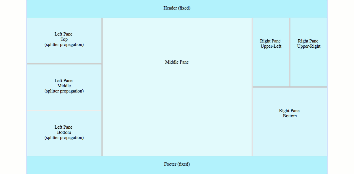
It intends to address in a simple way the needs of advanced React Web applications that require resizable layouts.
Here is a basic demo:
import ReactDOM from 'react-dom'
import React from 'react'
import {
ReflexContainer,
ReflexSplitter,
ReflexElement
} from 'react-reflex'
import 'react-reflex/styles.css'
class ReflexDemo extends React.Component {
render () {
return (
<ReflexContainer orientation="vertical">
<ReflexElement className="left-pane">
<div className="pane-content">
Left Pane (resizeable)
</div>
</ReflexElement>
<ReflexSplitter/>
<ReflexElement className="right-pane">
<div className="pane-content">
Right Pane (resizeable)
</div>
</ReflexElement>
</ReflexContainer>
)
}
}
ReactDOM.render(
<ReflexDemo/>,
document.getElementById('reflex-demo'))
Installation
npm install react-reflex
ES6, CommonJS, and UMD builds are available with each distribution.
import 'react-reflex/styles.css'
import {
ReflexContainer,
ReflexSplitter,
ReflexElement
} from 'react-reflex'
You can also use the UMD build
<link rel="stylesheet" href="path-to-react-reflex/styles.css">
<script src="path-to-react-reflex/dist/umd/react-reflex.min.js"></script>
React Support
React >= 0.13.x
Browser Support
Re-F|ex is responsive, mobile friendly and has been tested on the following browsers:
| IE 11+ ✔ | Latest ✔ | Latest ✔ | Latest ✔ | Latest ✔ | Latest ✔ |
Documentation & Samples
Re-F|ex is the most powerful resizeable React layout component out there ... Don't just trust me, try it!
Click here for code samples and live demos ...
-
Supported properties on ReflexContainer:
-
orientation: Orientation of the layout container.
Type: oneOf(['horizontal', 'vertical']).
Default value: horizontal.
-
maxRecDepth: Maximum recursion depth to solve initial flex of layout elements based on user provided values. This prevents infinite recursion in case the constraints solver cannot find suitable dimensions on the elements to satisfy initial inputs.
Type: number.
Default value: 100.
-
windowResizeAware: When set to true, this flag will update the layout upon a window resize event to attempt to satisfy minSize/maxSize constraints on each element. If your elements do not have those constraints, this is not needed.
Type: bool.
Default value: false.
-
className: Space separated classnames to apply custom styles on the component. Type: string.
Default value: empty string ''.
-
style: allows passing inline style to the container.
Type: object.
Default value: {}.
-
Supported properties on ReflexElement:
-
propagateDimensions: Setting this to true will propagate a dimensions {height, width} property to the children. See Size-aware element demo for more details.
Type: bool.
Default value: false.
-
propagateDimensionsRate: When resizing with propagateDimensions={true}, defines the rate at which the dimensions will be updated on the child elements (in times per second). This can help improving performances when using this approach on heavy components by skipping some rerender steps during resizing.
Type: number.
Default value: 100.
-
resizeHeight: Allows to control if height will be propagated when propagateDimensions={true}.
Type: bool.
Default value: true.
-
resizeWidth: Allows to control if width will be propagated when propagateDimensions={true}.
Type: bool.
Default value: true.
-
size: Allows to control the size in pixel of an element. The main use-case is to allow to perform animations programmatically on an element (shrinking/expanding). See Controlled elements demo for more details.
Type: number.
Default value: true.
-
minSize: Creates a constraint on the minimum size in pixel to which the element can be resized to by the user.
Type: number.
Default value: true.
-
maxSize: Creates a constraint on the maximum size in pixel to which the element can be resized to by the user.
Type: number.
Default value: true.
-
flex: Specifiy the initial flex of an element. By default all element will get evenly displayed inside a layout, unless some of them have minSize, maxSize or size specified.
Type: number.
Default value: true.
-
direction: Allows to control in which direction(s) the element will shrink/expand when its size property is modified. See Controlled elements demo for more details.
Type: -1, 1 or [-1, 1].
Default value: 1.
-
onStartResize: Event fired when user initiates layout resizing.
Type: function({domElement, component}).
Default value: undefined.
-
onStopResize: Event fired when user finishes layout resizing.
Type: function({domElement, component}).
Default value: undefined.
-
onResize: Event fired at each resize step when user resizes layout.
Type: function({domElement, component}).
Default value: undefined.
-
className: Space separated classnames to apply custom styles on the component.
Type: string.
Default value: empty string ''.
-
style: allows passing inline style to the container.
Type: object.
Default value: {}.
-
Supported properties on ReflexSplitter:
-
propagate: Propagate the drag when reszing a layout across multiple splitters. Layou must have at least 3 elements with therefore 2 splitters for this properties to be relevant.
Type: bool.
Default value: false.
-
onStartResize: Event fired when user initiates layout resizing.
Type: function({domElement, component}).
Default value: undefined.
-
onStopResize: Event fired when user finishes layout resizing.
Type: function({domElement, component}).
Default value: undefined.
-
onResize: Event fired at each resize step when user resizes layout.
Type: function({domElement, component}).
Default value: undefined.
-
className: Space separated classnames to apply custom styles on the component.
Type: string.
Default value: empty string ''.
-
style: allows passing inline style to the container.
Default value: {}.
Type: object.
Development
- Build the lib:
npm run build | npm run build-dev (dev mode non-minified with source-map)
- Build the demo:
npm run build-demo | npm run build-demo-dev (dev mode non-minified with source-map + webpack watch)
Web Applications using Re-F|ex
See here...
(Feel free to add your own by submitting a pull request...)
About the Author
https://twitter.com/F3lipek


