🎰 react-roulette-flip
A React library for random selection using two interactive components:
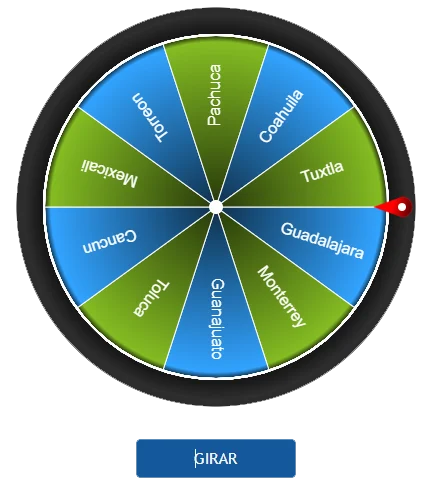
🎡 **RouletteWheel**
A spinning wheel that selects a random item from a list.
🃏 **FlipCard**
A sliding deck of cards that reveals a random choice.
Important: To ensure the styles for react-roulette-flip work correctly, you need to import the CSS file in your main.css (or your main CSS entry point). Add the following line to your main.css:
import "react-roulette-flip/dist/react-roulette-flip.css";
✨ Features
- 🎡 RouletteWheel: A customizable spinning wheel.
- 🃏 FlipCard: A horizontal sliding deck of cards that stops at the selected item.
- 🎨 Fully customizable with styles and animations.
- 🔥 Simple and lightweight.
- ⚡ Optimized for performance.
📦 Installation
npm install react-roulette-flip
yarn add react-roulette-flip
pnpm add react-roulette-flip
🚀 Usage
🎡 RouletteWheel Example
import { useState } from "react";
import { RouletteWheel } from "react-roulette-flip";

const options = ["Alice", "Bob", "Charlie", "David"];

function App() {
  const [startSpin, setStartSpin] = useState(false);

  const handleStopSpin = (index: number, text: string, allDrawsCompleted?: boolean) => {
    setStartSpin(false);
    alert(`Spin stopped at index ${index}: ${text}`);
  };

  return (
    <div>
      <button onClick={() => setStartSpin(true)}>Start Spin</button>

      <RouletteWheel
        data={options}
        startSpin={startSpin}
        onStopSpin={handleStopSpin}
      />
    </div>
  );
}

export default App;
⚙️ Props
data | string[] | [] | List of names or items to pick from. |
startSpin | boolean | false | Controls whether the wheel starts spinning. When true, the wheel will spin. |
onStopSpin? | (index: number, text: string) => void | undefined | Callback triggered when the wheel stops spinning. It provides the index and the selected item from the wheel. |
size | number | 400 | Diameter of the wheel. |
removeOnSelect? | boolean | false | Determines if the selected segment should be removed after being chosen. |
backgroundColor? | string | "#181818" | Sets the background color of the wheel. |
segmentColors? | string[] | ["#32A3FF", "#84BC23"] | An array of colors for the individual segments of the wheel. |
borderOuterWidth? | number | 2 | The width of the outer border of the wheel. |
borderOuterColor? | string | "#FFFFFF" | The color of the outer border of the wheel. |
borderInnerWidth? | number | 1 | The width of the inner border of the wheel. |
borderInnerColor? | string | "#FFFFFF" | The color of the inner border of the wheel. |
centerPointColor? | string | "#FFFFFF" | The color of the center point of the wheel. |
pointerColor? | string | "#FF0000" | The color of the pointer (indicator) used to select a segment. |
fontColor? | string[] | ["#FFFFFF"] | Specifies the color of the text displayed on the segments of the wheel. |
hasShadow? | boolean | true | Determines if the wheel should have a shadow effect. |
🃏 FlipCard Example
import { useState } from "react";
import { FlipCard } from "react-roulette-flip";

const data = [
  { name: "Alice", description: "A brilliant coder", url: "https://alice.com" },
  { name: "Bob", description: "A passionate developer", url: "https://bob.com" },
  { name: "Charlie", description: "A tech enthusiast", url: "https://charlie.com" },
  { name: "David", description: "A software architect", url: "https://david.com" },
];

function App() {
  const [startSpin, setStartSpin] = useState(false);

  const handleStopSpin = (index: number, text: string, allDrawsCompleted?: boolean) => {
    setStartSpin(false);
    alert(`Card stopped at index ${index}: ${text}`);
  };

  return (
    <div>
      <button onClick={() => setStartSpin(true)}>Start Spin</button>

      <FlipCard
        data={data}
        startSpin={startSpin}
        onStopSpin={handleStopSpin}
      />
    </div>
  );
}

export default App;
⚙️ Props
data | IBoxData[] | [] | Array of data objects to populate the flip card, each containing name, description, and url. |
startSpin | boolean | false | Controls whether the card selection starts spinning. |
onStopSpin | (index: number, text: string, allDrawsCompleted?: boolean) => void | undefined | Callback function triggered when the card stops spinning, providing the index, text, and whether all draws are completed. |
backgroundColor | string | "#1b1b1b" | The background color of the flip card. |
borderOuterWidth | number | 3 | The outer border width of the card. |
borderOuterColor | string | "#4886c7" | The outer border color of the card. |
hasFrame | boolean | false | Determines whether the winning card has a frame. |
frameColor | string | "#396ba0" | The color of the card’s frame (only if hasFrame is true). |
pointerColor | string | "#edcb31" | The color of the pointer or indicator. |
cardColor | string | "#1c95f1" | The color of the flip card background. |
removeOnSelect | boolean | false | Removes the selected item from the list once it has been selected. |
📝 Type Definitions:
interface IBoxData {
    name: string;
    description?: string;
    url?: string;
    color?: string
}
📜 Changelog
Version 1.0.0 (2024-01-20)
- Updated package version to 1.0.1.
- Updated
homepage URL in package.json.
Version 1.0.0 (2024-01-19)
- Stable Release: Initial stable release of
react-roulette-flip.
- Includes all features from previous versions, including
RouletteWheel with winner banner and FlipCard with color customization.
- Improved overall stability and performance.
Version 0.2.7 (2024-01-18)
- Bug Fix: Corrected CSS import path in documentation.
- Improvement: Updated README with more detailed usage instructions.
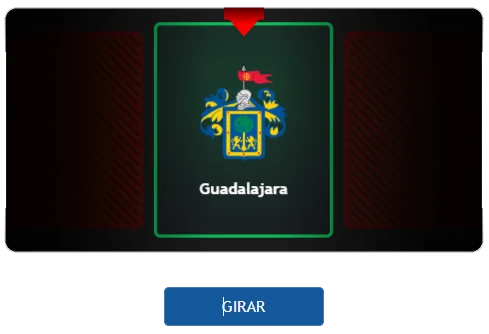
- New Feature: Added a "winner banner" to RouletteWheel that displays the selected item prominently after the spin stops.
Version 0.2.6 (2024-01-17)
New Feature: Added color property to IBoxData interface for customizing card colors.
Improvement: Enhanced performance of FlipCard animations.
Bug Fix: Fixed an issue where RouletteWheel would sometimes select the same item twice in a row.
🤝 Contributing
Pull requests and suggestions are welcome! Please open an issue if you find bugs or have feature requests.
📜 License
MIT License ©2025 BitCoder_


