react-simple-wheel-picker
You can set up simple and flexible wheel picker
Overview
- This package is simple and flexible wheel picker for React
- This package move like same as native applications picker
- This package support accessibility
Usage
npm i react-simple-wheel-picker or yarn add react-simple-wheel-picker- Look at simple example below or please check example if you want to know more detail usage
import WheelPicker from 'react-simple-wheel-picker';
const data = [
{
id: '1',
value: 'test1'
},
{
id: '2',
value: 'test2'
},
{
id: '3',
value: 'test3'
},
{
id: '4',
value: 'test4'
},
{
id: '5',
value: 'test5'
}
];
const Sample = () => {
const handleOnChange = target => {
console.log(target);
};
return (
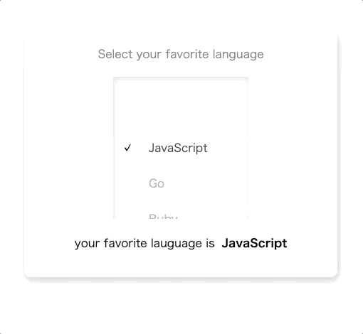
<WheelPicker
data={data}
onChange={handleOnChange}
height={150}
width={100}
titleText="Enter value same as aria-label"
itemHeight={30}
selectedID={data[0].id}
color="#ccc"
activeColor="#333"
backgroundColor="#fff"
/>
);
};
Normal Props
| data | Array<{id: string, value: string | number}> | true | It should be array of object that have id and value |
| selectedID | string | true | You can set default data id |
| onChange | function(data: PickerData): void | true | You can get value or id |
| height | number | true | You can specify height to wheel picker |
| itemHeight | number | true | You can specify item height to wheel picker item |
| width | number | false | You can specify width to wheel picker |
| idName | string | false | You can specify id name to have relation to htmlFor label element |
| color | string | false | You can specify color to picker value |
| activeColor | string | false | You can specify active color to picker value |
| fontSize | number | false | You can specify font size to picker value |
| backgroundColor | string | false | You can specify background color to wheel picker |
| shadowColor | string | false | You can specify shadow color to wheel picker |
| focusColor | string | false | You can specify focus color that is painted border color when WheelPicker is focused |
| ref | WheelPickerRef | false | You can refer element to use focus or blur function by specifying ref props |
Accessibility Props
| titleID | string | false | You can specify titleID that it is linked with aria-labelledby |
| titleText | string | false | You can specify titleText that it is linked with aria-label |
| required | boolean | false | You can specify required that it is linked with aria-required |
If you want to know more about accessibility, you can check here.
Accessibility for this package
- Support aria-* and role options
- Support keyboard operation