react-skeleton-placeholder
Advanced tools
react-skeleton-placeholder - npm Package Compare versions
Comparing version
| { | ||
| "name": "react-skeleton-placeholder", | ||
| "version": "0.2.0", | ||
| "version": "0.3.0", | ||
| "license": "MIT", | ||
| "author": "David Tang", | ||
| "private": false, | ||
@@ -19,5 +20,7 @@ "main": "dist/bundle.js", | ||
| "babel-preset-react": "^6.24.1", | ||
| "css-loader": "^0.28.4", | ||
| "prop-types": "^15.5.10", | ||
| "react": "^15.6.1", | ||
| "react-dom": "^15.6.1", | ||
| "style-loader": "^0.18.2", | ||
| "webpack": "^2.6.1", | ||
@@ -24,0 +27,0 @@ "webpack-dev-server": "^2.4.5" |
| # react-skeleton-placeholder | ||
| Make skeleton screens that automatically adapt to your app. | ||
| Make skeleton screens that automatically adapt to your app. | ||
|  |
| import React, { Component } from 'react'; | ||
| import './index.css'; | ||
| const style = { | ||
| background: '#eee', | ||
| borderRadius: 4, | ||
| display: 'inline-block', | ||
| height: '1em', | ||
| width: '100%', | ||
| verticalAlign: 'top', | ||
| }; | ||
| export default class Skeleton extends Component { | ||
@@ -20,7 +12,7 @@ static defaultProps = { | ||
| for (let i = 0; i < this.props.count; i++) { | ||
| elements.push(<span key={i} style={style}/>); | ||
| elements.push(<span key={i}>‌</span>); | ||
| } | ||
| return ( | ||
| <span> | ||
| <span className="react-skeleton-placeholder"> | ||
| {elements} | ||
@@ -27,0 +19,0 @@ </span> |
@@ -5,8 +5,2 @@ import React, { Component } from 'react'; | ||
| const containerStyle = { | ||
| padding: 8, | ||
| width: 400, | ||
| fontSize: 30, | ||
| }; | ||
| export default class Post extends Component { | ||
@@ -16,7 +10,24 @@ static propTypes = { | ||
| children: PropTypes.node, | ||
| size: PropTypes.oneOf('small', 'large'), | ||
| }; | ||
| static defaultProps = { | ||
| size: 'small', | ||
| }; | ||
| getStyle() { | ||
| const { size } = this.props; | ||
| const baseStyle = { | ||
| padding: 8, | ||
| width: 400, | ||
| }; | ||
| return Object.assign(baseStyle, { | ||
| fontSize: size === 'small' ? 16 : 25, | ||
| lineHeight: size === 'small' ? 1.2 : 2, | ||
| }); | ||
| } | ||
| render() { | ||
| return ( | ||
| <div style={containerStyle}> | ||
| <div style={this.getStyle()}> | ||
| <h1>{this.props.title || <Skeleton/>}</h1> | ||
@@ -23,0 +34,0 @@ <p>{this.props.children || <Skeleton count={5}/>}</p> |
@@ -11,5 +11,20 @@ import React from 'react'; | ||
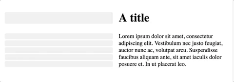
| <Post title="A title"> | ||
| Lorem ipsum dolor sit amet, consectetur adipiscing elit. Vestibulum nec justo feugiat, auctor nunc ac, volutpat arcu. Suspendisse faucibus aliquam ante, sit amet iaculis dolor posuere et. In ut placerat leo. | ||
| Lorem ipsum dolor sit amet, consectetur adipiscing elit. | ||
| Vestibulum nec justo feugiat, auctor nunc ac, volutpat arcu. | ||
| Suspendisse faucibus aliquam ante, sit amet iaculis dolor posuere et. | ||
| In ut placerat leo. | ||
| </Post> | ||
| </SideBySide> | ||
| )); | ||
| )) | ||
| .add('with large size', () => ( | ||
| <SideBySide> | ||
| <Post size="large"/> | ||
| <Post size="larger" title="A title"> | ||
| Lorem ipsum dolor sit amet, consectetur adipiscing elit. | ||
| Vestibulum nec justo feugiat, auctor nunc ac, volutpat arcu. | ||
| Suspendisse faucibus aliquam ante, sit amet iaculis dolor posuere et. | ||
| In ut placerat leo. | ||
| </Post> | ||
| </SideBySide> | ||
| )) | ||
| ; |
@@ -28,4 +28,12 @@ const path = require('path'); | ||
| }, | ||
| { | ||
| test: /\.css/, | ||
| use: [ | ||
| { loader: "style-loader" }, | ||
| { loader: "css-loader" } | ||
| ], | ||
| exclude: /node_modules/, | ||
| } | ||
| ], | ||
| }, | ||
| }; |
Fixed alerts
AI-detected possible typosquat
Supply chain riskAI has identified this package as a potential typosquat of a more popular package. This suggests that the package may be intentionally mimicking another package's name, description, or other metadata.
Found 1 instance in 1 package
Major refactor
Supply chain riskPackage has recently undergone a major refactor. It may be unstable or indicate significant internal changes. Use caution when updating to versions that include significant changes.
Found 1 instance in 1 package
No contributors or author data
MaintenancePackage does not specify a list of contributors or an author in package.json.
Found 1 instance in 1 package
Improved metrics
- Total package byte prevSize
32073
2.04%- Lines of code
155
9.15%- Number of low maintenance alerts
2
-33.33%- Number of lines in readme file
5
66.67%- Number of medium supply chain risk alerts
0
-100%Worsened metrics
- Dev dependency count
13
18.18%- Number of package files
14
-12.5%