Research
/Security News
DuckDB npm Account Compromised in Continuing Supply Chain Attack
Ongoing npm supply chain attack spreads to DuckDB: multiple packages compromised with the same wallet-drainer malware.
react-slider-input
Advanced tools
InputRange is a React component allowing users to input numeric values within a specific range. It can accept a single value, or a range of values (min/max). By default, basic styles are applied, but can be overridden depending on your design requirements.
A CodePen demo is available here.
react-input-range using npm (or yarn). npm install react-input-rangereact-input-range to use InputRange component.react-input-range/lib/css/index.css if you want to apply the default styling.To accept min/max value:
import React from 'react';
import ReactDOM from 'react-dom';
import InputRange from 'react-input-range';

class App extends React.Component {
  constructor(props) {
    super(props);

    this.state = {
      value: { min: 2, max: 10 },
    };
  }

  render() {
    return (
      <InputRange
        maxValue={20}
        minValue={0}
        value={this.state.value}
        onChange={value => this.setState({ value })} />
    );
  }
}

ReactDOM.render(
  <App />,
  document.getElementById('app')
);
To accept a single value:
class App extends React.Component {
  constructor(props) {
    super(props);

    this.state = { value: 10 };
  }

  render() {
    return (
      <InputRange
        maxValue={20}
        minValue={0}
        value={this.state.value}
        onChange={value => this.setState({ value })} />
    );
  }
}
To format labels:
<InputRange
  formatLabel={value => `${value}cm`}
  value={this.state.value}
  onChange={value => this.setState({ value })} />
To specify the amount of increment/decrement
<InputRange
  step={2}
  value={this.state.value}
  onChange={value => this.setState({ value })} />
Set to true to allow minValue and maxValue to be the same.
Set aria-labelledby attribute to your component.
Set aria-controls attribute to your component.
Override the default CSS classes applied to your component and its sub-components.
If this property is set to true, your component is disabled. This means you'll not able to interact with it.
If this property is set to true, you can drag the entire track.
By default, value labels are displayed as plain numbers. If you want to change the display, you can do so by passing in a function. The function can return something different, i.e.: append a unit, reduce the precision of a number.
Set a maximum value for your component. You cannot drag your slider beyond this value.
Set a minimum value for your component. You cannot drag your slider under this value.
Set a name for your form component.
Whenever your user interacts with your component (i.e.: dragging a slider), this function gets called. Inside the function, you should assign the new value to your component.
Whenever your user starts interacting with your component (i.e.: onMouseDown, or onTouchStart), this function gets called.
Every mouse / touch event can trigger multiple updates, therefore causing onChange callback to fire multiple times. On the other hand, onChangeComplete callback only gets called when the user stops dragging.
The default increment/decrement of your component is 1. You can change that by setting a different number to this property.
Set the current value for your component. If only a single number is provided, only a single slider will get rendered. If a range object (min/max) is provided, two sliders will get rendered
If you want to work on this project locally, you need to grab all of its dependencies, for which we recommend using yarn. You can find the instructions to setup yarn here.
yarn install
After that, you should be able run to preview
yarn dev
To test
yarn test
Contributions are welcome. :)
FAQs
React component for inputting numeric values within a range
We found that react-slider-input demonstrated a not healthy version release cadence and project activity because the last version was released a year ago. It has 1 open source maintainer collaborating on the project.
Did you know?

Socket for GitHub automatically highlights issues in each pull request and monitors the health of all your open source dependencies. Discover the contents of your packages and block harmful activity before you install or update your dependencies.

Research
/Security News
Ongoing npm supply chain attack spreads to DuckDB: multiple packages compromised with the same wallet-drainer malware.

Security News
The MCP Steering Committee has launched the official MCP Registry in preview, a central hub for discovering and publishing MCP servers.

Product
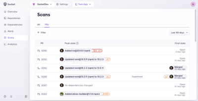
Socket’s new Pull Request Stories give security teams clear visibility into dependency risks and outcomes across scanned pull requests.