Security News
rv Is a New Rust-Powered Ruby Version Manager Inspired by Python's uv
Ruby maintainers from Bundler and rbenv teams are building rv to bring Python uv's speed and unified tooling approach to Ruby development.
react-spinners-loading
Advanced tools
A totally customizable component for loading spinners/animation for your react project, it can serve as document loader (full screen), specific block loading animation and more, it has presets and accept your own assets as spinners

A Highly Customizable React component to help you with loaders/spinners for specific part of your project or as a project loading, with built-in presets and the ability of using your own assets.

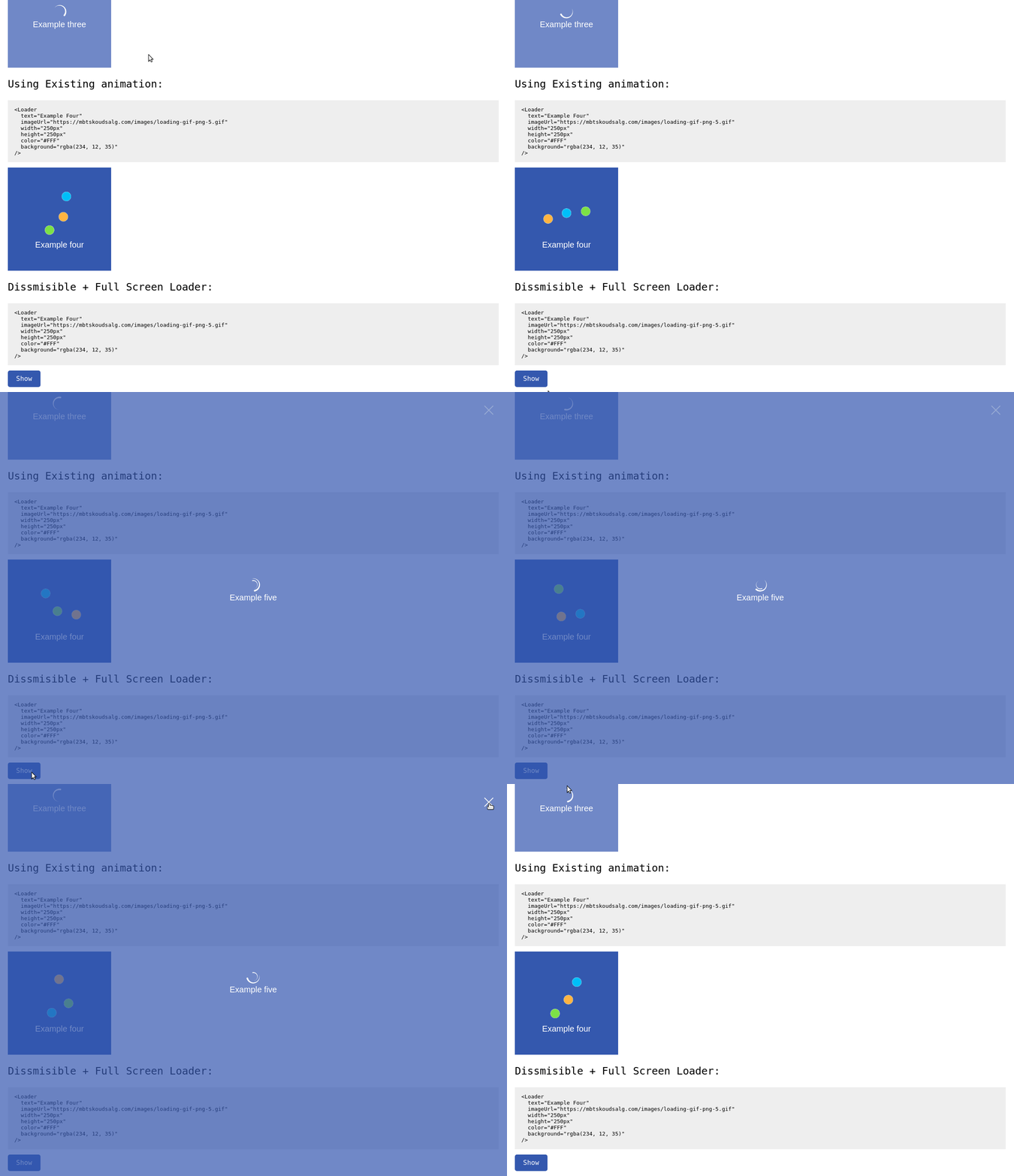
You can check out this little demo to get the feel of it: Online demo
It's very easy to use the tool, follow the instructions
Install the package using npm
npm i react-spinners-loading
import Loader from 'react-spinners-loading'
Example of the Configuraiton array:
  <Loader
    text="Loader Text"
    animation="clock"
    width="250px"
    height="250px"
    color="#FFF"
    background="rgba(234, 12, 35, 0.7)"
  />
And that's pretty much it!
| Name | Type | Default | Description |
|---|---|---|---|
| text | String | 'Loading...' | Unique string that defines the element |
| animation | String | null | One of the built-in presets [bar, circle, clock, dots, double-circle, drop, spinner] |
| color | String | '#FFFFFF' | The color of the text/spinner in HEX,RGB or RGBa |
| background | String | 'rgba(0, 0, 0, 0.7)' | The background color of the whole Loader in HEX,RGB or RGBa |
| width | String | '100%' | The Width of the Loader in Px/rem/em/% |
| height | String | '100%' | The Height of the Loader in Px/rem/em/% |
| fullscreen | Boolean | false | If the Loader should be showed in full-screen (Width & Height shouldn't be specified) |
| show | Boolean | true | To control if the Loader has to be shown or not |
| imageUrl | String | null | The URL for the Loading animation (animation doesn't need to be specified) |
| dismissible | Boolean | false | Showing a Closing button to close the Loader |
FAQs
A totally customizable component for loading spinners/animation for your react project, it can serve as document loader (full screen), specific block loading animation and more, it has presets and accept your own assets as spinners
The npm package react-spinners-loading receives a total of 24 weekly downloads. As such, react-spinners-loading popularity was classified as not popular.
We found that react-spinners-loading demonstrated a not healthy version release cadence and project activity because the last version was released a year ago. It has 1 open source maintainer collaborating on the project.
Did you know?

Socket for GitHub automatically highlights issues in each pull request and monitors the health of all your open source dependencies. Discover the contents of your packages and block harmful activity before you install or update your dependencies.

Security News
Ruby maintainers from Bundler and rbenv teams are building rv to bring Python uv's speed and unified tooling approach to Ruby development.

Security News
Following last week’s supply chain attack, Nx published findings on the GitHub Actions exploit and moved npm publishing to Trusted Publishers.

Security News
AGENTS.md is a fast-growing open format giving AI coding agents a shared, predictable way to understand project setup, style, and workflows.