
Research
Two Malicious Rust Crates Impersonate Popular Logger to Steal Wallet Keys
Socket uncovers malicious Rust crates impersonating fast_log to steal Solana and Ethereum wallet keys from source code.
By Kirill Boychenko - Sep 24, 2025
react-styled-floating-label
Advanced tools
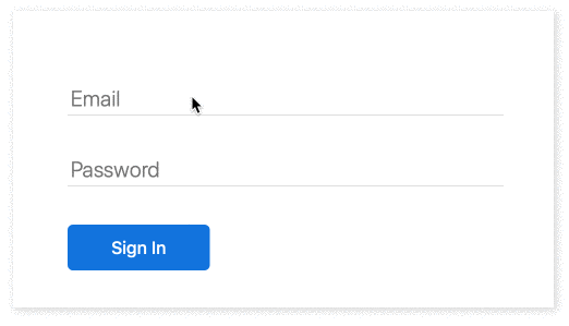
Floating label component which works with any HTML input. Supports styling with styled-components. Check this live demo to see it in action.
import FloatingLabel from 'react-styled-floating-label';
const email = (
<FloatingLabel text="Email">
<input type="email" />
</FloatingLabel>
);
npm i react-styled-floating-label styled-components --save
import styled from 'styled-components';
import FloatingLabel from 'react-styled-floating-label';

const BlueFloatingLabel = styled(FloatingLabel)`
    color: #0070e0;
`;

const Input = styled.input`
    -webkit-appearance: none;
    -moz-appearance: none;
    appearance: none;
    box-sizing: border-box;

    border: none;
    border-bottom: 0.5px solid #bdbdbd;

    font-size: 1.25em;
    padding-left: 0.25em;
    padding-top: 0.25em;
    min-width: 20em;

    :focus {
        border-color: #5eaefe;
        outline: none;
    }
`;

const email = (
    <BlueFloatingLabel text="Email">
        <Input type="email" />
    </BlueFloatingLabel>
);
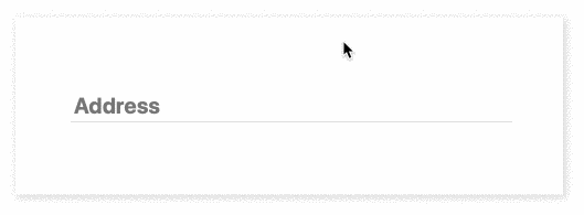
import FloatingLabel from 'react-styled-floating-label';

const address = (
    <FloatingLabel
        text="Address"
        style={{
            color: '#0070e0',
        }}
        placeholderStyle={{
            fontWeight: 'bold',
        }}>
        <Input />
    </FloatingLabel>
);
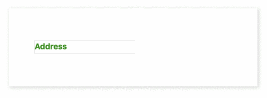
import styled from 'styled-components';
import FloatingLabel from 'react-styled-floating-label';

const FloatingLabelWithStyledPlaceholder = styled(FloatingLabel)`
    --placeholder-color: #328a09;
    --placeholder-font-weight: bold;
`;

const Input = styled.input`
    font-size: 1em;
`;

const address = (
    <FloatingLabelWithStyledPlaceholder text="Address">
        <Input />
    </FloatingLabelWithStyledPlaceholder>
);
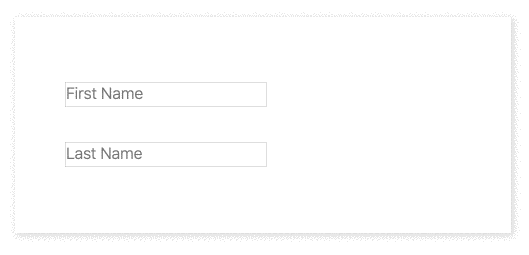
import styled from 'styled-components';
import FloatingLabel from 'react-styled-floating-label';

const VerticallyPositionedFloatingLabel = styled(FloatingLabel)`
    transform: translateY(-10px);
`;

const HorizontallyPositionedFloatingLabel = styled(FloatingLabel)`
    margin-left: 20px;
`;

const firstName = (
    <VerticallyPositionedFloatingLabel text="First Name">
        <Input />
    </VerticallyPositionedFloatingLabel>
);

const lastName = (
    <HorizontallyPositionedFloatingLabel text="Last Name">
        <Input />
    </HorizontallyPositionedFloatingLabel>
);
You can check all examples in action in this live demo.
| Prop | Required | Default | Description |
|---|---|---|---|
| text | Yes | Label text | |
| style | Optional | {} | Label style for projects which are not using styled-components |
| placeholderStyle | Optional | {} | Placeholder style for projects which are not using styled-components |
| container | Optional | div | Component container |
| label | Optional | label | Label component |
Label can be styled with styled-components:
import styled from 'styled-components';
import FloatingLabel from 'react-styled-floating-label';

const BlueFloatingLabel = styled(FloatingLabel)`
    color: #0070e0;
`;
To style placeholder use standard CSS properties with the "--placeholder-" prefix:
const BlueFloatingLabelWithBoldPlaceholder = styled(BlueFloatingLabel)`
    --placeholder-font-weight: bold;
`;
To run the demo, you need to clone the project and execute:
npm i && npm run demo
Or you can check a live demo here.
There are no mailing lists or discussion groups yet. Please use GitHub issues and pull request or follow me on Twitter @IhorBurlachenko
FAQs
Floating label component which works with any HTML input
We found that react-styled-floating-label demonstrated a not healthy version release cadence and project activity because the last version was released a year ago. It has 1 open source maintainer collaborating on the project.
Did you know?

Socket for GitHub automatically highlights issues in each pull request and monitors the health of all your open source dependencies. Discover the contents of your packages and block harmful activity before you install or update your dependencies.
Research
Socket uncovers malicious Rust crates impersonating fast_log to steal Solana and Ethereum wallet keys from source code.

Research
A malicious package uses a QR code as steganography in an innovative technique.

Research
/Security News
Socket identified 80 fake candidates targeting engineering roles, including suspected North Korean operators, exposing the new reality of hiring as a security function.