Product
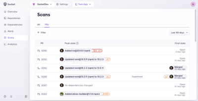
Introducing Pull Request Stories to Help Security Teams Track Supply Chain Risks
Socket’s new Pull Request Stories give security teams clear visibility into dependency risks and outcomes across scanned pull requests.
react-svg-piechart
Advanced tools
A lightweight responsive pie chart component for React using only SVG
A lightweight responsive React pie chart component using only SVG
You can download react-svg-piechart from the NPM registry via the npm or
yarn commands
yarn add react-svg-piechart
npm install react-svg-piechart --save
If you don't use package manager and you want to include react-svg-piechart
directly in your html, you could get it from the UNPKG CDN
https://unpkg.com/react-svg-piechart/umd/react-svg-piechart.js
See Demo page
import React from "react"
import ReactSvgPieChart from "react-svg-piechart"

const data = [
  {title: "Data 1", value: 100, color: "#22594e"},
  {title: "Data 2", value: 60, color: "#2f7d6d"},
  {title: "Data 3", value: 30, color: "#3da18d"},
  {title: "Data 4", value: 20, color: "#69c2b0"},
  {title: "Data 5", value: 10, color: "#a1d9ce"},
]

const MyCompo = () => (
  <ReactSvgPieChart
    data={data}
    // If you need expand on hover (or touch) effect
    expandOnHover
    // If you need custom behavior when sector is hovered (or touched)
    onSectorHover={(d, i, e) => {
      if (d) {
        console.log("Mouse enter - Index:", i, "Data:", d, "Event:", e)
      } else {
        console.log("Mouse leave - Index:", i, "Event:", e)
      }
    }}
  />
)
| Name | PropType | Description | Default |
|---|---|---|---|
| data | Array of data Objects | One data is {value: number (required), color: string, title: string, expanded: bool, href: string} | [] |
| expandedIndex | Number | Pass in an index to manually control the expanded sector of the pie | |
| expandOnHover | Boolean | Active hover and touch (mobile) effects | false |
| onSectorHover | Function | Callback when one sector is hovered or touched (mobile) - ex: (data, index, event) => {} | null |
| expandSize | Number | expand size, in pixels. Used if expandOnHover is active or one data has expanded attribute set to true | |
| strokeColor | String | Sector stroke color | "#fff" |
| startAngle | Number | Angle to start drawing sectors from measured clockwise from the x-axis | 0 |
| angleMargin | Number | Angle of margin between sectors | 0 |
| strokeLinejoin | String | Sector stroke line join (One of miter, round, bevel) | "round" |
| strokeWidth | Number | Sector width, in pixels (0 to disable stroke) | 1 |
| viewBoxSize | Number | SVG viewbox width and height | 100 |
| transitionDuration | String | CSS property for transition-duration, set to 0s to disable transition | "0s" |
| transitionTimingFunction | String | CSS Property for transition-timing-function | "ease-out" |
npm test).See CONTRIBUTING.md guidelines
See changelog
This project is licensed under the MIT License - see the LICENCE.md file for details
FAQs
A lightweight responsive pie chart component for React using only SVG
We found that react-svg-piechart demonstrated a not healthy version release cadence and project activity because the last version was released a year ago. It has 1 open source maintainer collaborating on the project.
Did you know?

Socket for GitHub automatically highlights issues in each pull request and monitors the health of all your open source dependencies. Discover the contents of your packages and block harmful activity before you install or update your dependencies.

Product
Socket’s new Pull Request Stories give security teams clear visibility into dependency risks and outcomes across scanned pull requests.

Research
/Security News
npm author Qix’s account was compromised, with malicious versions of popular packages like chalk-template, color-convert, and strip-ansi published.

Research
Four npm packages disguised as cryptographic tools steal developer credentials and send them to attacker-controlled Telegram infrastructure.