
Security News
ESLint Adds Official Support for Linting HTML
ESLint now supports HTML linting with 48 new rules, expanding its language plugin system to cover more of the modern web development stack.
By Sarah Gooding - May 13, 2025
react-three-gui
Advanced tools
A graphical user interface for changing variable states in React.
https://codesandbox.io/s/react-three-fiber-gui-62pvp
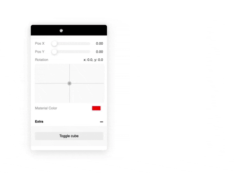
Basic example
import { Controls, useControl } from 'react-three-gui';
export const App = () => {
const rotationX = useControl('Rotation X', { type: 'number' });
return (
<Controls.Provider>
<Controls.Canvas>
<mesh rotation-x={rotationX} />
</Controls.Canvas>
<Controls />
</Controls.Provider>
);
};
Use the spring option to return a react-spring value:
useControl('My ctrl', {
  type: 'number',
  spring: true,
});

// or pass a react-spring configuration value

useControl('My ctrl', {
  type: 'number',
  spring: { mass: 5, tension: 280, friction: 50 },
});
Also possible to pass in your own state:
const [value, set] = useState(0);

useControl('Adjust value', {
  type: 'number',
  state: [value, set],
});
Also you can pass your own control component:
const MyControl = ({ value, setValue }) => (
  <input
    type="number"
    onChange={e => setValue(e.currentTarget.value)}
    value={value}
  />
);

useControl('Test', {
  type: 'custom',
  value: 2,
  component: MyControl,
});
import { Canvas } from 'react-three-fiber';
import { withControls } from 'react-three-gui';

// Wrap the <Canvas> with `withControls`
const YourCanvas = withControls(Canvas);

const Scene = () => (
  <YourCanvas>
    <mesh rotation-x={rotationX} />
  </YourCanvas>
);

const App = () => {
  const rotationX = useControl('Rotation X', { type: 'number' });
  return (
    <Controls.Provider>
      <Scene />
      <Controls />
    </Controls.Provider>
  );
};
import { useControl, Controls } from 'react-three-gui';

// All the possible options
useControl(name: string, {
  // General
  type: 'number' | 'xypad' | 'boolean' | 'button' | 'color' | 'select' | 'string' | 'file' | 'custom';
  value: any; // Initial value
  spring: boolean | SpringConfig; // Use spring
  group: string; // Group name
  state: [any, Dispatch<SetStateAction<any>>]; // Use your own state
  onChange(value: any): void; // onChange callback

  // number | xypad
  min: number; // Minimum value (default: 0)
  max: number; // Maximum value (default: 1)
  distance: number; // The end-to-end slider distance (default: 1)
  scrub: boolean; // When slider is released it will reset to the center but keep its value

  // select
  items: string[];

  // button
  onClick(): void;

  // file
  loader?: THREE.TextureLoader | THREE.FileLoader | etc;

  // custom
  component?: React.Component;
});

// Controls component
<Controls
  title="react-three-gui"
  collapsed={true}
  defaultClosedGroups={['Other', 'Stuff']}
  width={300} // default 300
  anchor={'top_left' | 'bottom_left' | 'top_right' | 'bottom_right'} // see ControlsAnchor enum
  style={{ ... }} // pass any kind of styles here. Supports @react-spring/web styles.
/>
number{ x: number, y: number } objectbooleanvoidstring (as hex: #ffffff)stringnew THREE.FileLoaderstringFAQs
A graphical user interface for changing variable states in React.
The npm package react-three-gui receives a total of 35 weekly downloads. As such, react-three-gui popularity was classified as not popular.
We found that react-three-gui demonstrated a not healthy version release cadence and project activity because the last version was released a year ago. It has 1 open source maintainer collaborating on the project.
Did you know?

Socket for GitHub automatically highlights issues in each pull request and monitors the health of all your open source dependencies. Discover the contents of your packages and block harmful activity before you install or update your dependencies.
Security News
ESLint now supports HTML linting with 48 new rules, expanding its language plugin system to cover more of the modern web development stack.

Security News
CISA is discontinuing official RSS support for KEV and cybersecurity alerts, shifting updates to email and social media, disrupting automation workflows.

Security News
The MCP community is launching an official registry to standardize AI tool discovery and let agents dynamically find and install MCP servers.