react-tinacms-date
This package provides a Field Plugin for editing dates on websites built with TinaCMS.
As of TinaCMS v0.40.1+, DateFieldPlugin is now a default plugin.
This package is deprecated and should only be used for previous versions of TinaCMS.
You can learn more about this change and reasons for it here.
Installation
yarn add react-tinacms-date
Registering the Date Field Plugin
The simplest approach is to simply import the package and add it to the CMS.
import { DateFieldPlugin } from "react-tinacms-date"

cms.plugins.add(DateFieldPlugin)
However, to help reduce bundle size you may also import the plugin dynamically:
import("react-tinacms-date").then(({ DateFieldPlugin }) => {
  cms.plugins.add(DateFieldPlugin)
})
Visit the Plugin Docs to learn more about efficiently loading and registering plugins.
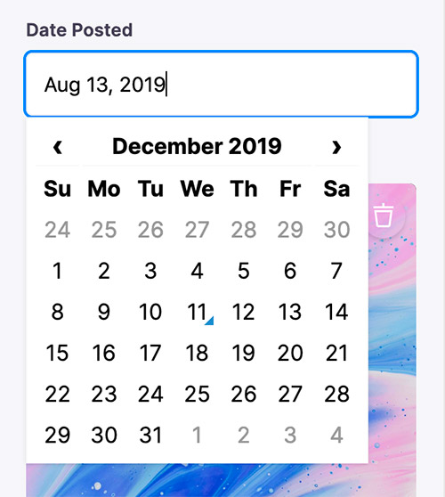
Using the Date Field Plugin
Once registered you will be able to use the Date Field in your Forms:
const formConfig = {
  fields: [
    {
      name: "created_at",
      label: "Created At",
      component: "date",
      dateFormat: 'MMMM DD YYYY',
      timeFormat: false,
    }
  ]
}
Options
This field plugin uses react-datetime under the hood.
interface DateConfig extends FieldConfig, DatetimepickerProps {
component: 'date'
name: string
label?: string
description?: string
dateFormat?: boolean | string
timeFormat?: boolean | string
}
component | The name of the plugin component. Always 'date'. |
name | The path to some value in the data being edited. |
label | A human readable label for the field. Defaults to the name. (Optional) |
description | Description that expands on the purpose of the field or prompts a specific action. (Optional) |
dateFormat | Defines the format for the date. It accepts any Moment.js date format (not in localized format). If true the date will be displayed using the defaults for the current locale. See react-datetime docs for more details. (Optional) |
timeFormat | Defines the format for the time. It accepts any Moment.js time format (not in localized format). If true the time will be displayed using the defaults for the current locale. If false the timepicker is disabled and the component can be used as datepicker. See react-datetime docs for more details.(Optional) |
FieldConfig
This interfaces only shows the keys unique to the date field.
Visit the Field Config docs for a complete list of options.
DatetimepickerProps
Any extra properties added to the the date field definition will be passed along to the react-datettime component. Moment.js format is used. See the full list of options here.


