Product
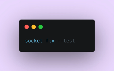
Introducing Socket Fix for Safe, Automated Dependency Upgrades
Automatically fix and test dependency updates with socket fix—a new CLI tool that turns CVE alerts into safe, automated upgrades.
By John-David Dalton - Apr 25, 2025
react-toast-popup-jpranays
Advanced tools
React Toast Popup is a simple and customizable toast notification component for React applications.
React Toast Popup is a simple and customizable toast notification component for React applications.
You can install React Toast Popup via npm:
npm install react-toast-popup
To use React Toast Popup in your React application, follow these steps:
Import the useNotification hook and necessary styles in your component:
import useNotification from "react-toast-popup";
Initialize the useNotification hook with your preferred position:
const { NotificationComponent, triggerNotification } =
  useNotification("top-left");
Use NotificationComponent in your JSX to display notifications:
return (
  <div className="App">
    {NotificationComponent}
    {/* Your other JSX content */}
  </div>
);
Trigger notifications using the triggerNotification function:
triggerNotification({
  type: "success",
  message: "This is a success message!",
  duration: 3000,
});
You can specify an animation type for the notifications. The available animations are:
triggerNotification({
  type: "success",
  message: "This is a success message with a pop animation!",
  duration: 3000,
  animation: "pop",
});
useNotification(position: PositionType)
This hook returns an object with the following properties:
NotificationComponent: React element representing the notification container.triggerNotification(notificationProps: NotificationProps): Function to trigger a notification with the specified properties.NotificationProps
The triggerNotification function accepts an object of type NotificationProps, which includes:
Here's a basic example of how to use React Toast Popup:
import React from "react";
import useNotification from "react-toast-popup";

function App() {
  const { NotificationComponent, triggerNotification } =
    useNotification("top-left");

  const handleButtonClick = () => {
    triggerNotification({
      type: "success",
      message: "This is a success message!",
      duration: 3000,
    });
  };

  return (
    <div className="App">
      {NotificationComponent}
      <h1>Toast Component</h1>
      <button onClick={handleButtonClick}>Show Success</button>
    </div>
  );
}

export default App;
This project is licensed under the MIT License - see the LICENSE file for details.
FAQs
React Toast Popup is a simple and customizable toast notification component for React applications.
The npm package react-toast-popup-jpranays receives a total of 0 weekly downloads. As such, react-toast-popup-jpranays popularity was classified as not popular.
We found that react-toast-popup-jpranays demonstrated a healthy version release cadence and project activity because the last version was released less than a year ago. It has 0 open source maintainers collaborating on the project.
Did you know?

Socket for GitHub automatically highlights issues in each pull request and monitors the health of all your open source dependencies. Discover the contents of your packages and block harmful activity before you install or update your dependencies.
Product
Automatically fix and test dependency updates with socket fix—a new CLI tool that turns CVE alerts into safe, automated upgrades.

Security News
CISA denies CVE funding issues amid backlash over a new CVE foundation formed by board members, raising concerns about transparency and program governance.
Product
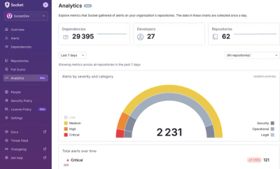
We’re excited to announce a powerful new capability in Socket: historical data and enhanced analytics.