react-user-card
Author: Brian Tomlinson darthlukan@gmail.com
Description
A user card heavily inspired by Google's Material Design
written as a ReactJS component.
TODO
Package for NPM/Bower/whatever the JS users are using nowadaysOptional color params for title background and title fontFix CSS inclusion, copying files from installation paths is janky- Better behavior on mobile screens, current media queries aren't really good enough
- Cleanups
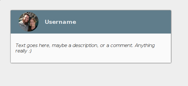
Screenshot
Usage
The card supports optional css object parameters as shown in the example below:
var React = require('react');
var Card = React.createFactory(require('react-user-card'));
var cardStl = {
backgroundColor: '#fafafa',
width: '30%',
height: '20%',
overflow: 'hidden',
boxShadow: '.25px .25px 5px .25px',
borderRadius: '2px 2px 2px 2px',
zIndex: 5
};
var headerStl = {
backgroundColor: '#901111',
padding: '1%',
color: '#eceff1',
position: 'relative'
};
var contentStl = {
color: 'rgb(0, 0, 0, 0.54)',
padding: '2%'
};
React.render(
Card(
{
userimg: 'http://www.gravatar.com/avatar/6a8561ee5706d17a4382a391720db523.png',
username: 'DarthLukan',
content: 'Dark Lord of the Sith.',
cardStyle: cardStl,
headerStyle: headerStl,
contentStyle: contentStl
}
), document.getElementById('app')
);
Calling the card with the example code above will render a card that looks like:
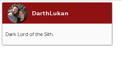
NOTE: Omitting the cardStyle, headerStyle, and contentStyle parameters will render the same
as the one in the "Screenshots" section of the README.
License
MIT, see LICENSE file


