Security News
Risky Biz Podcast: Making Reachability Analysis Work in Real-World Codebases
This episode explores the hard problem of reachability analysis, from static analysis limits to handling dynamic languages and massive dependency trees.
react-vh normalizes the CSS-unit vh. It sets a global CSS-variable with the current pixel-number of 1vh based on window.innerHeight.
(Mobile-)Browsers implement the vh-unit differently. To avoid layout-inconsistencies and janks, this hook provides a normalized value for vh stored in a global CSS-variable.
For a detailed explanation check out this article: https://css-tricks.com/the-trick-to-viewport-units-on-mobile/#article-header-id-0
Install all dependencies via yarn or npm.
yarn add react-vh react react-dom
Place the hook in a component, the higher in the component-tree the better.
import React from "react";
import useVH from "react-vh";

const MyComponent: React.FC = () => {
  useVH();
  return (
    <div>
      <h1>This is a Test!</h1>
    </div>
  );
};

export default MyComponent;
Then use it in your CSS by using calc and multiply by your desired percent-number. 1vh is the (optional) fallback.
.example-wrapper-of-100-vh {
  height: calc(var(--vh, 1vh) * 100);
}
.example-wrapper-of-50-vh {
  height: calc(var(--vh, 1vh) * 50);
}
Same procedure also works for vw:
.example-wrapper-of-100-vw {
  height: calc(var(--vw, 1vw) * 100);
}
.example-wrapper-of-50-vw {
  height: calc(var(--vw, 1vw) * 50);
}
If you want to use the complete viewport-size (browser-bar included), take --vh-total, which depends on window.outerHeight.
.example-wrapper-of-99-total-viewport-height {
  height: calc(var(--vh-total, 1vh) * 99);
}
If the width of your Layout is limited to a max-width and you can also limit the vw-value to a value, by passing an object with key maxWidth to useVH:
const MyComponent: React.FC = () => {
  useVH({ maxWidth: 2400 });
  return (
    <div>
      <h1>This is a Test!</h1>
    </div>
  );
};
react-vh adds two root CSS-variables to the html-tag and updates it on viewport-resize on desktop- or orientation-change on mobile-devices.
It differs mobile and desktop by checking the media-query pointer: coarse, which is not supported by older browsers. Checks like this are not completely reliable, so please report an issue, if you experience bugs.
<html style="--vh:6.67px; --vh-total:6.67px;">
  <head>
    <title>Test</title>
  </head>
  <body></body>
</html>
Every contribution is very much appreciated.
If you like react-vh, don't hesitate to star it on GitHub.
Licensed under the MIT License, Copyright © 2021-present Andreas Faust.
See LICENSE for more information.
1.1.1 (2021-08-12)
FAQs
Save correct vh in root-variable and use it in CSS.
The npm package react-vh receives a total of 278 weekly downloads. As such, react-vh popularity was classified as not popular.
We found that react-vh demonstrated a not healthy version release cadence and project activity because the last version was released a year ago. It has 1 open source maintainer collaborating on the project.
Did you know?

Socket for GitHub automatically highlights issues in each pull request and monitors the health of all your open source dependencies. Discover the contents of your packages and block harmful activity before you install or update your dependencies.

Security News
This episode explores the hard problem of reachability analysis, from static analysis limits to handling dynamic languages and massive dependency trees.

Security News
/Research
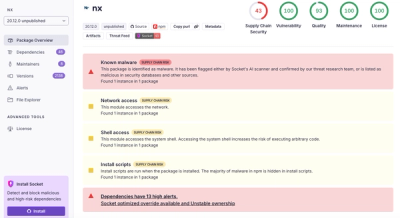
Malicious Nx npm versions stole secrets and wallet info using AI CLI tools; Socket’s AI scanner detected the supply chain attack and flagged the malware.

Security News
CISA’s 2025 draft SBOM guidance adds new fields like hashes, licenses, and tool metadata to make software inventories more actionable.