React Star Rating Component
ReactJS Star Rating is a flexible and customizable star rating component that supports both full and half-star ratings. It comes with features like custom labels, read-only mode, hover effects, and custom styling, making it perfect for any React project.
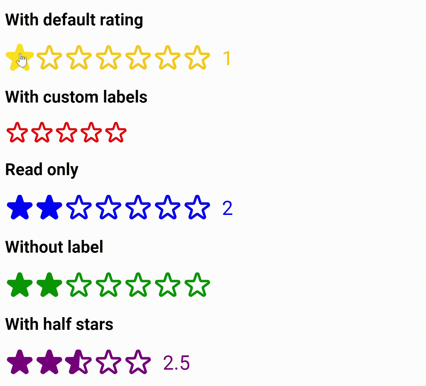
Demo
Installation
Using npm:
npm install reactjs-star-rating
Using yarn:
yarn add reactjs-star-rating
Features
- ⭐ Full and half-star ratings
- 🎨 Customizable colors and sizes
- 🏷️ Custom labels support
- 🔒 Read-only mode
- 📱 Responsive design
- 🎯 Callback functions
- 💅 Custom styling support
Basic Usage
import StarRating from "reactjs-star-rating";

function App() {
  return <StarRating defaultRating={3} maxRating={5} />;
}
Props
| maxRating | number | 5 | Maximum rating value |
| color | string | "#fcc419" | Color of the stars |
| size | number | 48 | Size of stars in pixels |
| className | string | "" | Custom CSS class name |
| defaultRating | number | 0 | Initial rating value |
| readOnly | boolean | false | Makes the rating read-only |
| showLabel | boolean | true | Shows/hides the rating label |
| labels | string[] | [] | Custom labels for ratings |
| onSetRating | function | undefined | Callback when rating changes |
| allowHalf | boolean | false | Enables half-star ratings |
Examples
Basic Star Rating
<StarRating defaultRating={3} maxRating={5} />
Half Star Rating
<StarRating
  allowHalf
  defaultRating={2.5}
  maxRating={5}
  color="purple"
  onSetRating={(rating) => console.log(rating)}
/>
Custom Labels
<StarRating
  maxRating={5}
  showLabel={true}
  labels={["Poor", "Fair", "Good", "Very Good", "Excellent"]}
  defaultRating={3}
  color="green"
/>
Read-only Rating
<StarRating defaultRating={4} maxRating={5} readOnly color="blue" />
With Callback Function
<StarRating
  maxRating={5}
  onSetRating={(rating) => {
    console.log(`Selected rating: ${rating}`);
  }}
/>
Custom Styling
<StarRating
  maxRating={5}
  className="custom-star-rating"
  size={32}
  color="#ff9800"
/>
Styling
You can customize the appearance using CSS by targeting the provided className:
.custom-star-rating {
background: #f5f5f5;
padding: 10px;
border-radius: 8px;
}
Contributing
Contributions are welcome! Please feel free to submit a Pull Request.
License
MIT © Varshil Shah
Made with ❤ by Varshil Shah from 🇮🇳


