Research
/Security News
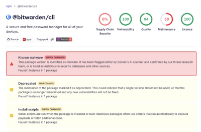
Bitwarden CLI Compromised in Ongoing Checkmarx Supply Chain Campaign
Bitwarden CLI 2026.4.0 was compromised in the Checkmarx supply chain campaign after attackers abused a GitHub Action in Bitwarden’s CI/CD pipeline.
Tourist Guide into your React Components
npm i -S reactour
# or
yarn add reactour
From v1.9.1 styled-components it isn't bundled into the package and is required styled-components@^4 and react@^16.3 due to the use of createRef, so:
npm i -S styled-components@^4.0.0
# or
yarn add styled-components@^4.0.0
Reactour is proud to be sponsored by Frigade, a developer tool for building better product onboarding: guided tours, getting started checklists, announcements, and more.
Dopt gives developers UI components and SDKs to build seamless onboarding and education experiences in minutes.
Add the Tour Component in your Application, passing the steps with the elements to highlight during the Tour.
import React from 'react'
import Tour from 'reactour'

class App extends Component {
  // ...

  render  (
    <>
      { /* other stuff */}
      <Tour
        steps={steps}
        isOpen={this.state.isTourOpen}
        onRequestClose={this.closeTour} />
    </>
  )
}

const steps = [
  {
    selector: '.first-step',
    content: 'This is my first Step',
  },
  // ...
]
Change
--reactour-accent(defaults to accentColor on IE) css custom prop to apply color in Helper, number, dots, etc
Type: string
Default: #007aff
Customize Badge content using
currentandtotalsteps values
Type: func
// example
<Tour badgeContent={(curr, tot) => `${curr} of ${tot}`} />
Content to be rendered inside the Helper
Type: node | elem
Custom class name to add to the Helper
Type: string
aria-labelattribute for the close button (for accessibility)
Type: string
Default: 'Close'
Close the Tour by clicking the Mask
Type: bool
Default: true
Disable interactivity with Dots navigation in Helper
Type: bool
Disable the ability to click or intercat in any way with the Highlighted element
Type: bool
Disable all keyboard navigation (next and prev step) when true, disable only selected keys when array
Type: bool | array(['esc', 'right', 'left'])
// example
<Tour disableKeyboardNavigation={['esc']} />
Function triggered each time current step change
Type: func
// example
<Tour
  getCurrentStep={(curr) => console.log(`The current step is ${curr + 1}`)}
/>
Programmatically change current step after the first render, when the value changes
Type: number
Custom class name to add to the element which is the overlay for the target element when
disableInteraction
Type: string
Tolerance in pixels to add when calculating if an element is outside viewport to scroll into view
Type: number
You know…
Type: bool
Required: true
Change Next button in last step into a custom button to close the Tour
Type: node
// example
<Tour lastStepNextButton={<MyButton>Done! Let's start playing</MyButton>} />
Custom class name to add to the Mask
Type: string
Extra Space between in pixels between Highlighted element and Mask
Type: number
Default: 10
Renders as next button navigation
Type: node
Overrides default
nextStepinternal function
Type: func
Do something after Tour is opened
Type: func
// example
<Tour onAfterOpen={(target) => (document.body.style.overflowY = 'hidden')} />
Do something before Tour is closed
Type: func
// example
<Tour onBeforeClose={(target) => (document.body.style.overflowY = 'auto')} />
Function to close the Tour
Type: func
Required: true
Renders as prev button navigation
Type: node
Overrides default
prevStepinternal function
Type: func
Beautify Helper and Mask with
border-radius(in px)
Type: number
Default: 0
Smooth scroll duration when positioning the target element (in ms)
Type: number
Default: 1
Offset when positioning the target element after scroll to it
Type: number
Default: a calculation to the center of the viewport
Show/Hide Helper Navigation buttons
Type: bool
Default: true
Show/Hide Helper Close button
Type: bool
Default: true
Show/Hide Helper Navigation Dots
Type: bool
Default: true
Show/Hide number when hovers on each Navigation Dot
Type: bool
Default: true
Show/Hide Helper Number Badge
Type: bool
Default: true
Starting step when Tour is open the first time
Type: number
Array of elements to highligt with special info and props
Type: shape
Required: true
steps: PropTypes.arrayOf(PropTypes.shape({
  'selector': PropTypes.string,
  'content': PropTypes.oneOfType([
    PropTypes.node,
    PropTypes.element,
    PropTypes.func,
  ]).isRequired,
  'position':PropTypes.oneOfType([
    PropTypes.arrayOf(PropTypes.number),
    PropTypes.oneOf(['top', 'right', 'bottom', 'left', 'center']),
  ]),
  'action': PropTypes.func,
  'style': PropTypes.object,
  'stepInteraction': PropTypes.bool,
  'navDotAriaLabel': PropTypes.string,
  'observe': PropTypes.string,
  'highlightedSelectors': PropTypes.array,
  'mutationObservables': PropTypes.array,
  'resizeObservables': PropTypes.array,
})),
const steps = [
  {
    selector: '[data-tour="my-first-step"]',
    content: ({ goTo, inDOM }) => (
      <div>
        Lorem ipsum <button onClick={() => goTo(4)}>Go to Step 5</button>
        <br />
        {inDOM && '🎉 Look at your step!'}
      </div>
    ),
    position: 'top',
    // you could do something like:
    // position: [160, 250],
    action: (node) => {
      // by using this, focus trap is temporary disabled
      node.focus()
      console.log('yup, the target element is also focused!')
    },
    style: {
      backgroundColor: '#bada55',
    },
    // Disable interaction for this specific step.
    // Could be enabled passing `true`
    // when `disableInteraction` prop is present in Tour
    stepInteraction: false,
    // Text read to screen reader software for this step's navigation dot
    navDotAriaLabel: 'Go to step 4',
    // Observe direct children DOM mutations of this node
    // If a child is added: the highlighted region is redrawn focused on it
    // If a child is removed: the highlighted region is redrawn focused on the step selector node
    observe: '[data-tour="observable-parent"]',
    // Array of selectors, each selected node will be included (by union)
    // in the highlighted region of the mask. You don't need to add the
    // step selector here as the default highlighted region is focused on it
    highlightedSelectors: ['[data-tour="highlighted-element"]'],
    // Array of selectors, addition/removal of a matching node will trigger a rerender
    // of the mask shape. Useful in combination with highlightedSelectors when highlighted
    // region of mask should be redrawn after a user action
    mutationObservables: ['[data-tour="mutable-element"]'],
    // Array of selectors, each selected node resize will triggered a rerender of the mask shape.
    // Useful in combination with highlightedSelectors when highlighted region of mask should
    // be redrawn after a user action. You should also add the selector in mutationObservables
    // if you want to track DOM addition/removal too
    resizeObservables: ['[data-tour="resizable-parent"]'],
  },
  // ...
]
Value to listen if a forced update is needed
Type: string
Delay time when forcing update. Useful when there are known animation/transitions
Type: number
Default: 1
Disable FocusLock component.
Type: bool
Default: false
To guarantee a cross browser behaviour we use body-scroll-lock.
Import the library
import { disableBodyScroll, enableBodyScroll } from 'body-scroll-lock'
Create the event handlers
disableBody = target => disableBodyScroll(target)
enableBody = target => enableBodyScroll(target)
Then assign them into the Tour props
<Tour
  {...props}
  onAfterOpen={this.disableBody}
  onBeforeClose={this.enableBody}
/>
FAQs
Tourist Guide into your React Components
The npm package reactour receives a total of 52,807 weekly downloads. As such, reactour popularity was classified as popular.
We found that reactour demonstrated a not healthy version release cadence and project activity because the last version was released a year ago. It has 1 open source maintainer collaborating on the project.
Did you know?

Socket for GitHub automatically highlights issues in each pull request and monitors the health of all your open source dependencies. Discover the contents of your packages and block harmful activity before you install or update your dependencies.

Research
/Security News
Bitwarden CLI 2026.4.0 was compromised in the Checkmarx supply chain campaign after attackers abused a GitHub Action in Bitwarden’s CI/CD pipeline.

Research
/Security News
Docker and Socket have uncovered malicious Checkmarx KICS images and suspicious code extension releases in a broader supply chain compromise.

Product
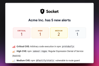
Stay on top of alert changes with filtered subscriptions, batched summaries, and notification routing built for triage.