ReactWindTS UI Library
Introduction
Welcome to our React Typescript library, a collection of UI components crafted using the TypeScript language and styled with the Tailwind CSS framework. Our primary goal is to provide a set of pre-built, easily customizable UI components that can be seamlessly integrated into various projects, accelerating development processes and reducing the workload for developers.
Key Features
- Efficiency: Speed up your project's development by utilizing our ready-to-use UI components.
- Customizability: Tailor components to your project's needs with minimal effort, thanks to the flexible design of Tailwind CSS.
- Integration: Our library is built on the popular Tailwind CSS framework, which, while widely used, often lacks extensive component libraries. This makes our components not only useful but also highly integrable within the Tailwind ecosystem.
Problem Solving
This library addresses two main challenges:
- UI Component Availability: It provides a robust set of pre-built UI components that developers can use immediately, avoiding the need to build from scratch.
- Framework Compatibility: By building this library on top of Tailwind CSS, we ensure that it integrates smoothly with one of the most popular CSS frameworks, enhancing both usability and accessibility.
Pre-Install Requirements
Before starting with the project, ensure that you have the following prerequisites:
-
React 18
- Ensure you have React version 18 installed. You can check the React documentation for installation instructions.
-
Tailwind CSS
Make sure these requirements are met before proceeding with the development.
Instalation instruction
First, install the package using npm:
npm i reactwindts
After installing the package, you need to integrate it into your project's Tailwind CSS configuration. Update your tailwind.config.js file by adding a new line in the content array to include reactwindts as follows:
export default {
content: [
"./index.html",
"./src/**/*.{js,ts,jsx,tsx}",
"./node_modules/reactwindts/**/*.{js,ts,jsx,tsx}",
],
};
This configuration ensures that Tailwind CSS correctly processes the styles used within the reactwindts components.
Usage
After installing reactwindts, you can start utilizing the components within your React projects. Here are the general steps and code snippets to help you get started quickly.
import { ComponentName } from "reactwindts";
Replace ComponentName with the actual component you wish to use, such as Button, Text, or any other available component.
Here is little example how it looks in code:
export default function ComponentName() {
  return (
    <div>
      <Input placeholder="Date" type="date" />
      <Button colorScheme="primary" size="md" variant="solid">
        Button
      </Button>
      <Text as="h2" size="lg" weight="normal">
        Text1
      </Text>
    </div>
  );
}
API Documentation
Now, the documentation for each existing component will provide details on its attributes and explanations for easier usage.
Button
This table describes the properties of the Button component, including their possible values and defaults.
| children | Content to be displayed inside the button. | None |
| size | Sets the size of the button. Options: "sm", "md", "lg", or null. | "md" |
| colorscheme | Defines the color scheme of the button. Options: "primary" or null. | "primary" |
Card
This table outlines the properties of the Card component, describing their types, possible values, and defaults.
| cardTitle | Title of the card, displayed at the top. | None |
| children | Content to be displayed inside the card. | None |
| imageSrc | Source URL for the card's image. | None |
| imageAlt | Alternative text for the card's image. | None |
| title | Main title of the card, often styled as a header. | None |
| colorscheme | Color theme of the card. Options: "light", "dark", or null. | None |
| border | Border style of the card. Options: "sm", "md", "lg", "none", or null. | None |
| padding | Padding inside the card. Options: "sm", "md", "lg", "none", or null. | None |
| shadow | Shadow effect on the card. Options: "sm", "md", "lg", "none", or null. | None |
| rounded | Rounded corners of the card. Options: "sm", "md", "lg", "none", or null. | None |
Checkbox
This table outlines the properties of the Checkbox component, describing their types and defaults.
| label (required) | The text label associated with the checkbox. | None |
| checkBoxSize | Size of the checkbox. Options: "sm", "md", "lg". | None |
Divider
This table outlines the properties of the Divider component, describing their types, possible values, and defaults.
| orientation | Direction of the divider: "horizontal", "vertical", or null. | None |
| children | Content to be displayed alongside the divider. | None |
| className | CSS class to apply custom styling. | None |
| color | Color of the divider. Options: "gray", "red", "blue", "green", or null. | None |
| width | Thickness of the divider. Options: "thin", "medium", "thick", or null. | None |
| lineType | Style of the divider line. Options: "solid", "dashed", "dotted", or null. | None |
Input
This table outlines the properties of the Input component, describing their types and defaults.
| type | Type of the input field. | None |
| placeholder | Placeholder text displayed in the input field. | None |
This table outlines the properties of the Pagination component, describing their types and defaults.
| totalItems (required) | Total number of items to paginate. | None |
| itemsPerPage (required) | Number of items displayed per page. | None |
| currentPage (required) | The current page number being viewed. | None |
| onPageChange (required) | Function called when the current page changes. It receives the new page number as a parameter. | None |
Star Rating Component
This table outlines the properties of the Star Rating component, describing their types and defaults.
| onRate (required) | Function that is called when a new rating is selected. It typically receives the new rating value as a parameter. | None |
| selectedColor (required) | Color of the stars that represent the selected rating. | None |
| unselectedColor (required) | Color of the stars that represent the unselected part of the rating. | None |
Table Component
This table outlines the properties of the Table component, describing their types and defaults.
| items (required) | An array of items (T[]) that will populate the table rows. Each item represents one row of data. | None |
| headers (required) | An array of objects defining the headers of the table. Each object should include a key, which is a property name of items in items, and a label, which is the string that will be displayed as the header. | None |
Text
This table outlines the properties of the Text component, describing their types and defaults.
| as | An override of the default HTML tag. Can also be another React component.
ElementType<any> | None |
| children | Content to be displayed within the text component. | None |
| emphasis | The emphasis style of the text. Options: "low", null. | None |
| size | The size of the text. Options: "sm", "base", "lg", "xl", "2xl", "3xl", null. | None |
| weight | The weight (thickness) of the text. Options: "thin", "normal", "medium", "semibold", "bold", "black", null. | None |
| align | The alignment of the text. Options: "left", "center", "right", null. | None |
| italic | Whether the text is italic. Options: boolean, null. | None |
| underline | Whether the text is underlined. Options: boolean, null. | None |
| ref | A ref to the text component. Type: any. | None |
Examples
Now it's time for examples. Code snippets and component previews will be provided to help you choose the component you want to use.
Button
This section provides an example of how to use the Button component, including an image for visual reference and the corresponding code snippet.

Figure 1: Example of the Button component.
Code Example
Here's the code to create a button with a primary color scheme, large size, and outline variant:
<Button colorscheme="primary" size="lg" variant="outline">
  Click!
</Button>
Card
This section provides an example of how to use the Card component, including an image for visual reference and the corresponding code snippet.
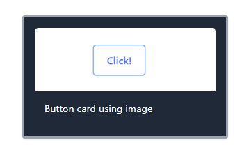
Figure 1: Example of the Card component.
Code Example
Here's the code to create a card with a large border, dark color scheme, medium padding, and shadow, including an image and a title:
<Card
  border="lg"
  cardTitle="Card with Image"
  colorscheme="dark"
  imageAlt="Placeholder Image"
  imageSrc="https://i.postimg.cc/25xZx2gL/Screenshot-2024-05-14-174645.png"
  padding="md"
  shadow="md"
>
  Button card using image
</Card>
rd>
Checkbox
This section provides an example of how to use the Checkbox component, including an image for visual reference and the corresponding code snippet.

Figure 1: Example of the Checkbox component.
Code Example
Here's the code to create a checkbox with a medium size and a label:
<Checkbox checkBoxSize="md" label="Check me" />
Divider
This section provides an example of how to use the Divider component, including an image for visual reference and the corresponding code snippet.

Figure 1: Example of the Divider component.
Code Example
Here's the code to create a horizontal divider with a red color, dashed line type, and medium width:
<Divider color="red" lineType="dashed" orientation="horizontal" width="medium">
  Horizontal
</Divider>
Input
This section provides an example of how to use the Input component, including an image for visual reference and the corresponding code snippet.

Figure 1: Example of the Input component.
Code Example
Here's the code to create a text input with a placeholder:
<Input placeholder="Insert text here" type="text" />
This section provides an example of how to use the Pagination component, including an image for visual reference and the corresponding code snippet.

Figure 1: Example of the Pagination component.
Code Example
Here's the code to create a pagination component with the current page set to 1, 10 items per page, a total of 150 items, and an empty function for the page change handler:
<Pagination
  currentPage={1}
  itemsPerPage={10}
  onPageChange={() => {}}
  totalItems={150}
/>
Table
This section provides an example of how to use the Table component, including an image for visual reference and the corresponding code snippet.
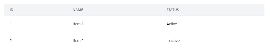
Figure 1: Example of the Table component.
Code Example
Here's the code to create a table with headers for ID, Name, and Status, and with items populated accordingly:
<Table
  headers={[
    {
      key: "id",
      label: "ID",
    },
    {
      key: "name",
      label: "Name",
    },
    {
      key: "status",
      label: "Status",
    },
  ]}
  items={[
    {
      id: 1,
      name: "Item 1",
      status: "Active",
    },
    {
      id: 2,
      name: "Item 2",
      status: "Inactive",
    },
  ]}
/>
Star Rating
This section provides an example of how to use the Star Rating component, including an image for visual reference and the corresponding code snippet.

Figure 1: Example of the Star Rating component.
Code Example
Here's the code to create a star rating component with custom selected and unselected colors, and an empty function for the rating handler:
<StarRating
  onRate={() => {}}
  selectedColor="rgba(143, 139, 21, 1)"
  unselectedColor="rgba(0, 0, 0, 1)"
/>
Text
This section provides an example of how to use the Text component, including an image for visual reference and the corresponding code snippet.

Figure 1: Example of the Text component.
Code Example
Here's the code to create a text component with center alignment, h1 tag, low emphasis, and size 3xl:
<Text align="center" as="h1" emphasis="low" size="3xl">
  Text placeholder
</Text>
License
This project is licensed under the MIT License. Permission is hereby granted, free of charge, to any person obtaining a copy of this software and associated documentation files (the "Software"), to deal in the Software without restriction, including without limitation the rights to use, copy, modify, merge, publish, distribute, sublicense, and/or sell copies of the Software, and to permit persons to whom the Software is furnished to do so, subject to the following conditions:
The above copyright notice and this permission notice shall be included in all copies or substantial portions of the Software.
THE SOFTWARE IS PROVIDED "AS IS", WITHOUT WARRANTY OF ANY KIND, EXPRESS OR IMPLIED, INCLUDING BUT NOT LIMITED TO THE WARRANTIES OF MERCHANTABILITY, FITNESS FOR A PARTICULAR PURPOSE AND NONINFRINGEMENT. IN NO EVENT SHALL THE AUTHORS OR COPYRIGHT HOLDERS BE LIABLE FOR ANY CLAIM, DAMAGES OR OTHER LIABILITY, WHETHER IN AN ACTION OF CONTRACT, TORT OR OTHERWISE, ARISING FROM, OUT OF OR IN CONNECTION WITH THE SOFTWARE OR THE USE OR OTHER DEALINGS IN THE SOFTWARE.
Changelog
0.0.26
0.0.25
- Fixed minor bugs
- Updated readme
0.0.24
- Component code refactoring
0.0.23
0.0.22
0.0.21
- Updated Licence
- Updated Keywords
- Updated Readme
0.0.20
- Added
Pagination component
- Added
Star Rating component
0.0.17
- Improved
Button component functionality
- Fixed alignment issues in
Card component
0.0.15
- Added
Divider component
- Enhanced
Input component for better validation
0.0.14
- Added
Checkbox component
- Improved styling for
Button component
0.0.13
- Introduced
Table component
- Added initial version of
Text component
0.0.12
- Added
Card component with image support
- Improved responsiveness for
Button component
0.0.11
- Initial release of
Button component with primary and secondary variants
0.0.1
- Project initialization
- Basic setup and configuration
Contact Information
For support, questions, or contributions regarding this project, please reach out through one of the following channels:
Contributions are always welcome, and detailed information on how to contribute can be found in our contributing guidelines.


