
Schema-driven React form system that builds entire UI — no HTML, no CSS.
Define once. Render anywhere. Fully typed, flexible, and lightning-fast.


Building forms in React often means juggling inputs, styles, and validation logic for every single field.
Red Form solves that by letting you define the schema only once — it automatically generates the UI, handles validation, manages state, and aligns everything perfectly.
You get developer clarity, instant layout, and zero boilerplate.
✨ Features
- 🧱 Schema-driven – define once, render everywhere
- 🎨 No HTML/CSS needed – automatic layout, focus, hover, spacing, and shadows
- ⚙️ Type-safe – fully typed schema and form instance with TypeScript
- 🧩 Extensible – inject custom components and validation logic
- 🚀 Optimized – minimal re-renders, built for scalability
- 💡 Declarative logic – dynamic visibility and conditional rendering
- 🪶 Extremely Lightweight – 80kb package saves hours of development
- 🪲 Low Code – less code means fewer bugs
- ✅ Built-in Validation – email, password, phone, date, and custom validators
- 🎯 20+ Field Types – text, email, password, select, multi-select, tags, date, time, image, and more
- 🪜 StepperForm – production-grade multi-step forms with visual progress indicators (see docs)
📦 Installation
npm install red-form
yarn add red-form
pnpm add red-form
🚀 Quick Start
import Form, { create } from "red-form";
import "red-form/dist/index.css";

const loginSchema = create({
  email: {
    label: "Email",
    component: "email",
    value: "",
    required: true
  },
  password: {
    label: "Password",
    component: "password",
    value: "",
    required: true,
    min: 8
  }
});

export default function LoginForm() {
  return <Form title="Welcome Back" description="Sign in to your account" schema={loginSchema} onSubmit={values => console.log(values)} />;
}
🧩 Example 1 — Create Product Form
A simple and elegant example showing Red Form's minimal setup.
import Form, { create } from "red-form";
import "red-form/dist/index.css";

const productForm = create({
  name: {
    label: "Product Name",
    component: "text",
    value: "",
    required: true,
    max: 100
  },
  category: {
    label: "Category",
    component: "select",
    options: ["Electronics", "Clothing", "Books", "Other"],
    value: "",
    required: true
  },
  price: {
    label: "Price ($)",
    component: "number",
    value: 0,
    min: 0,
    required: true
  },
  available: {
    label: "In Stock",
    component: "switch",
    value: true
  },
  description: {
    label: "Description",
    component: "textarea",
    value: "",
    span: 12,
    max: 500
  }
});

export default function CreateProduct() {
  return (
    <Form title="Add New Product" description="Fill in the details below to list your product." schema={productForm} onSubmit={values => alert(JSON.stringify(values, null, 2))} />
  );
}
⚙️ Example 2 — Dynamic Form + Custom Component
Dynamic field rendering and asynchronous file uploads — all declaratively.
import Form, { create } from "red-form";

const schema = create({
  title: {
    label: "Project Title",
    component: "text",
    value: "",
    required: true
  },
  category: {
    label: "Category",
    component: "select",
    options: ["Web", "Mobile", "AI", "IoT"],
    value: "",
    required: true
  },
  image: {
    label: "Cover Image",
    component: "image",
    value: "",
    onSelect: async file => {
      const reader = new FileReader();
      return new Promise(resolve => {
        reader.onloadend = () => resolve(reader.result as string);
        reader.readAsDataURL(file);
      });
    }
  },
  isPrivate: {
    label: "Private Project",
    component: "switch",
    value: false
  },
  password: {
    label: "Access Password",
    component: "password",
    value: "",
    hidden: form => !form.values.isPrivate
  },
  customFooter: {
    label: "Custom Note",
    component: "custom",
    inputBase: false,
    render: () => (
      <div style={{ padding: 12, background: "#f5f5f5", borderRadius: 6 }}>
        <small>All fields are auto-validated before submit ✅</small>
      </div>
    ),
    span: 12
  }
});

export default function ProjectForm() {
  return <Form title="New Project" description="Quickly configure and submit your project details." schema={schema} onSubmit={values => console.log("Submitted:", values)} />;
}
🪜 Example 4 — Multi-Step Registration with StepperForm
Production-grade stepper with visual progress, validation, and data persistence.
import { StepperForm, create } from "red-form";

export default function Registration() {
  return (
    <StepperForm
      steps={[
        {
          label: "Personal Info",
          description: "Basic details",
          schema: create({
            firstName: { label: "First Name", component: "text", value: "", required: true, span: 6 },
            lastName: { label: "Last Name", component: "text", value: "", required: true, span: 6 },
            email: { label: "Email", component: "email", value: "", required: true, span: 12 }
          })
        },
        {
          label: "Address",
          description: "Where you live",
          schema: create({
            street: { label: "Street Address", component: "text", value: "", required: true, span: 12 },
            city: { label: "City", component: "text", value: "", required: true, span: 6 },
            zip: { label: "Zip Code", component: "text", value: "", required: true, span: 6 }
          })
        },
        {
          label: "Preferences",
          description: "Optional settings",
          schema: create({
            newsletter: { label: "Subscribe to Newsletter", component: "switch", value: false, span: 12 }
          }),
          optional: true
        }
      ]}
      title="Create Account"
      description="Complete all steps to register"
      onComplete={data => {
        console.log("Registration data:", data);
        // Submit to API
      }}
      options={{
        showStepNumbers: true,
        allowSkip: true,
        validateOnNext: true
      }}
    />
  );
}
📖 Full StepperForm Documentation
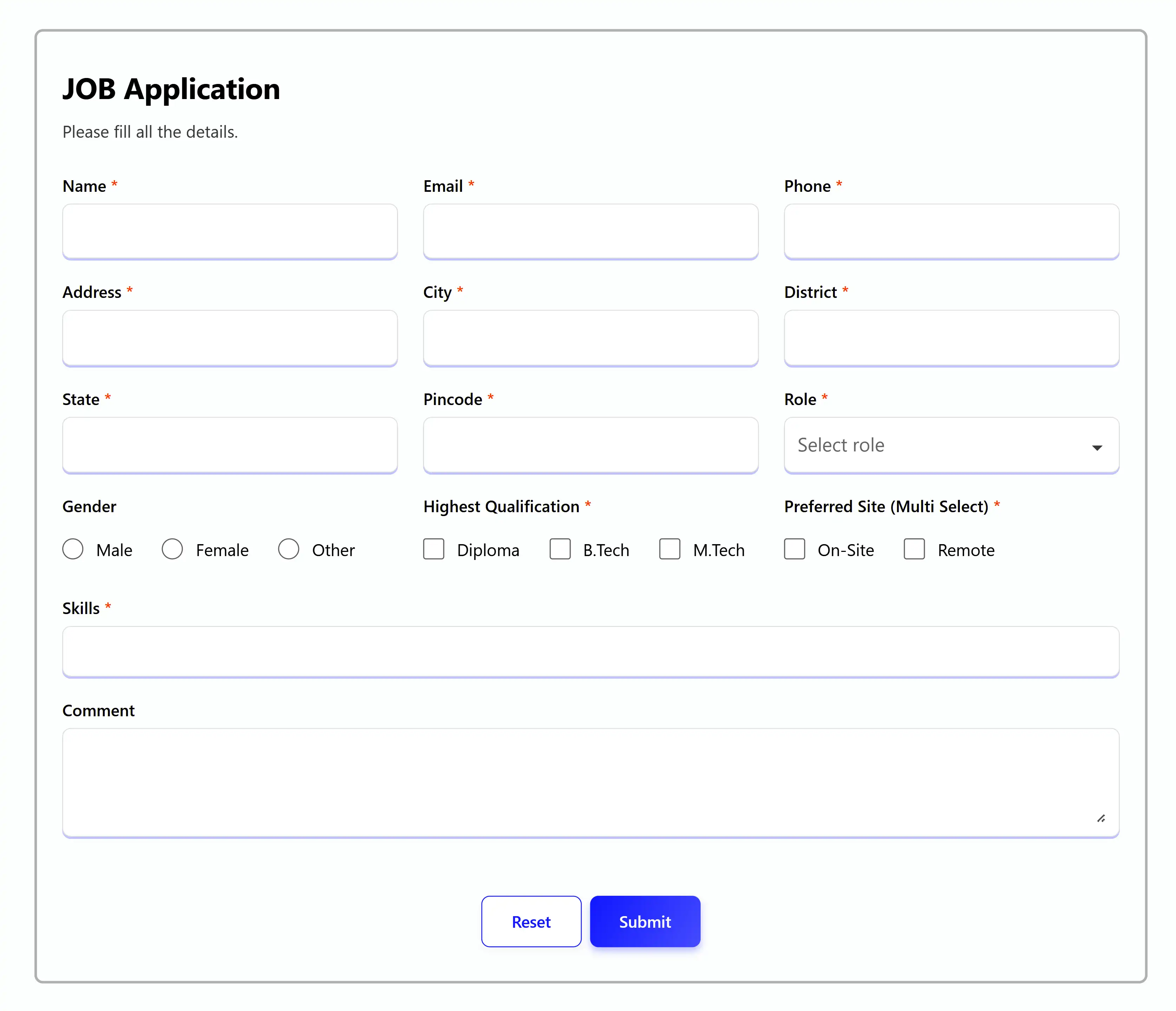
👩💼 Example 3 — Job Application Form (Real-world)
A large, production-grade form built entirely through schema configuration.
import Form, { create } from "red-form";
export default function JobApplication() {
const schema = create({
name: {
label: "Name",
component: "text",
value: "",
autoFill: "name",
required: true,
max: 50
},
email: {
label: "Email",
component: "email",
value: "",
autoFill: "email",
required: true
},
phone: {
label: "Phone",
component: "telephone",
value: "",
autoFill: "tel",
required: true,
min: 10,
max: 10
},
address: {
label: "Address",
component: "text",
value: "",
autoFill: "address-line1",
required: true,
span: 6
},
city: {
label: "City",
component: "text",
value: "",
autoFill: "address-level2",
required: true,
span: 6
},
state: {
label: "State",
component: "text",
value: "",
autoFill: "address-level1",
required: true,
span: 6
},
zipcode: {
label: "Pincode",
component: "text",
value: "",
autoFill: "postal-code",
required: true,
max: 6,
span: 6
},
role: {
label: "Role",
component: "search",
value: "",
options: ["Frontend", "Backend", "Sales", "Analyst", "Architect", "DBA"],
required: true
},
gender: {
label: "Gender",
component: "radio",
value: "",
options: ["Male", "Female", "Other"],
direction: "row"
},
qualification: {
label: "Highest Qualification",
component: "checkbox",
value: "",
options: ["Diploma", "B.Tech", "M.Tech"],
required: true
},
workMode: {
label: "Preferred Work Mode",
component: "checkbox",
value: [],
options: ["On-site", "Remote", "Hybrid"],
required: true
},
skills: {
label: "Skills",
component: "multi-select",
value: [],
span: 12,
options: [
{ label: "React", value: "react" },
{ label: "Angular", value: "angular" },
{ label: "Node.js", value: "node" },
{ label: "PHP", value: "php" }
],
required: true
},
comment: {
label: "Additional Comments",
component: "textarea",
value: "",
span: 12,
max: 500
}
});
return (
<Form
title="Job Application"
description="Please fill all the details carefully."
schema={schema}
onSubmit={values => console.log(values)}
options={{
validateOn: ["change", "blur", "submit"]
}}
/>
);
}
🧩 Components
💎 Common Props (Available in all components)
{
label: string;
required?: boolean;
placeholder?: string;
helperText?: ReactNode;
information?: string;
disabled?: boolean;
span?: 1 | 2 | 3 | 4 | 5 | 6 | 7 | 8 | 9 | 10 | 11 | 12;
validate?: ({ field, props, form }) => string[];
hidden?: boolean | ((form) => boolean);
adorment?: {
start?: ReactNode;
end?: ReactNode;
};
}
🛡️ Custom Validation
const schema = create({
  website: {
    component: "text",
    label: "Website URL",
    value: "",
    validate: ({ field, props, form }) => {
      const errors: string[] = [];
      const value = form.values[field];
      if (value && !value.startsWith("http")) {
        errors.push(`${props.label} must start with "http".`);
      }
      return errors;
    }
  }
});
📝 Field Types
🗒️ Text
{
component: "text";
value: string;
autoFill?: AutoFillField;
min?: number;
max?: number;
}
📧 Email
{
component: "email";
value: string;
}
🔑 Password
{
component: "password";
value: string;
min?: number;
max?: number;
}
🔢 Number
{
component: "number";
value: number | "";
min?: number;
max?: number;
step?: number;
fraction?: number;
}
📞 Telephone
{
component: "telephone";
value: number;
min?: number;
max?: number;
}
🖹 TextArea
{
component: "textarea";
value: string;
min?: number;
max?: number;
span?: 12;
}
🔽 Select
{
  component: "select";
  value: string | number;
  options: string[] | { label: string; value: string | number }[];
}
🔍 Search (Searchable Dropdown)
{
  component: "search";
  value: string | number;
  options: string[] | { label: string; value: string | number }[];
  reloadOptions?: boolean;
}
🏷️ Tags
{
component: "tags";
value: string[];
}
🔽🔍 Multi-Select
{
component: "multi-select";
value: string[];
options: { label: string; value: string }[];
onClick?: ({ field, props, form, item }) => void;
}
✅ Checkbox (Single)
{
component: "checkbox";
value: string | undefined;
options: string[] | { label: string; value: string }[];
direction?: "row" | "column";
}
✅✅ Checkbox (Multiple)
{
component: "checkbox";
value: string[];
options: string[] | { label: string; value: string }[];
direction?: "row" | "column";
}
🔴 Radio
{
  component: "radio";
  value: string | number;
  options: string[] | { label: string; value: string | number }[];
  direction?: "row" | "column";
}
⇆ Switch
{
  component: "switch";
  value: boolean;
}
─•──── Range (Slider)
{
  component: "range";
  value: number;
  min: number;
  max: number;
  step?: number;
}
🌈 Color
{
component: "color";
value: `#${string}`;
}
🌄 Image
{
component: "image";
value: string;
onSelect: (file: File) => Promise<string>;
}
📅 Date
{
  component: "date";
  value: "" | "YYYY-MM-DD";
  min?: string;
  max?: string;
}
📅🕘 DateTime
{
  component: "datetime";
  value: "" | "YYYY-MM-DDTHH:mm";
  min?: string;
  max?: string;
}
🕘 Time
{
  component: "time";
  value: "" | "HH:mm";
  min?: string;
  max?: string;
}
📅 Week
{
  component: "week";
  value: "" | "YYYY-Www";
  min?: string;
  max?: string;
}
🗓 Month
{
  component: "month";
  value: "" | "YYYY-MM";
  min?: string;
  max?: string;
}
✨ Custom
{
component: "custom";
value?: any;
inputBase?: boolean;
render: ({ field, props, form, error, sx }) => ReactNode;
}
🎨 Styling with sx
Customize any part of the form with inline styles:
<Form
  schema={schema}
  sx={{
    container: { maxWidth: 800, margin: "0 auto" },
    title: { color: "#e11d48", fontWeight: 700 },
    description: { color: "#64748b" },
    submitButton: { background: "#e11d48", color: "#fff" },
    resetButton: { borderColor: "#e11d48", color: "#e11d48" },
    inputBase: { borderRadius: 8, borderColor: "#ddd" },
    inputLabel: { fontWeight: 600 },
    errorItem: { fontSize: 12 }
  }}
/>
Available sx properties:
container, title, description, formactionArea, submitButton, resetButton, deleteButtoninputContainer, inputLabelContainer, inputLabelinputBase, helperText, errorList, errorItemtooltipContainer, tooltipInfoIcon, tooltip
⚙️ Form Options
<Form
schema={schema}
options={{
validateOn: ["change", "blur", "submit"],
reInitialization: true,
onValidate: () => console.log("Validating..."),
buttons: {
submit: "Create Account",
reset: "Clear Form",
delete: "Remove"
},
infoIcon: <CustomIcon />
}}
onSubmit={(values, form) => console.log(values)}
onChange={(values, form) => console.log("Changed:", values)}
onError={(errors, form) => console.log("Errors:", errors)}
onBlur={(touched, form) => console.log("Touched:", touched)}
onDelete={form => console.log("Delete clicked")}
/>
🔧 useForm Hook
For advanced use cases, use the useForm hook directly:
import { useForm, create } from "red-form";

function CustomForm() {
  const schema = create({
    name: { label: "Name", component: "text", value: "" }
  });

  const form = useForm(schema, values => {
    console.log("Submit:", values);
  });

  return (
    <div>
      <input {...form.getFieldProps("name")} />
      <button onClick={form.handleSubmit}>Submit</button>
    </div>
  );
}
🐛 Recent Bug Fixes
Version 1.x.x includes 14 critical bug fixes:
- ✅ Fixed email validation
- ✅ Fixed password min/max validation
- ✅ Fixed telephone validation
- ✅ Fixed date/time range validation
- ✅ Fixed TagsField crash on undefined values
- ✅ Fixed duplicate tags prevention
- ✅ Fixed MultiSelectField search by label
- ✅ Improved error messages
- ✅ Fixed type safety issues
See BUG_FIXES.md for complete details.
📚 Documentation
🤝 Contributing
Contributions are welcome! Please feel free to submit a Pull Request.
- Fork the repository
- Create your feature branch (
git checkout -b feature/AmazingFeature)
- Commit your changes (
git commit -m 'Add some AmazingFeature')
- Push to the branch (
git push origin feature/AmazingFeature)
- Open a Pull Request
🧑💻 Author
Manish Gun
💻 GitHub • 🌐 Website • ✉️ mail.cto.manish@gmail.com
🪪 License
MIT © Manish Gun
⭐ Show Your Support
If you find this project helpful, please give it a ⭐️ on GitHub!


