Product
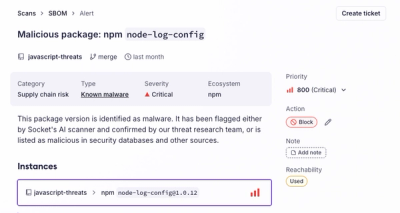
Introducing the Alert Details Page: A Better Way to Explore Alerts
Socket's new Alert Details page is designed to surface more context, with a clearer layout, reachability dependency chains, and structured review.
riot-md-checkbox
Advanced tools
Material Design animated Checkbox input, for Riot.js

bower install riot-md-checkbox
or
npm install riot-md-checkbox
<md-checkbox
  label="Checkbox Label 1" input="group[]" check="true">
</md-checkbox>

<md-checkbox
  label="Checkbox Label 2" input="group[]" text="Additional display text.">
</md-checkbox>

<md-checkbox
  label="Checkbox Label 3" input="group[]" value="Custom 'on' value">
</md-checkbox>
With Bower, you have access to the pre-compiled and non-compiled files.
Pre-compiled:
<!-- mount point -->
<md-checkbox></md-checkbox>

<!-- include riot.js only -->
<script src="//cdn.jsdelivr.net/riot/2.3/riot.min.js"></script>
<!-- include the precompiled js file -->
<script src="bower_components/riot-md-checkbox/md-checkbox.js"></script>
<!-- standard `mount()` -->
<script>
  riot.mount('*');
</script>
In-browser Compilation:
<!-- mount point -->
<md-checkbox></md-checkbox>

<!-- include source tag -->
<script src="bower_components/riot-md-checkbox/md-checkbox.tag" type="riot/tag"></script>
<!-- include riot.js and the compiler -->
<script src="//cdn.jsdelivr.net/riot/2.3/riot+compiler.min.js"></script>
<!-- standard `mount()` -->
<script>
  riot.mount('*');
</script>
A pre-compiled version, including styles, is exported as the NPM module. This means you may require() the module directly.
// templates.js (example file)
var riot = require('riot');

require('riot-md-checkbox');

riot.mount('*');
Note: You do not need to require
riotwithin the same file. However,riotmust be loaded and accessible before your template file(s) -- a simple global will work.
Type:
string
Default:null
Required:false
Serves as both the id and name attributes of your <input /> element.
Type:
string
Default:null
Required:false
Sets the checked attribute. Passing any string will be handled as true!
Type:
string
Default:1
Required:false
The value of the input when checked.
Type:
string
Default:null
Required:false
The main label / text for your input.
Type:
string
Default:null
Required:false
Additional text to display; appears within a <small> element.
Type:
function
Default:null
Required:false
An additional callback when toggling a checkbox, regardless of checked status.
MIT © Luke Edwards
FAQs
Material Design animated Checkbox input, for Riot.js
We found that riot-md-checkbox demonstrated a not healthy version release cadence and project activity because the last version was released a year ago. It has 1 open source maintainer collaborating on the project.
Did you know?

Socket for GitHub automatically highlights issues in each pull request and monitors the health of all your open source dependencies. Discover the contents of your packages and block harmful activity before you install or update your dependencies.

Product
Socket's new Alert Details page is designed to surface more context, with a clearer layout, reachability dependency chains, and structured review.

Product
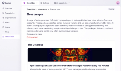
Campaign-level threat intelligence in Socket now shows when active supply chain attacks affect your repositories and packages.

Research
Malicious PyPI package sympy-dev targets SymPy users, a Python symbolic math library with 85 million monthly downloads.