React Native custom Alert and Prompt
Spanish documentation
Installation
npm i rn-custom-alert-prompt
or
yarn add rn-custom-alert-prompt
Configuration and personalization
- Import and use AlertContainer
Now, we need to import the AlertContainer component. Normally you would do this in your input file, such as App.js or App.tsx.
import {AlertContainer} from 'rn-custom-alert-prompt';

export const App = () => {
  return (
    <View>
      <AlertContainer />
      {/* Rest of your app code */}
    </View>
  );
};
Properties
You can send some optional properties in order to customize your alerts.
animationType | Choose the animation with which your alert will appear. | 'none' | 'fade' | 'slide' | 'none' |
appearance | Choose between light and dark appearance for your alert. | 'light' | 'dark' | Device appearance |
personalTheme | Completely customize how your alert will appear. | PersonalTheme | PersonalTheme defaults |
theme | Choose the theme between iOS and Android for your alert. | 'ios' | 'android' | Auto detect OS |
PersonalTheme Props
backgroundColor | Background color around your alert. | rgba color | rgba(0,0,0,0.4) | rgba(0,0,0,0.4) |
backgroundInputColor | Background color of the text input in the prompt. | string | Light: '#1C1C1E' | Dark: '#FFFFFF' | Light: 'transparent' | Dark: 'transparent' |
cardBackgroundColor | Alert color. | string | Light: '#EEEEEE' | Dark: '#222222' | Light: '#282F2C'| Dark: '#FFFFFF' |
descriptionColor | Color of your alert description. | string | Light: '#000000' | Dark: '#FFFFFF' | Light: '#000000'| Dark: '#FFFFFF' |
inputBorderColor | Border color for your prompt input. | string | Light: '#C3C3C3' | Dark: '#616161' | Light: '#00D982'| Dark: '#00D982' |
inputColor | Color of the text input in the prompt. | string | Light: '#000000' | Dark: '#FFFFFF' | Light: '#000000' | Dark: '#FFFFFF' |
lineColor | Color of the line border to separate buttons -iOS Only-. | string | Light: '#C3C3C3' | Dark: '#616161' | N/A |
placeholderColor | Color of the placeholder in the prompt. | string | Light: '#C3C3C3' | Dark: '#666666' | Light: '#C3C3C3' | Dark: '#666666' |
textButtonColor | Color of the text on the buttons. | string | Light: '#4F87FF' | Dark: '#4F87FF' | Light: '#00D982' | Dark: '#00D982' |
titleColor | Color of your alert title. | string | Light: '#000000' | Dark: '#FFFFFF' | Light: '#000000' | Dark: '#FFFFFF' |
Usage
Alert component
This is the typical system alert with the big difference that we can customize it and it returns a promise with the user's response.
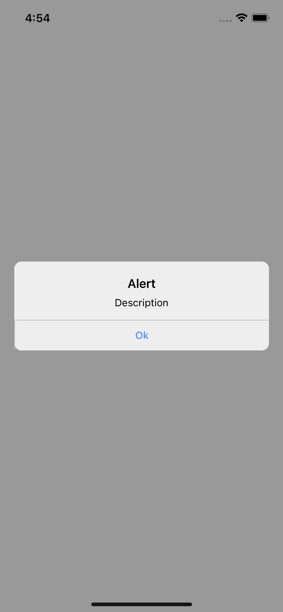
Basic usage
import {Text, TouchableOpacity, View} from  'react-native';
import {Alert} from  'rn-custom-alert-prompt';

const  MyComponent  = () => {

 const handlePress = () => {
   Alert.alert('Title', 'Description')
 }

 return (
   <View>
	  <TouchableOpacity onPress={handlePress} >
        <Text>Open Alert</Text>
      </TouchableOpacity>
   </View>
 )
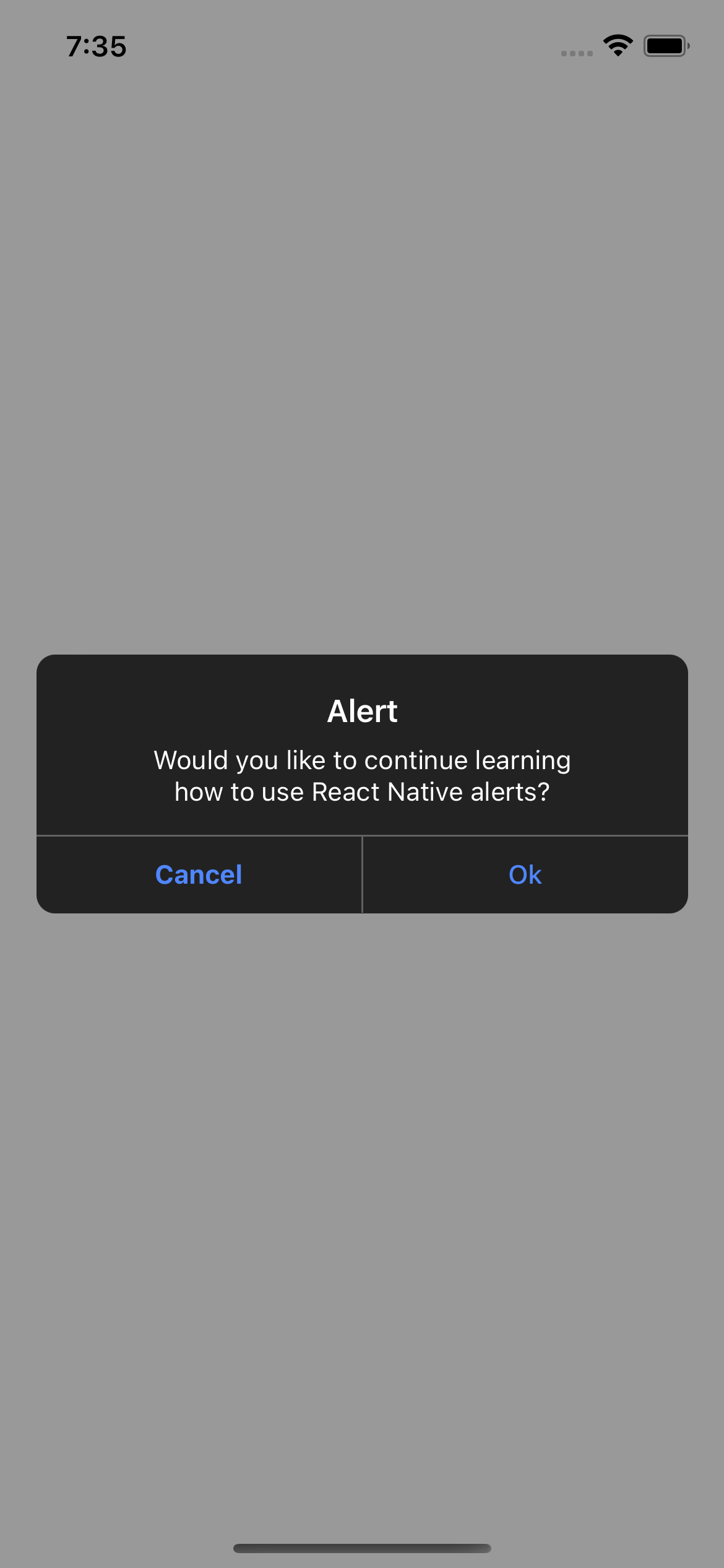
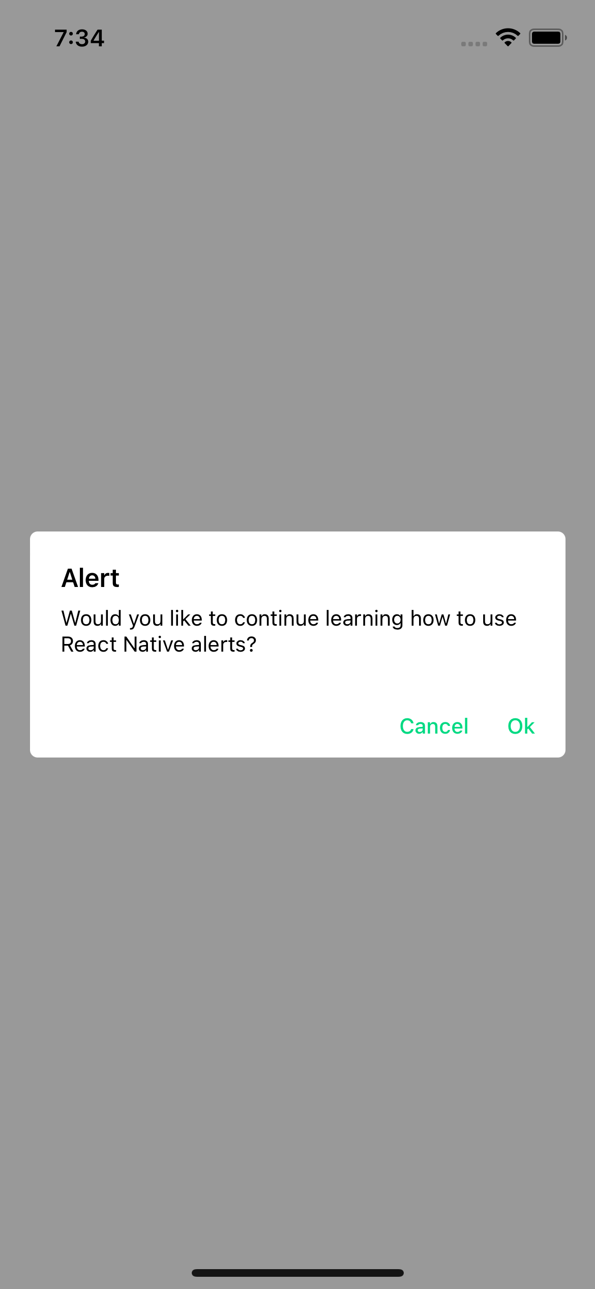
Examples
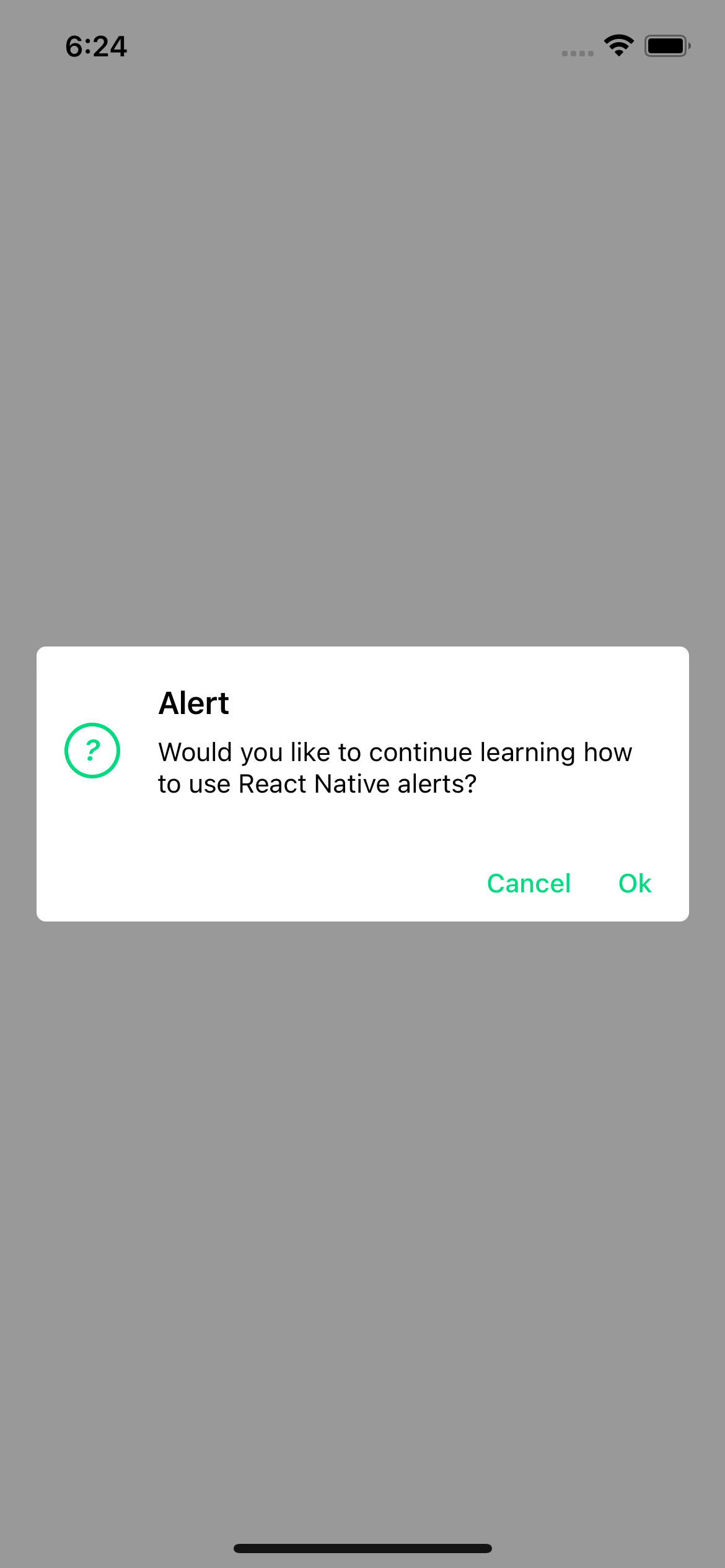
iOS
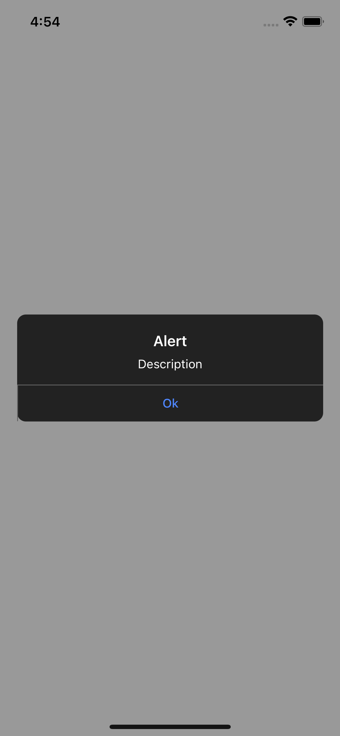
Android
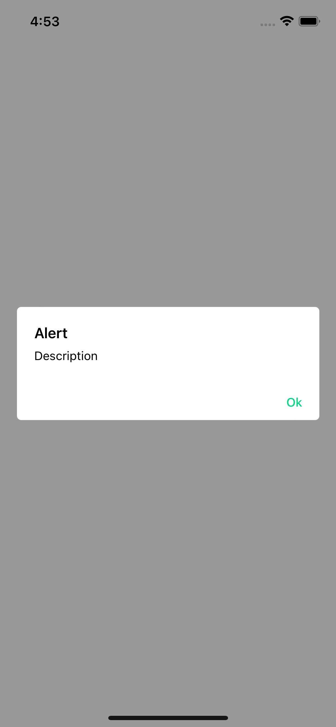
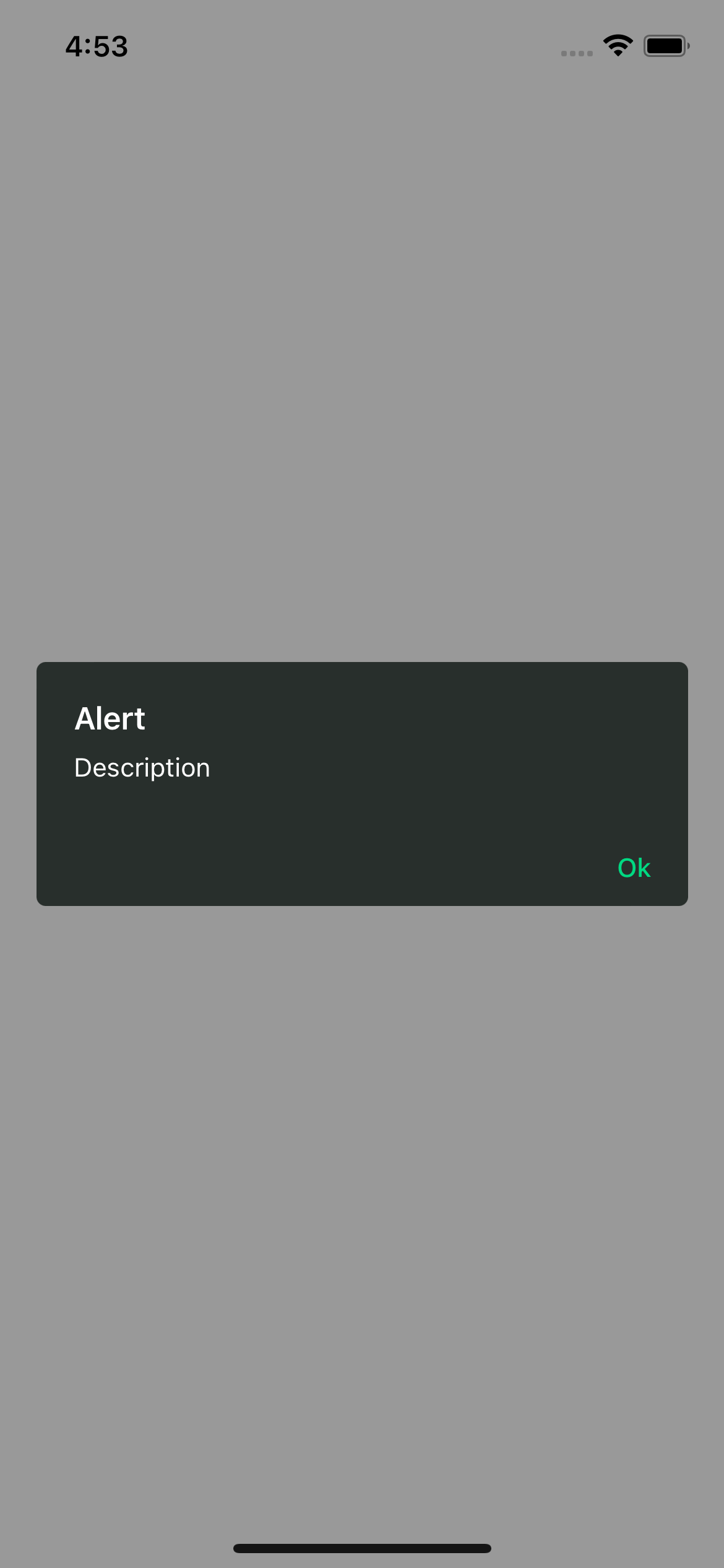
With props
import {Text, TouchableOpacity, View} from 'react-native';
import {Alert} from 'rn-custom-alert-prompt';
const MyComponent = () => {
const handlePress = async () => {
const response = await Alert.alert({
title: 'Alert',
description: 'Would you like to continue learning how to use React Native alerts?',
showCancelButton: true,
})
console.log(response)
}
return (
<View>
<TouchableOpacity onPress={handlePress} >
<Text>Open Alert</Text>
</TouchableOpacity>
</View>
)
Alert props
title | Title for your alert. | string | Yes |
buttons | Personalized buttons for your alert. | Button[] | No |
cancelColorText | Cancel button text color. | string | No |
cancelText | Cancel button text. | string | No |
confirmColorText | Confirm button text color. | string | No |
confirmText | Confirm button text. | string | No |
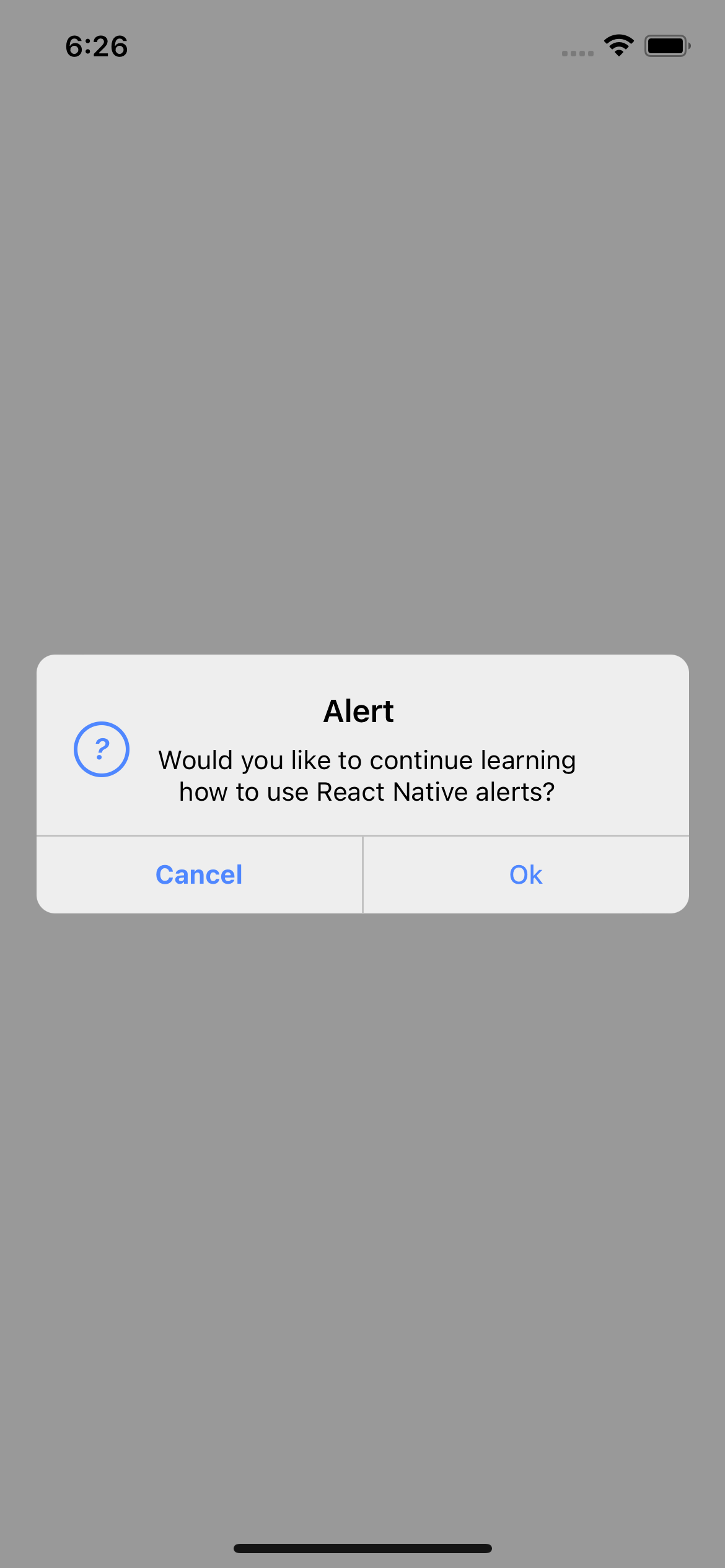
icon | Alert icon. | 'error' | 'info' | 'success' | 'question' | No |
iconColor | Icon color. | string | No |
showCancelButton | Shows the cancel button. | boolean | No |
Button props
text | Button text. | string | Yes |
textStyle | Personalized styles for your text button. | StyleProp<TextStyle> | No |
onPress | Function that is executed when the button is pressed. | function | No |
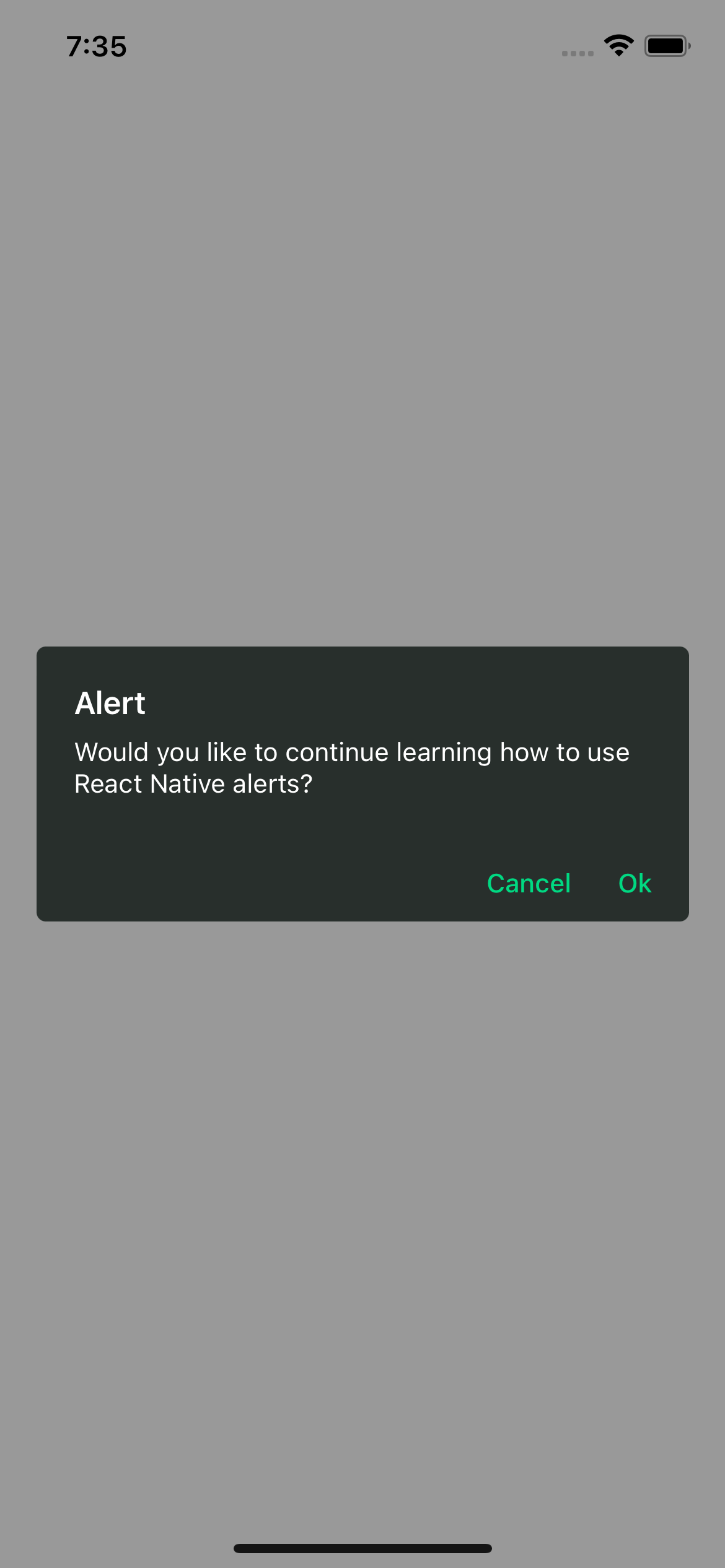
Examples
iOS

Android
With icon
Prompt
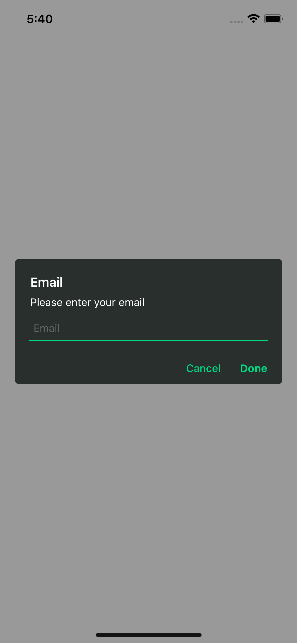
Prompt component
This is the system prompt that we can use in iOS, with the big difference that we can customize it and it returns a promise with the text entered by the user.
Basic usage
import {Text, TouchableOpacity, View} from 'react-native';
import {Alert} from 'rn-custom-alert-prompt';
const MyComponent = () => {
const handlePress = () => {
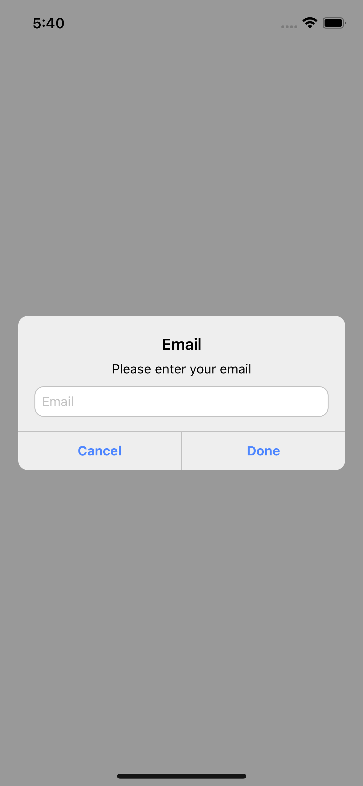
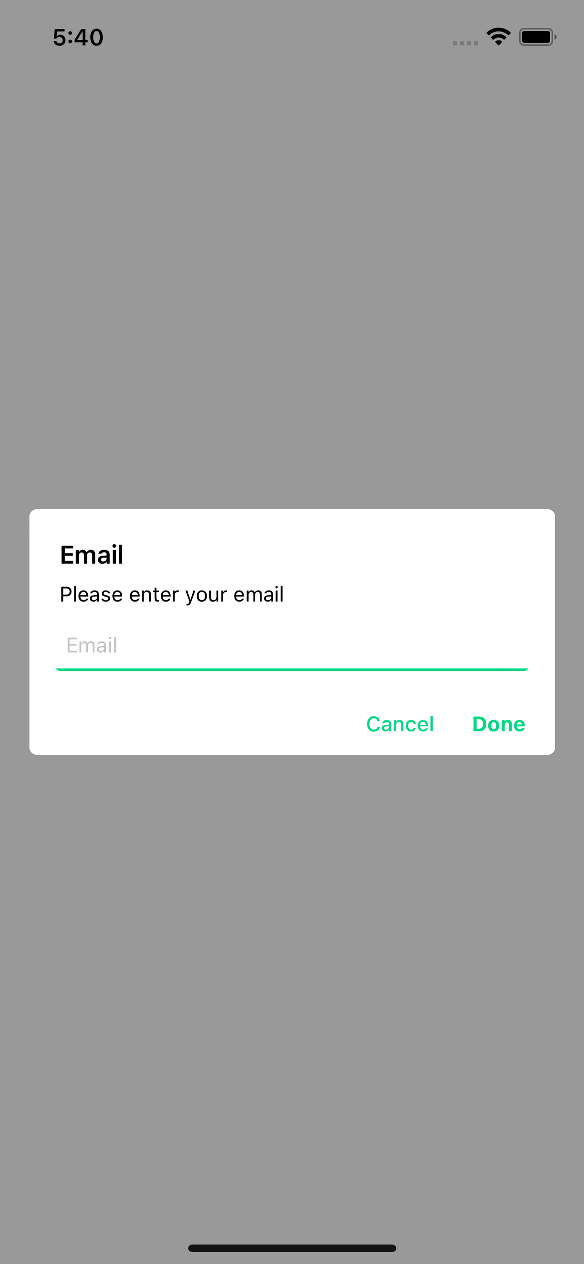
const response = await Alert.prompt('Email', 'Please enter your email');
console.log(response)
}
return (
<View>
<TouchableOpacity onPress={handlePress} >
<Text>Open Prompt</Text>
</TouchableOpacity>
</View>
)
Examples
iOS
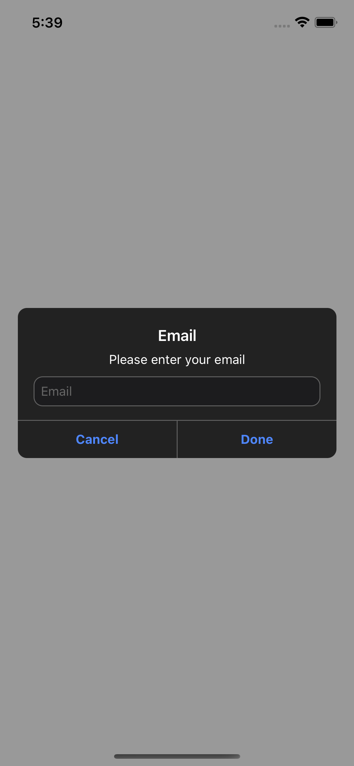
Android
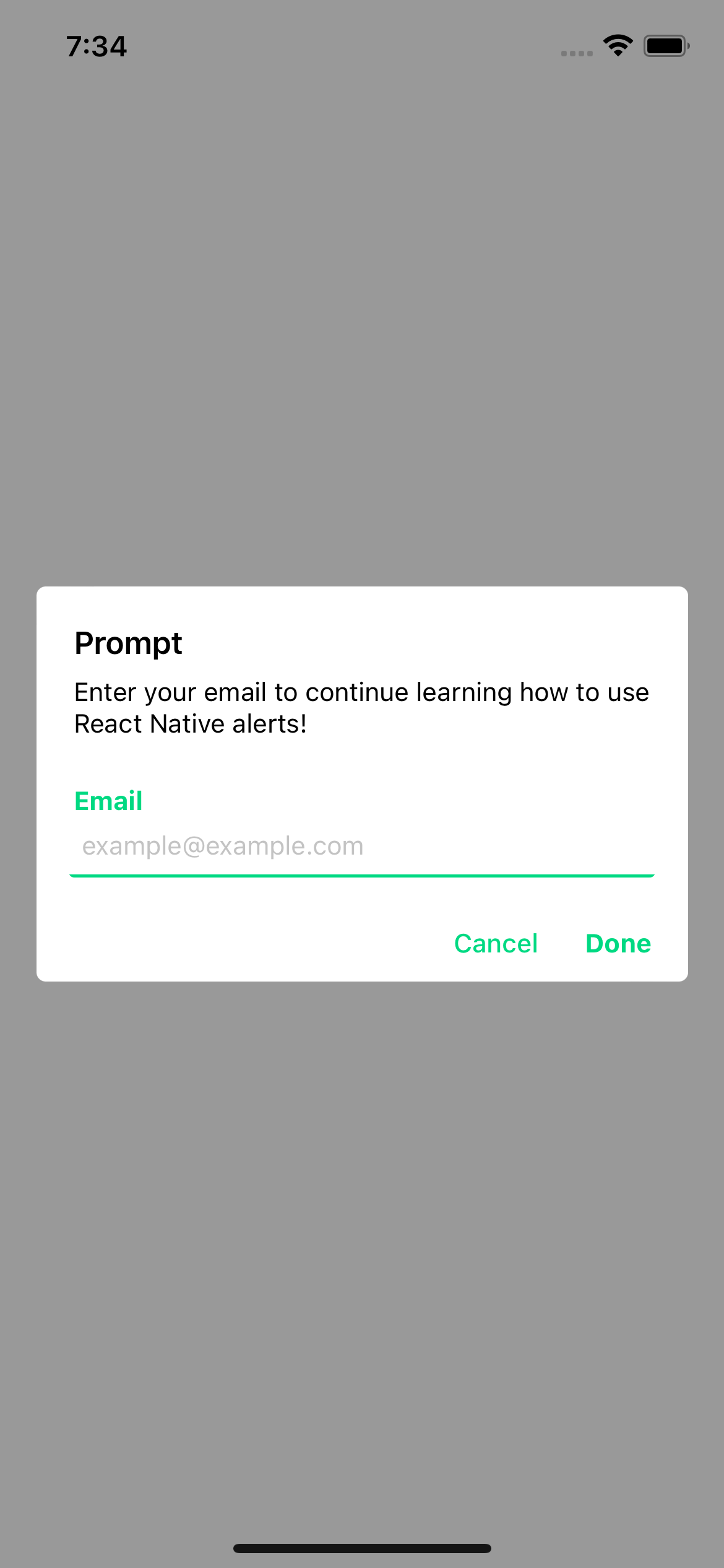
With props
import {Text, TouchableOpacity, View} from 'react-native';
import {Alert} from 'rn-custom-alert-prompt';
const MyComponent = () => {
const handlePress = async () => {
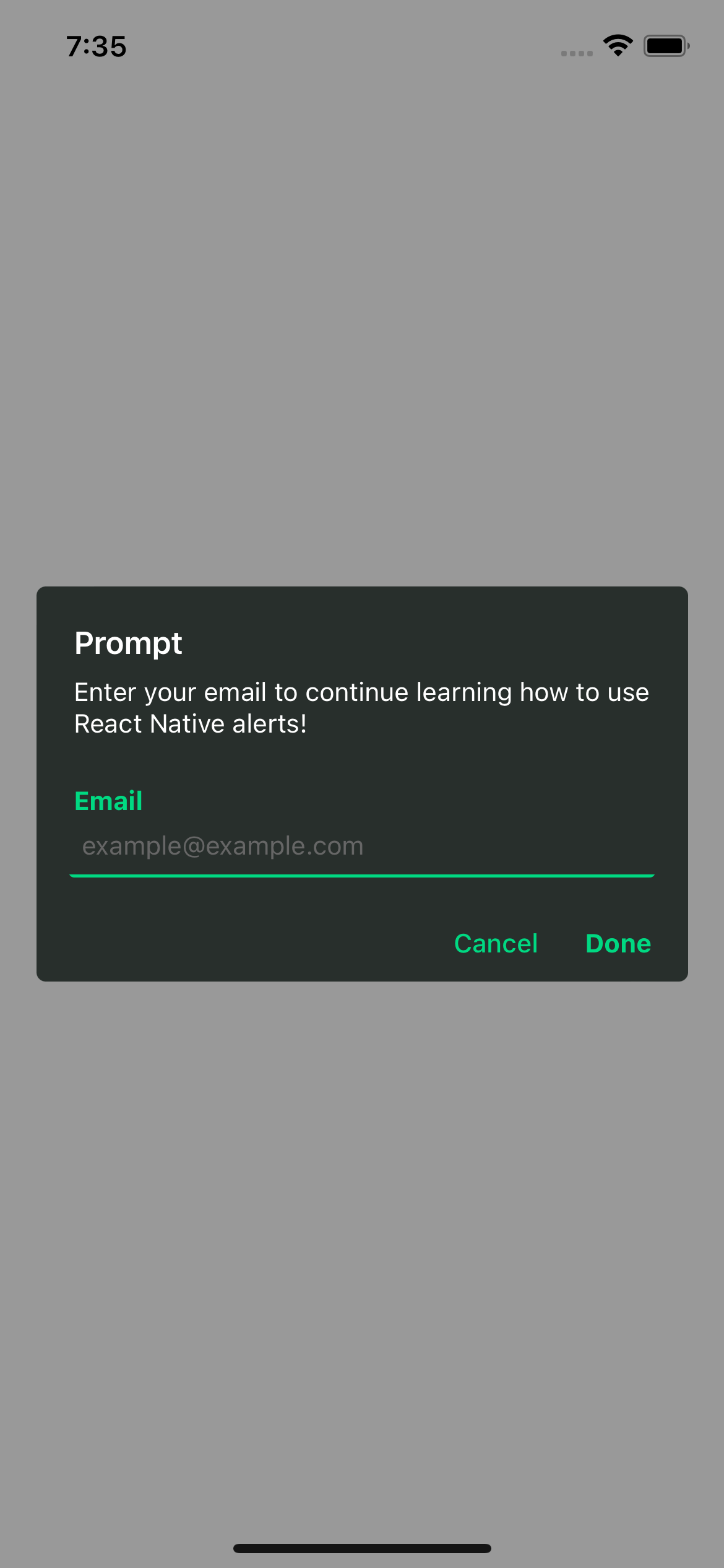
const response = await Alert.prompt({
title: 'Prompt',
description: 'Enter your email to continue learning how to use React Native alerts!',
label: 'Email',
placeholder: 'example@example.com',
})
console.log(response)
}
return (
<View>
<TouchableOpacity onPress={handlePress} >
<Text>Open Prompt</Text>
</TouchableOpacity>
</View>
)
Prompt props
title | Title for your alert. | string | Yes |
cancelColorText | Cancel button text color. | string | No |
cancelText | Cancel button text. | string | No |
confirmColorText | Confirm button text color. | string | No |
confirmText | Confirm button text. | string | No |
label | Label for input -Android only-. | string | No |
placeholder | Input placeholder. default: title value | string | No |
Examples
iOS
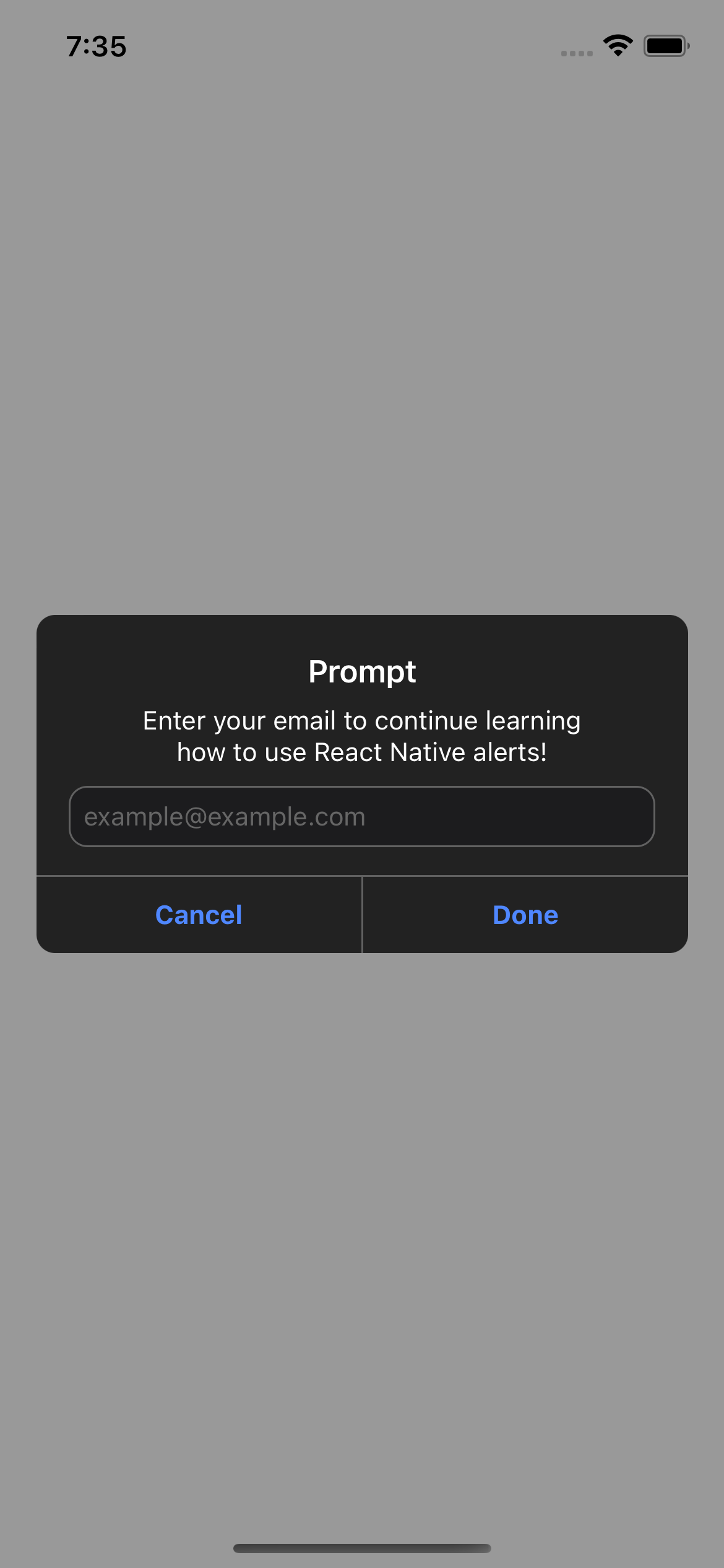
Android
License
This project is licenced under the MIT License.


