

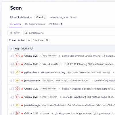
Product
Introducing Webhook Events for Pull Request Scans
Add real-time Socket webhook events to your workflows to automatically receive pull request scan results and security alerts in real time.
By Jeppe Hasseriis - Oct 22, 2025
rn-skeleton-loading
Advanced tools
I'm piecing together a detailed description for a "rn-skeleton-loading." The goal is to highlight this tool's simplicity and effectiveness in creating animated skeleton components for better user experience during content loading, aiming for a clear, enga

A lightweight, customizable, and fast skeleton loading component for React Native.
🔥 Supports shimmer animation & fully customizable UI elements.

You can install it using npm or yarn:
npm install rn-skeleton-loading
or
yarn add rn-skeleton-loading
Here is a basic usage example:
import { Skeleton } from "rn-skeleton-loading";
import { View } from "react-native";

export default function App() {
  return (
    <View style={{ padding: 20 }}>
      <Skeleton width="90%" height={20} />
      <Skeleton width="80%" height={20} />
      <Skeleton width={60} height={60} borderRadius={30} />
    </View>
  );
}
You can customize the skeleton UI by passing props.
| Prop | Type | Default | Description |
|---|---|---|---|
width | string / number | "100%" | Width of the skeleton |
height | number | 20 | Height of the skeleton |
borderRadius | number | 4 | Border radius |
color | string | "#E0E0E0" | Base color of the skeleton |
highlightColor | string | "#F5F5F5" | Shimmer effect color |
duration | number | 1000 | Duration of shimmer animation in ms |
import { Skeleton } from "rn-skeleton-loading";
import { View } from "react-native";

export default function ProfileSkeleton() {
  return (
    <View style={{ padding: 20 }}>
      <Skeleton width={100} height={100} borderRadius={50} color="#ccc" />
      <Skeleton width="80%" height={15} style={{ marginTop: 10 }} />
      <Skeleton width="60%" height={15} style={{ marginTop: 5 }} />
    </View>
  );
}
✔ Lightweight & Fast
✔ Customizable Width, Height, Colors, Border Radius
✔ Works on both iOS & Android
✔ Supports shimmer animation
✔ Perfect for loading states in lists, cards, and avatars
Pull requests are welcome! If you find a bug or have a feature request, please open an issue. 🚀
MIT License – You are free to use, modify, and distribute this package!
🎉 💡 Happy Coding 🚀😊 😎
FAQs
I'm piecing together a detailed description for a "rn-skeleton-loading." The goal is to highlight this tool's simplicity and effectiveness in creating animated skeleton components for better user experience during content loading, aiming for a clear, enga
We found that rn-skeleton-loading demonstrated a healthy version release cadence and project activity because the last version was released less than a year ago. It has 0 open source maintainers collaborating on the project.
Did you know?

Socket for GitHub automatically highlights issues in each pull request and monitors the health of all your open source dependencies. Discover the contents of your packages and block harmful activity before you install or update your dependencies.
Product
Add real-time Socket webhook events to your workflows to automatically receive pull request scan results and security alerts in real time.

Research
The Socket Threat Research Team uncovered malicious NuGet packages typosquatting the popular Nethereum project to steal wallet keys.
Product
A single platform for static analysis, secrets detection, container scanning, and CVE checks—built on trusted open source tools, ready to run out of the box.