rsuite-table
A React table component.


Features
- Support virtualized.
- Support fixed header, fixed column.
- Support custom adjustment column width.
- Support for custom cell content.
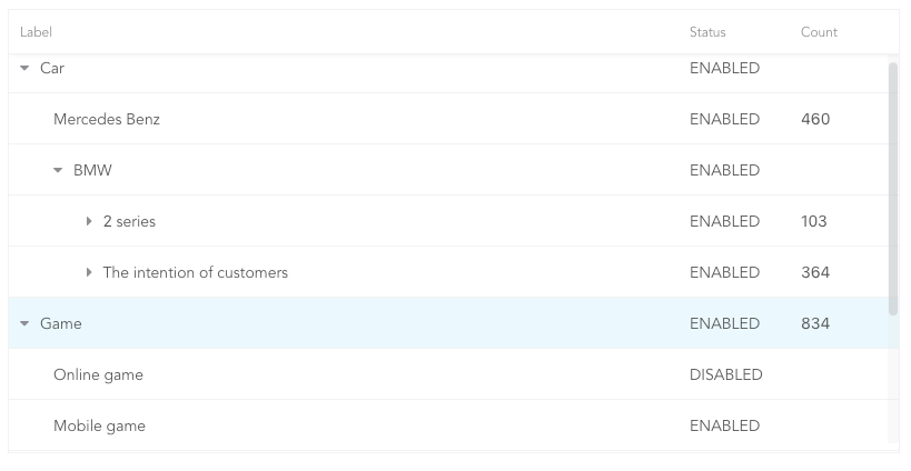
- Support for displaying a tree form.
- Support for sorting.
- Support for expandable child nodes
- Support for RTL
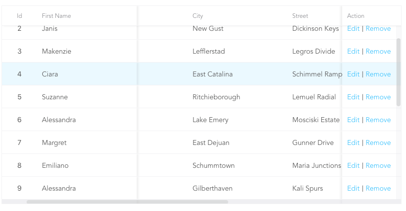
Preview
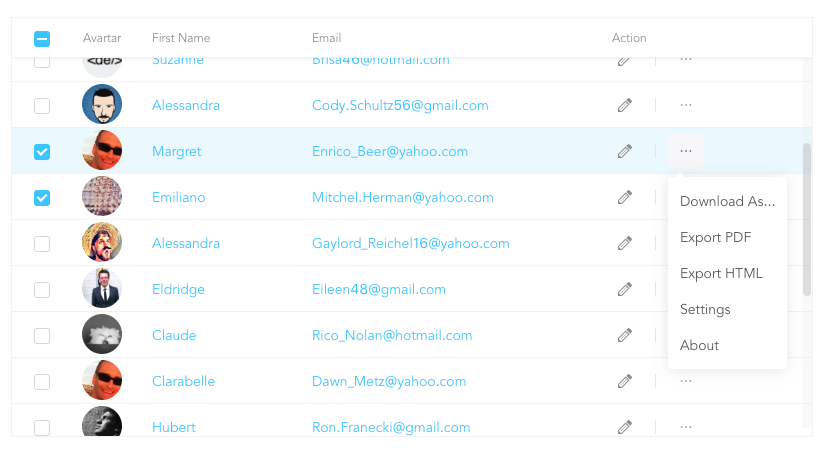
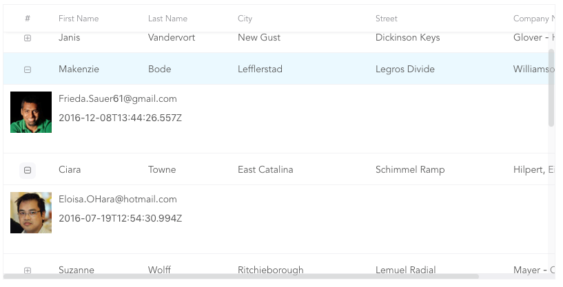
More Examples
Install
npm i rsuite-table
yarn add rsuite-table
pnpm add rsuite-table
Usage
import { Table, Column, HeaderCell, Cell } from 'rsuite-table';
import 'rsuite-table/lib/less/index.less';
const dataList = [
{ id: 1, name: 'a', email: 'a@email.com', avartar: '...' },
{ id: 2, name: 'b', email: 'b@email.com', avartar: '...' },
{ id: 3, name: 'c', email: 'c@email.com', avartar: '...' }
];
const ImageCell = ({ rowData, dataKey, ...rest }) => (
<Cell {...rest}>
<img src={rowData[dataKey]} width="50" />
</Cell>
);
const App = () => (
<Table data={dataList}>
<Column width={100} sortable fixed resizable>
<HeaderCell>ID</HeaderCell>
<Cell dataKey="id" />
</Column>
<Column width={100} sortable resizable>
<HeaderCell>Name</HeaderCell>
<Cell dataKey="name" />
</Column>
<Column width={100} sortable resizable>
<HeaderCell>Email</HeaderCell>
<Cell>
{(rowData, rowIndex) => {
return <a href={`mailto:${rowData.email}`}>{rowData.email}</a>;
}}
</Cell>
</Column>
<Column width={100} resizable>
<HeaderCell>Avartar</HeaderCell>
<ImageCell dataKey="avartar" />
</Column>
</Table>
);
API
<Table>
| affixHeader | boolean, number | Affix the table header to a specified position on the page. |
| affixHorizontalScrollbar | boolean, number | Affix the table's horizontal scrollbar to a specified position on the page. |
| autoHeight | boolean | Automatically expand the table's height based on the number of data rows, without displaying a vertical scrollbar. |
| bordered | boolean | Display table borders. |
| cellBordered | boolean | Display cell borders. |
| children | (components: { Cell, HeaderCell, Column, ColumnGroup }) => ReactNode | ReactNode | Render props that receive parameterized Cell, HeaderCell, Column, and ColumnGroup components, making TypeScript usage more convenient. |
| data * | RowData[] | Table data. |
| defaultExpandAllRows | boolean | Expand all rows by default. |
| defaultExpandedRowKeys | string[] | Specify the initially expanded rows by their keys. |
| defaultSortType | 'desc' | 'asc' | Default sort type. |
| expandedRowKeys | string[] | Specify the expanded rows by their keys (Controlled). |
| fillHeight | boolean | Force the table's height to match its parent container's height. Cannot be used with autoHeight. |
| headerHeight | number (40) | Table header height. |
| height | number (200) | Table height. |
| hover | boolean (true) | Enable row hover effects. |
| isTree | boolean | Display the table as a tree structure. |
| loading | boolean | Show a loading state. |
| locale | {emptyMessage: string, loading: string} | Messages for empty data and loading states. |
| maxHeight | number | Maximum table height. |
| minHeight | number (0) | Minimum table height. |
| onExpandChange | (expanded: boolean, rowData: RowData) => void | Callback function triggered when a tree table node is expanded or collapsed. |
| onRowClick | (rowData: RowData, event: SyntheticEvent) => void | Callback function triggered when a row is clicked, returning the row data. |
| onRowContextMenu | (rowData: RowData, event: SyntheticEvent) => void | Callback function triggered by a context menu event, returning the row data. |
| onScroll | (scrollX: object, scrollY: object) => void | Callback function for scrollbar scroll events. |
| onSortColumn | (dataKey: string, sortType: string) => void | Callback function triggered when the sort order changes, returning the column key and sort type. |
| renderEmpty | (info: ReactNode) => ReactNode | Custom content to display when there is no data. |
| renderLoading | (loading: ReactNode) => ReactNode | Custom content to display during data loading. |
| renderRow | (children?: ReactNode, rowData?: RowData) => ReactNode | Custom row element renderer. |
| renderRowExpanded | (rowData?: RowData) => ReactNode | Custom content to display in an expanded row. |
| renderTreeToggle | (icon: ReactNode, rowData: RowData, expanded: boolean) => ReactNode | Custom toggle icon for expanding/collapsing tree nodes. |
| rowClassName | string, (rowData: RowData, rowIndex: number) => string | Add an optional custom class name to rows. |
| rowExpandedHeight | number (100), (rowData?: RowData) => number | Set the height of expanded rows. |
| rowHeight | number (46), (rowData: RowData) => number | Row height. |
| rowKey | string ('key') | Unique key for each row, derived from data. |
| rtl | boolean | Enable right-to-left layout. |
| shouldUpdateScroll | boolean, (event) => ({ x, y }) (true) | Determine whether to update the scroll position after the table size changes. |
| showHeader | boolean (true) | Display the table header. |
| sortColumn | string | Name of the column to sort by. |
| sortType | 'desc' | 'asc' | Sort type (Controlled). |
| virtualized | boolean | Efficiently render large datasets. |
| width | number | Table width. |
| wordWrap | boolean | 'break-all' | 'break-word' | 'keep-all' | Control text wrapping behavior within cells. |
<Column>
| align | 'left' | 'center' | 'right' | Sets the text alignment within the column. |
| colSpan | number | Merges cells within the column when the dataKey value for the merged cells is null or undefined. |
| fixed | boolean | 'left' | 'right' | Fixes the column to the left or right side of the table. |
| flexGrow | number | Automatically adjusts the column width based on the value of flexGrow. Cannot be used with resizable and width properties. |
| fullText | boolean | Displays the full text of the cell content when the mouse hovers over it. |
| minWidth | number (200) | Sets the minimum width of the column when using flexGrow. |
| onResize | (columnWidth?: number, dataKey?: string) => void | Callback function triggered after the column width changes. |
| resizable | boolean | Allows the column width to be resized. |
| rowSpan | (rowData: RowData) => number | Merges rows in the specified column. |
| sortable | boolean | Enables sorting on the column. |
| treeCol | boolean | Indicates that the column is part of a tree structure. |
| verticalAlign | 'top' | 'middle' | 'bottom' | Sets the vertical alignment of content within the column. |
| width | number | Specifies the column width. |
sortable is used to define whether the column is sortable, but depending on what key sort needs to set a dataKey in Cell.
The sort here is the service-side sort, so you need to handle the logic in the ' Onsortcolumn ' callback function of <Table>, and the callback function returns sortColumn, sortType values.
<ColumnGroup>
| align | 'left' | 'center' | 'right' | Sets the text alignment within the column group. |
| fixed | boolean | 'left' | 'right' | Fixes the column group to the left or right side of the table. |
| groupHeaderHeight | number | Sets the height of the group header. The default value is 50% of the table's headerHeight. |
| header | ReactNode | Specifies the content to be displayed as the group header. |
| verticalAlign | 'top' | 'middle' | 'bottom' | Sets the vertical alignment of content within the column group. |
| children | ReactNode | Specifies the content to be displayed in the column header. |
| renderSortIcon | (sortType) => ReactNode | Customizes the rendering of sort icons on column headers. |
<Cell>
| children | ReactNode | ((rowData: RowData, rowIndex?: number) => ReactNode) | The content to be displayed in the cell. |
| dataKey | string | The key used for data binding and sorting. |
| rowData | RowData | The data associated with the current row. |
| rowIndex | number | The index of the current row. |
There are three ways to use <Cell>, as follows:
- 1.Associate the fields in the data with
dataKey.
<Column width="{100}" align="center">
  <HeaderCell>Name</HeaderCell>
  <Cell dataKey="name" />
</Column>
const NameCell = ({ rowData, ...props }) => (
  <Cell {...props}>
    <a href={`mailto:${rowData.email}`}>{rowData.name}<a>
  </Cell>
);

<Column width={100} align="center">
  <HeaderCell>Name</HeaderCell>
  <NameCell />
</Column>
- 3.Customize functions directly within the
<Cell>.
<Column width={100} align="center">
  <HeaderCell>Name</HeaderCell>
  <Cell>
    {(rowData, rowIndex) => {
      return <a href={`mailto:${rowData.email}`}>{rowData.name}</a>;
    }}
  </Cell>
</Column>
(For nested data read this: https://github.com/rsuite/rsuite-table/issues/158)
Table ref
| body | HTMLDivElement | The body element of the table |
| root | HTMLDivElement | The root element of the table |
| scrollLeft | (left:number)=>void | Set the number of pixels for horizontal scrolling of the table |
| scrollPosition | {top:number,left:number} | The scroll position of the table |
| scrollTop | (top:number)=>void | Set the number of pixels for vertical scrolling of the table |
Type safety
We can pass generic type parameters to Table, Cell etc. for better type-safety when using typescript.
Passing a render prop to Table is recommended when using TS, as this will ensure that
the right generic type parameter is automatically propagated to the Cell component.
const products: Product[] = [{ name: 'Pineapple' }];

<Table<Product, string> ref={table} data={products}>
  {({ Column, HeaderCell, Cell }) => (
    <>
      <Column>
        <HeaderCell>Name</HeaderCell>
        {/* No need for passing explicit type parameter to Cell */}
        <Cell>{row => row.name}</Cell>
      </Column>
    </>
  )}
</Table>;
In fact, the type parameter from table can be inferred from the data passed to it, so the type parameter to Table can also be skipped.
const products: Product[] = [{ name: 'Pineapple' }];

<Table data={products}>
  {({ Column, HeaderCell, Cell }) => (
    <>
      <Column>
        <HeaderCell>Name</HeaderCell>
        <Cell>{row => row.name}</Cell>
      </Column>
    </>
  )}
</Table>;
When writing reusable components, it is recommended to make your components generic as well. For example:
interface ImageCellProps<TKey extends string, TRow extends Record<TKey, string>> {
rowData: TRow;
dataKey: TKey;
}
const ImageCell = <TKey extends string, TRow extends Record<TKey, string>>({
rowData,
dataKey,
...rest
}: ImageCellProps<TKey, TRow>) => (
<Cell<TRow, TKey> {...rest}>
<img src={rowData[dataKey]} width="50" />
</Cell>
);


