Security News
Package Maintainers Call for Improvements to GitHub’s New npm Security Plan
Maintainers back GitHub’s npm security overhaul but raise concerns about CI/CD workflows, enterprise support, and token management.
sass-media-queries
Advanced tools

Sass Importable Media Queries. Can be used as a class, or as a mixin. All mixins and classes are prepended with smq__. This follows BEM naming methodologies.
Github Pages Demo. NPM Module Link.
Install to the project:
npm install --save sass-media-queries
Simply import at the top of a sass file to get going:
@import './node_modules/sass-media-queries/index.scss';

// Other Sass down here...
Before we can start using the library, let's understand the defined widths:
$mobile-width: 320px;
$tablet-width: 768px;
$desktop-width: 1024px;
$large-desktop-width: 1440px;
With these in mind, here are the available classes and mixins:
@include smq__mobile or class="smq__mobile" - Show only on mobile devices
@include smq__tablet or class="smq__tablet" - Show only on tablet devices
@include smq__desktop or class="smq__desktop" - Show only on desktop devices
@include smq__large-desktop or class="smq__large-desktop" - Show only on large-desktop devices
@include smq__all-mobile or class="smq__all-mobile" - Show only on mobile and tablet devices
@include smq__not-mobile or class="smq__not-mobile" - Show only on desktop and large desktop devices
@include smq__all-desktop or class="smq__all-desktop" - Show only on desktop and large desktop devices
@include smq__not-desktop or class="smq__not-desktop" - Show only on mobile and tablet devices
In HTML on an element:
<div class="smq__all-mobile">
  🖥️ You won't see me on desktop! 🖥️
</div>
As a mixin in Sass:
.my-awesome-class {
  display: block;
  color: blue;

  @include smq__not-mobile {
    display: none;
  }
}
Clone the project:
git clone https://github.com/torch2424/sass-media-queries.git
Install devDependencies:
npm install
Run the command: npm run build, to continuously see changes to the index.html in the docs folder. Sorry, but no livereload or watch is set up for this (Since it's just a simple little package).
FAQs
Sass Importable Media Queries
We found that sass-media-queries demonstrated a not healthy version release cadence and project activity because the last version was released a year ago. It has 1 open source maintainer collaborating on the project.
Did you know?

Socket for GitHub automatically highlights issues in each pull request and monitors the health of all your open source dependencies. Discover the contents of your packages and block harmful activity before you install or update your dependencies.

Security News
Maintainers back GitHub’s npm security overhaul but raise concerns about CI/CD workflows, enterprise support, and token management.

Product
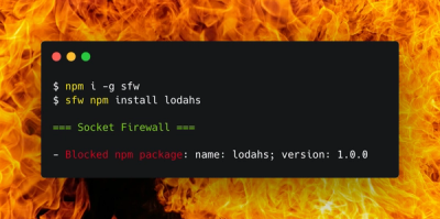
Socket Firewall is a free tool that blocks malicious packages at install time, giving developers proactive protection against rising supply chain attacks.

Research
Socket uncovers malicious Rust crates impersonating fast_log to steal Solana and Ethereum wallet keys from source code.