Simple Circular Progress Bar
Simple Circular Progress Bar is a web component to nicely show the progress in a circular manner.
Installation
Use npm to install the package
npm install simple-circular-progress
Usage
Add below code to main.ts file
import { defineCustomElements } from 'simple-circular-progress';
.....
.....
defineCustomElements(window); // call the function here at the end of the file
import in your page module.ts file i.e. in your home.module.ts
import { CUSTOM_ELEMENTS_SCHEMA } from '@angular/core';
import 'simple-circular-progress';
@NgModule({
imports: [CommonModule, FormsModule, IonicModule, HomePageRoutingModule],
declarations: [HomePage],
schemas: [CUSTOM_ELEMENTS_SCHEMA],
})
export class HomePageModule {}
In your html(view)
<div style="width: 150px; height: 150px">
      <simple-circular-progress
        hide-label="false"
        progress-percentage="40"
        progress-color="#3f51b5"
        progress-stroke-color="#f1f1f1"
        label="<strong>40% <br/> New </strong>"
        label-font-size="1.3rem">
      </simple-circular-progress>
</div>
Customization in the html element attribute
hide-label="false/true" // Hide label in the center of progress bar
progress-percentage="40" // Progress bar percentage only number
progress-color="#3f51b5" // Any valid color code to color progress
progress-stroke-color="#f1f1f1" // Any valid color code to color circular stroke
label="<strong>40% <br/> New </strong>" // Any valid html to be display in center of progress bar
label-font-size="1.3rem" // Any valid font size to apply label
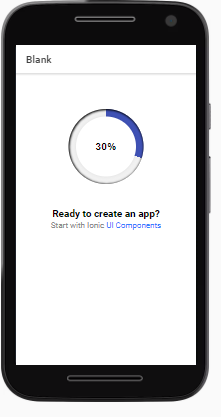
ionic example
checkout the ionic example
angular example
checkout the angular example
Contributing
Pull requests are welcome. For major changes, please open an issue first to discuss what you would like to change.
License
MIT
Author
Umar Memon


