
Security News
New React Server Components Vulnerabilities: DoS and Source Code Exposure
New DoS and source code exposure bugs in React Server Components and Next.js: what’s affected and how to update safely.
By Sarah Gooding - Dec 12, 2025
simple-react-donut-chart
Advanced tools
This is a dead simple donut chart component implemented in React.
To use it simply install it via npm:
npm i --save simple-react-donut-chart
You can see this component in action here.
## usage
This is an example how can you use this component in your project(s)
    import DonoutChart from 'simple-react-donut-chart'
    import 'simple-react-donut-chart/src/style.css'
Yes, in this version you have to include the compiled d css also
Using the component:
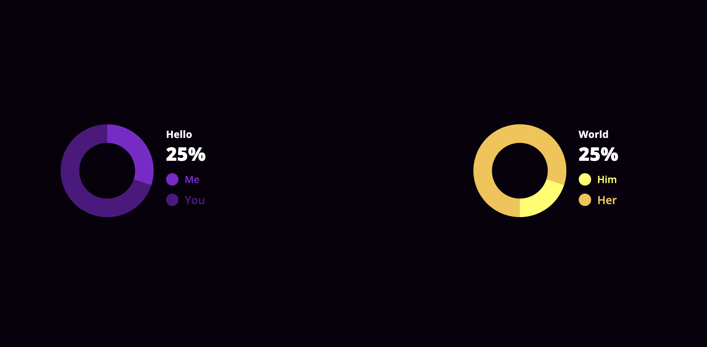
<DonoutChart
    percentage={30}
    colorOn="#510E80"
    colorOff="#8217CC"
    labelOff="Me"
    labelOn="You"
    circleColor="#ffffff"
    baseClass="customize"
    textStyle={{
        color: '#ff0000',
    }}
    labelStyle={{
        off: {
            fontSize: '16px',
        },
        on: {
            fontSize: '18px',
        },
    }}
/>
| name | isRequired | type | default | example | description |
|---|---|---|---|---|---|
percentage | yes | Number | 0 | percentage={10} | the percentage the donut chart should show |
colorOn | yes | String | null | colorOn="#ff0000" | the color that matches with the percentage on the chart |
colorOff | yes | String | null | colorOff="#ffff00" | the color that matches the rest of the donut part on the chart |
labelOn | yes | String | null | labelOn="On" | the text will be shown with the percentage on the chart |
labelOff | yes | String | null | labelOff="Off" | the text will be shown with the rest of the donut part on the chart |
circleColor | yes | String | "#ffffff" | circleColor="#444444" | the color the circle should have on the middle of the donut chart |
labelStyle | no | Object | {} | labelStyle={{ off: {,fontSize: '16px',}, on: {,fontSize: '18px',} }} | styleObject passed to the labels of the donut chart |
textStyle | no | Object | {} | textStyle={{ color: '#fff', }} | styleObject passed to the explanation text of the donut chart |
baseClass | no | String | null | baseClass={styles.chartBase} | Providing a baseClass will be applied on every domNode the donut chart has. See more at the styleing section |
By providing the baseClass props, you are able to customize the chart as you wish, with CSS.
Here is a quick example how it works:
<DonoutChart
	percentage={30}
    ...
    baseClass="customize"
/>
Given the customize as the value of baseClass the following will happen.
The donutContainer class will be assigned another class, which is the baseClass prop itself.
<div class="donutContainer customize">
    ...
</div>
The rest of the dom will be suffixed with the baseClass prop's value.
| className | extended |
|---|---|
donutContainer | className={`donutContainer ${baseClass}`} |
details | className={`details details--${baseClass}`} |
indicator off | className={`indicator off indicator-off-${baseClass}`} |
indicator on | className={`indicator on, indicator-on-${baseClass}`} |
More might come later if there's a need.
If you encountered an issue, or a bug, or want to request a feature, please use the issues section.
If you want to modify something yourself, feel free to fork this project, create a new branch for your feature, then send a PR and I will be happy to review and merge it. :wink:
This package depends on styled-components
FAQs
Creates donut charts in react
We found that simple-react-donut-chart demonstrated a not healthy version release cadence and project activity because the last version was released a year ago. It has 1 open source maintainer collaborating on the project.
Did you know?

Socket for GitHub automatically highlights issues in each pull request and monitors the health of all your open source dependencies. Discover the contents of your packages and block harmful activity before you install or update your dependencies.
Security News
New DoS and source code exposure bugs in React Server Components and Next.js: what’s affected and how to update safely.

Security News
Socket CEO Feross Aboukhadijeh joins Software Engineering Daily to discuss modern software supply chain attacks and rising AI-driven security risks.

Security News
GitHub has revoked npm classic tokens for publishing; maintainers must migrate, but OpenJS warns OIDC trusted publishing still has risky gaps for critical projects.