smart-hoverjs
smart-hoverjs WebComponent inspired on iPad OS contextual cursor.
Install
npm -i smart-hoverjs
Import
To use the web component simply import it in your main or app file like so:
import 'smart-hoverjs'
Or include it in your index.html file
<script src="./node_modules/smart-hoverjs/dist/index.js">
Use
smart-hoverjs component behaves as a regular div container, except it can take a few attributes that can define certain behaviors and its style.
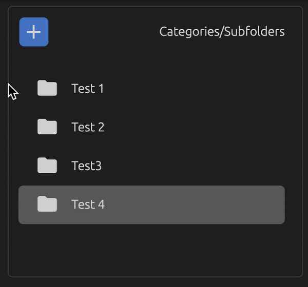
<smart-hover class="category-list">
  <div class="category-list-item">Test 1</div>
  <div class="category-list-item">Test 2</div>
  <div class="category-list-item">Test 3</div>
  <div class="category-list-item">Test 4</div>
</smart-hover>
Smart hover component will automatically position itself on top of the elements that where found with the query selector when they are hovered, automatically adapting to their position and size. The smart hover element will be appended programatically with the class ".smart-hover-shadow" with the defautl styles applied.
.smart-hover-shadow {
  border-radius: 5px;
  background: rgba(0,0,0,0.15);
}
Customization
Smart hoverjs has default styles applied under the .smart-hover-shadow css class
Feel free to add your own class to the shadow element trough the shadow-class attribute.
Or make use of any of the other optional attributes specified below.
Restrictions
NOTE: There are a few style properties programatically applied to the shadow element that you will not be able to override like transform, with, height.
The shadow element also has by default absolute position and pointer events set to none, to avoid problems with your hoverable elements
Attributes
<smart-hover
  move-event=""
  query-selector=""
  initial-child-query=""
  shadow-class=""
  children-can-change=""
  transition-time=""
  transition-mode=""
  transition-props="">
</smart-hover>
move-event
This is the property that defines the type of interaction the shadow should react to.
If set to "hover" the shadow element will only be visible and move while hovering interactable elements.
If set to "click" the shadow element will always be visible and only move when an interactable element is clicked
<smart-hover move-event="hover | click"></smart-hover>
query-selector
Query selector defined here will be used to find elements inside the container, all elements found by the query selector will become 'interactable'.
If unset it retrieves all children of the container using parentElement.children property.
<smart-hover query-selector=".interactable">
<div class="interactable">
<div class="interactable">
<div class="not-interactable">
</smart-hover>
initial-child-query
This is ONLY used if the move-event is set to "click".
This is another query selector used to define the initial position of the shadow element.
If this is unset it will use the first element found trough the query selector or the first children of the container
<smart-hover initial-child-query=".interactable.initial">
<div class="interactable">
<div class="interactable">
<div class="not-interactable">
<div class="interactable initial">
</smart-hover>
shadow-class
The string defined here will be applied to the shadow element as a single class, when this is defined the default styles of the shadow will be removed
<smart-hover shadow-class="my-custom-class-name"></smart-hover>
children-can-change
This is used to tell the component that interactable elements might be added or removed from the container, to make sure that only the necessary event listeners are applied.
If unset defaults to false
<smart-hover children-can-change="true | false"></smart-hover>
transition-props
If you want to apply the transition to specific css properties, you can apply them by adding them in this attribute, separating them with a comma. If
this is unset it will default to 'all'
<smart-hover transition-props="left,top,height,width"></smart-hover>
transition-time
Time in milliseconds that the shadow element will take from one element to the next one when hover changes. If unset default value will be set to 176.
<smart-hover transition-time="200 | 180 | 340"></smart-hover>
transition-mode
Transition mode can be any valid css transition timing functiontype
https://developer.mozilla.org/en-US/docs/Web/CSS/transition-timing-function
<smart-hover transition-mode="ease | ease-in-out"></smart-hover>


