Product
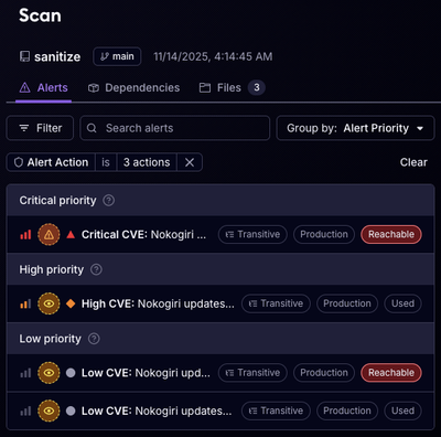
Reachability for Ruby Now in Beta
Reachability analysis for Ruby is now in beta, helping teams identify which vulnerabilities are truly exploitable in their applications.
solid-element
Advanced tools
This library extends Solid by adding Custom Web Components and extensions to manage modular behaviors and composition. It uses Component Register to create Web Components and its composed mixin pattern to construct modular re-usable behaviors. This allows your code to available as simple HTML elements for library interop and to leverage Shadow DOM style isolation. Solid already supports binding to Web Components so this fills the gap allowing full modular applications to be built out of nested Web Components. Component Register makes use of the V1 Standards and on top of being compatible with the common webcomponent.js polyfills, has a solution for Polyfilling Shadow DOM CSS using the ShadyCSS Parser from Polymer in a generic framework agnostic way (unlike the ShadyCSS package).
See here for an example of a webcomponent created by solid-element.
npm i solid-element solid-js babel-preset-solid
The simplest way to create a Web Component is to use the customElement method.
The arguments of customElement are:
'my-component'){someProp: 'one', otherProp: 'two'}). Props without default values will be ignored by the customElement.(props, { element }) => { solid code here })import { customElement } from 'solid-element';
customElement('my-component', {someProp: 'one', otherProp: 'two'}, (props, { element }) => {
// ... Solid code
})
Props get assigned as element properties and hyphenated attributes. This exposes the component that can be used in HTML/JSX as:
<my-component some-prop="some value" other-prop="some value"></my-component>
This is all you need to get started with Solid Element.
A shadow DOM is used by default for style isolation. If you want to disable the shadow DOM, you can do it with noShadowDOM() like this:
import { customElement, noShadowDOM } from 'solid-element';

customElement('my-component', {someProp: 'one', otherProp: 'two'}, (props, { element }) => {
  noShadowDOM();
  // ... Solid code
})
Web Component Todos Simple Todos Comparison
Solid Element exposes Component Register's Hot Module Replacement solution for Webpack and Parcel. It does not preserve state, swapping Components that are changed and their descendants. This approach is simple but predictable. It works by indicating the component to be Hot Replaced with the hot method in your file.
import { customElement, hot } from 'solid-element';

hot(module, 'my-component');
This is a new feature that is actively seeking feedback. Read more: Component Register
There is also a webpack loader that handles adding this automatically. Check out Component Register Loader
Under the hood the customElement method is using Component Register's mixins to create our Custom Element. So this library also provides the way to do so directly if you wish to mixin your own functionality. It all starts by using the register HOC which upgrades your class or method to a WebComponent. It is always the start of the chain.
import { register } from 'component-register';

/*
register(tag, defaultProps)
*/
register('my-component', {someProp: 'one', otherProp: 'two'})((props, options) =>
  // ....
)
Component Register exposes a convenient compose method (a reduce right) that makes it easier compose multiple mixins. From there we can use withSolid mixin to basically produce the Component method above. However, now you are able to add more HOC mixins in the middle to add additional behavior in your components.
import { register, compose } from 'component-register';
import { withSolid } from 'solid-element';

/*
withSolid
*/
compose(
  register('my-component'),
  withSolid
)((props, options) =>
  // ....
)
FAQs
Webcomponents wrapper for Solid
We found that solid-element demonstrated a not healthy version release cadence and project activity because the last version was released a year ago. It has 1 open source maintainer collaborating on the project.
Did you know?

Socket for GitHub automatically highlights issues in each pull request and monitors the health of all your open source dependencies. Discover the contents of your packages and block harmful activity before you install or update your dependencies.

Product
Reachability analysis for Ruby is now in beta, helping teams identify which vulnerabilities are truly exploitable in their applications.

Research
/Security News
Malicious npm packages use Adspect cloaking and fake CAPTCHAs to fingerprint visitors and redirect victims to crypto-themed scam sites.

Security News
Recent coverage mislabels the latest TEA protocol spam as a worm. Here’s what’s actually happening.