
Security News
Meet Socket at Black Hat Europe and BSides London 2025
Socket is heading to London! Stop by our booth or schedule a meeting to see what we've been working on.
By Anders Søndergaard - Nov 11, 2025
storybook-addon-deep-controls
Advanced tools
A Storybook addon that extends @storybook/addon-controls and provides an alternative to interacting with object arguments

This addon extends the functionality of the @storybook/addon-controls addon and provides an alternative to interact with object arguments.
The default JSON control used for objects provides an interface to interact with the JSON representation of the arg value which can be useful, however it can be difficult for deeply nested objects.
This addon tries to simplify this by splitting objects into multiple primitive controls for each deep primitive property. This allows you to interact with the object arg value and also benefit from general controls functionality e.g. defining different controls for different deep properties.
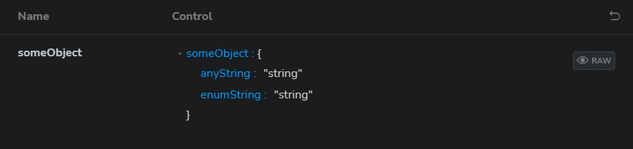
Generally, it turns this:
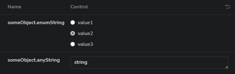
into this:
See an interactive example here.
First, install the addon:
npm i -D storybook-addon-deep-controls
Then add it to your .storybook/main.* file in the addons array:
export default {
  addons: ["storybook-addon-deep-controls"],
};
After this the addon is setup and ready to use in your stories. It is disabled by default and you will need to enable it via a story parameter, see examples below.
Add the parameter to the story object:
export const SomeStory = {
  ...
  parameters: {
    deepControls: { enabled: true },
  },
  ...
};
Add the parameter to the meta object (ie the default exported object):
export default {
  ...
  parameters: {
    deepControls: { enabled: true },
  },
  ...
};
Add the parameter to the global parameters object in the .storybook/preview.* file:
export const parameters = {
  ...
  deepControls: { enabled: true },
  ...
};
or
export default {
  ...
  parameters: {
    deepControls: { enabled: true, },
  },
  ...
};
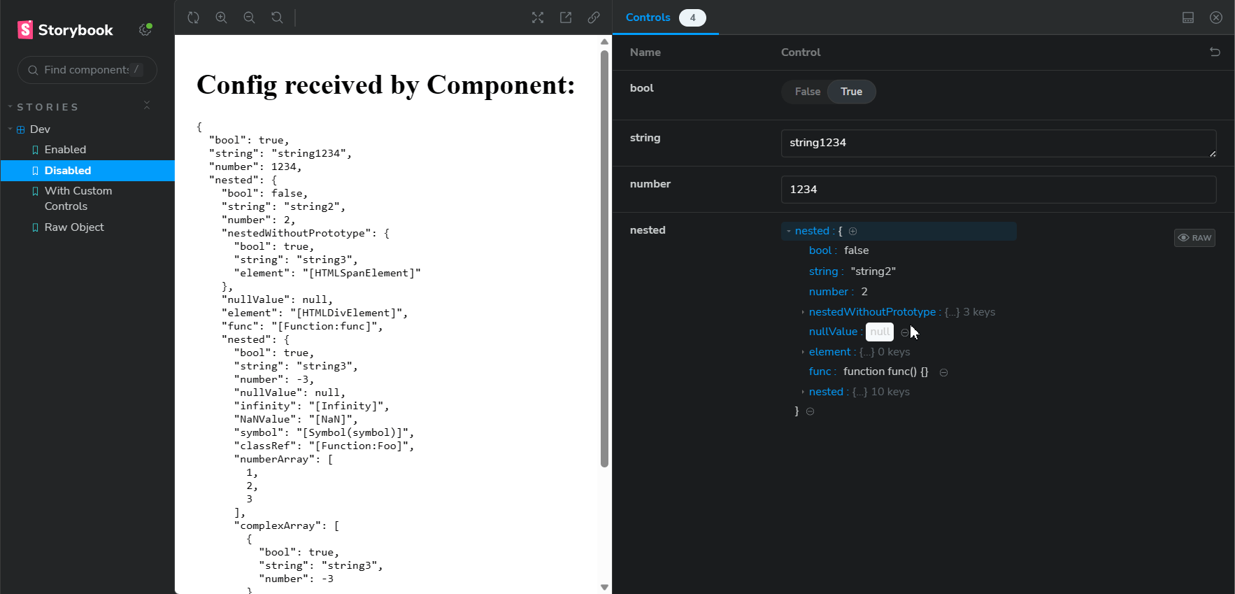
Below are some examples of what this looks like in the UI. This is for a story that generally serialises and displays the config it receives.
Example with/without the addon and some editing:
See an interactive example here.
Once you have this enabled for a story the addon will automatically split any defined object args into multiple primitive controls for each deep primitive property.
You can customise the controls for each deep property by defining an argType for the flattened key. For example if you have an object arg property foo which has a property bar you can define an argType for the bar property using the path to the property, ie foo.bar, and this will define the control for that property.
Here is an example of this in use:
export const SomeStory = {
  args: {
    someObject: {
      anyString: "string",
      enumString: "string", // we only want specific values for this
    },
  },
  argTypes: {
    // so we define an argType for the property to use a radio control with specific values
    "someObject.enumString": {
      control: "radio",
      options: ["value1", "value2", "value3"],
    },
  },
};
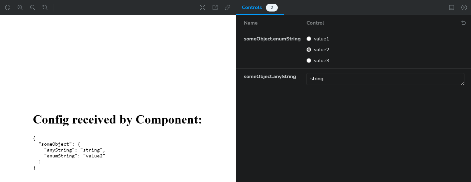
Which produces the following:
See interactive example here.
The custom argTypes you provide are merged with the inferred argTypes from the args object, so you can add documentation or other properties to the argTypes for the deep properties, e.g.
export default {
  ...
  args: {
    object: {
      booleanPropWithCustomDescription: true,
      requiredNumberProp: 5,
    },
  },
  argTypes: {
    "object.booleanPropWithCustomDescription": {
      description: "Custom description",
    },
    "object.requiredNumberProp": {
      type: {required: true},
    },
  },
  ...
}
Which produces the following docs page:
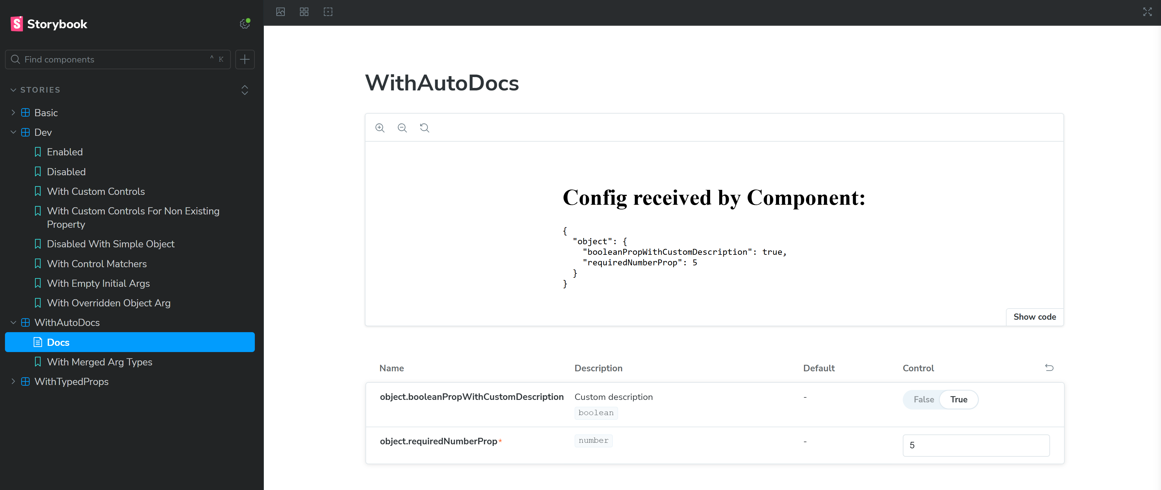
See an interactive example here.
NOTE: To avoid type errors when partially defining argTypes for documentation, you can use the TypeWithDeepControls utility type from this addon, see the Typescript section below.
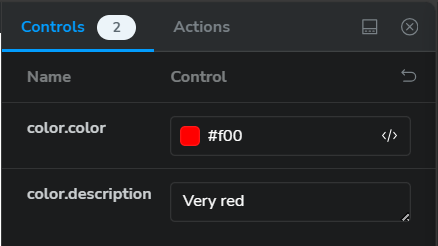
The @storybook/addon-controls addon supports selecting specific controls based on the name of properties, ie control type matchers.
This behaviour is also supported with this addon and it only matches on the property name (ie the last segment in the path).
For example, if you have a story defined as follows, ie with a custom matcher that uses color controls for arg properties that contain the word "color":
export const WithControlMatchers = {
  parameters: {
    controls: {
      matchers: {
        color: /color/i,
      },
    },
  },
  args: {
    color: {
      color: "#f00",
      description: "Very red",
    },
  },
};
Then the output of this is as follows, ie color.color uses a color control, however color.description doesn't, because even though the path contains color the property name (description) doesn't:
If you are using the @storybook/addon-docs addon, it will generate controls from the prop types of the component. For this to work properly with deep controls you will need to define explicit initial values for any object properties in args for the corresponding deep controls for those object properties to be added.
Some notes about this:
args value) the deep controls will only be added for the properties that are defined, so if you want a lot of controls to be shown by default you need to define them with default values in args or manually define argTypes for them.If you are using Typescript, defining the argTypes for deep properties as above will produce a type error. To avoid this you can use the TypeWithDeepControls utility type from this addon which you can wrap over your Meta or Story types e.g. if your story type is called StoryType and your meta type is MetaType you can do the following:
import type {TypeWithDeepControls} from "storybook-addon-deep-controls";

const meta: TypeWithDeepControls<MetaType> = {
  argTypes: {
    // no type error
    "someObject.enumString": {
      control: "string",
    },
  },
  // Type is wrapped over the MetaType
};

export default meta;

// Type is wrapped over the StoryType
type Story = TypeWithDeepControls<StoryType>;

export const SomeStory: Story = {
  args: {
    someObject: {
      anyString: "string",
      enumString: "string",
    },
  },
  argTypes: {
    // no type error
    "someObject.enumString": {
      control: "radio",
      options: ["value1", "value2", "value3"],
    },
  },
};
Compatibility of this addon is tested with different versions of Storybook and the following are the supported version ranges:
>= 7.0.0 < 8.5.0 supported addon version: >= 0.9.x>= 8.5.0 < 9.0.0 supported addon version: None
>= 9.0.0 < 10.0.0 supported addon version: >= 0.9.x>= 10.0.0 supported addon version: >= 0.10.xUsing Storybook versions outside of the ranges above may work, but is not guaranteed and may result in unexpected behaviour.
Some notes about the functionality of this addon:
FAQs
A Storybook addon that extends @storybook/addon-controls and provides an alternative to interacting with object arguments
The npm package storybook-addon-deep-controls receives a total of 45,940 weekly downloads. As such, storybook-addon-deep-controls popularity was classified as popular.
We found that storybook-addon-deep-controls demonstrated a healthy version release cadence and project activity because the last version was released less than a year ago. It has 1 open source maintainer collaborating on the project.
Did you know?

Socket for GitHub automatically highlights issues in each pull request and monitors the health of all your open source dependencies. Discover the contents of your packages and block harmful activity before you install or update your dependencies.
Security News
Socket is heading to London! Stop by our booth or schedule a meeting to see what we've been working on.

Security News
OWASP’s 2025 Top 10 introduces Software Supply Chain Failures as a new category, reflecting rising concern over dependency and build system risks.

Research
/Security News
Socket researchers discovered nine malicious NuGet packages that use time-delayed payloads to crash applications and corrupt industrial control systems.